The user’s journey was established prior to my involvement in the project. The point of this app was for it to have one purpose only. This meant that the user could only follow one path from start to finish unless they decided to exit the app.
A free tool that helps sufferers of chronic pain communicate their issues more efficiently and accurately.
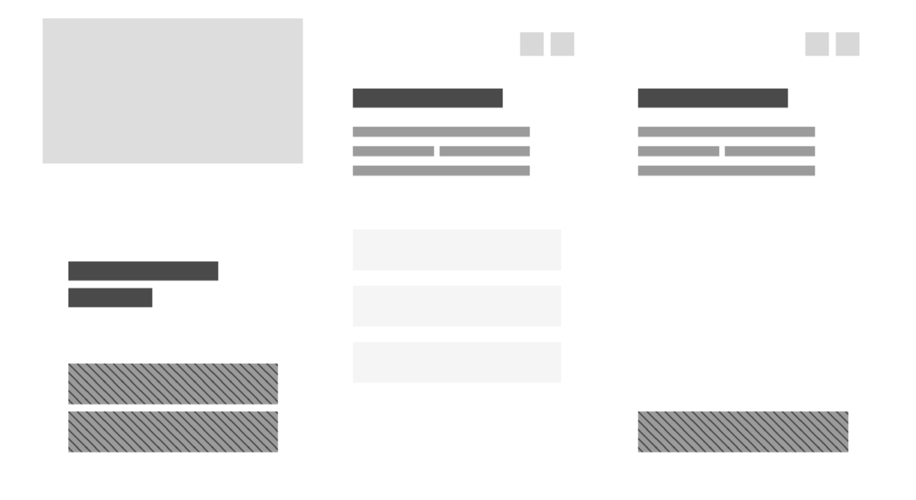
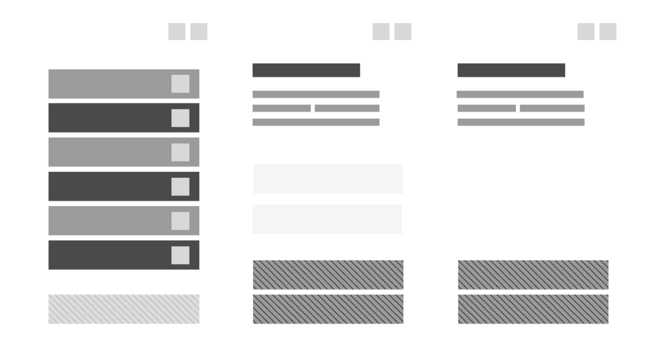
The complete user flow
The user’s journey was established prior to my involvement in the project. The point of this app was for it to have one purpose only. This meant that the user could only follow one path from start to finish unless they decided to exit the app.
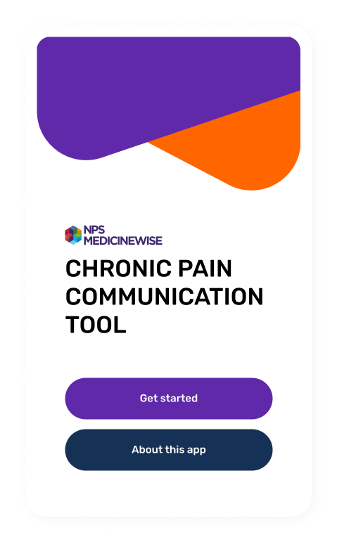
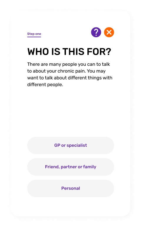
The user starts at the home screen and is presented with two options, proceed with the app or find out more about the app. Next we find out who the user is planning to talk to about their chronic pain. The user should be able to select more than one option then proceed to the next section which is the core section of the app.
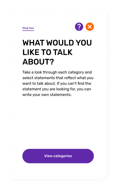
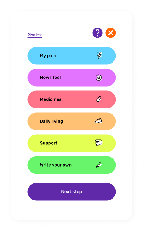
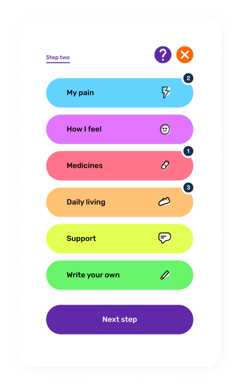
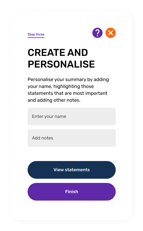
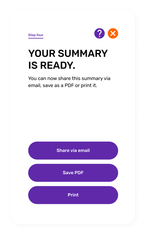
This is where the user selects what they would like to talk about. Once they’ve completed this step they move on to the next section where they can add their name, notes and prioritise what they’d like to talk about. Once they’re happy with everything they move on to the final step. The user can now save, share or print their summary.

Designing the layout
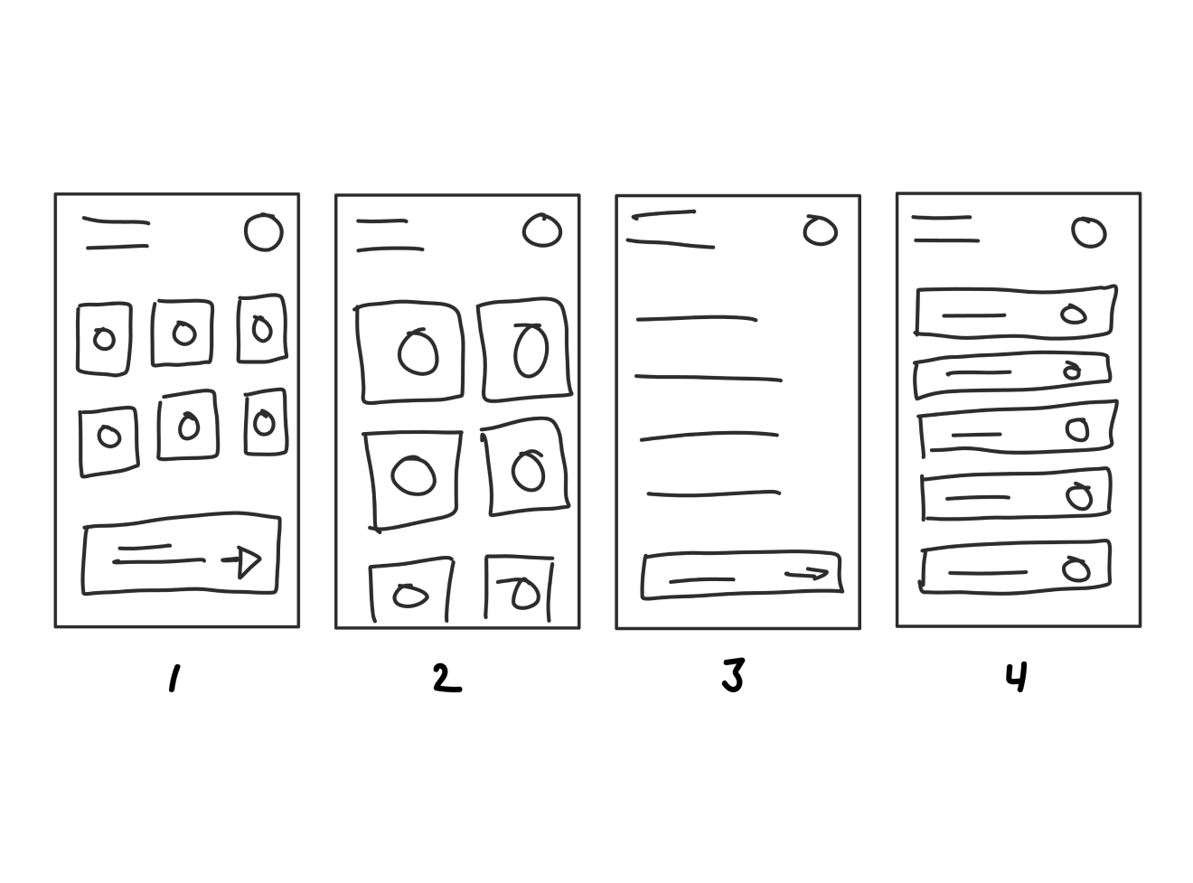
First up, the categories and cards section. This section had the highest priority as it required the most amount of input from the user. The user needed to easily select one of the six categories and then pick statement cards to help them communicate their chronic pain better.
The first two options displayed icons only. Each category would be represented by a specific colour and icon that represents that category. Testing for these two options revealed that users found it hard to determine what the categories were. The third sketch had no icons but instead used the category titles. This received better feedback from testing but users commented that it seemed less visually appealing.
The final sketch incorporated both the icons and category titles. Even though this could cause users with devices with smaller screens, this received the most positive feedback as users understood what each category was plus it has the visual aspect of the icons.
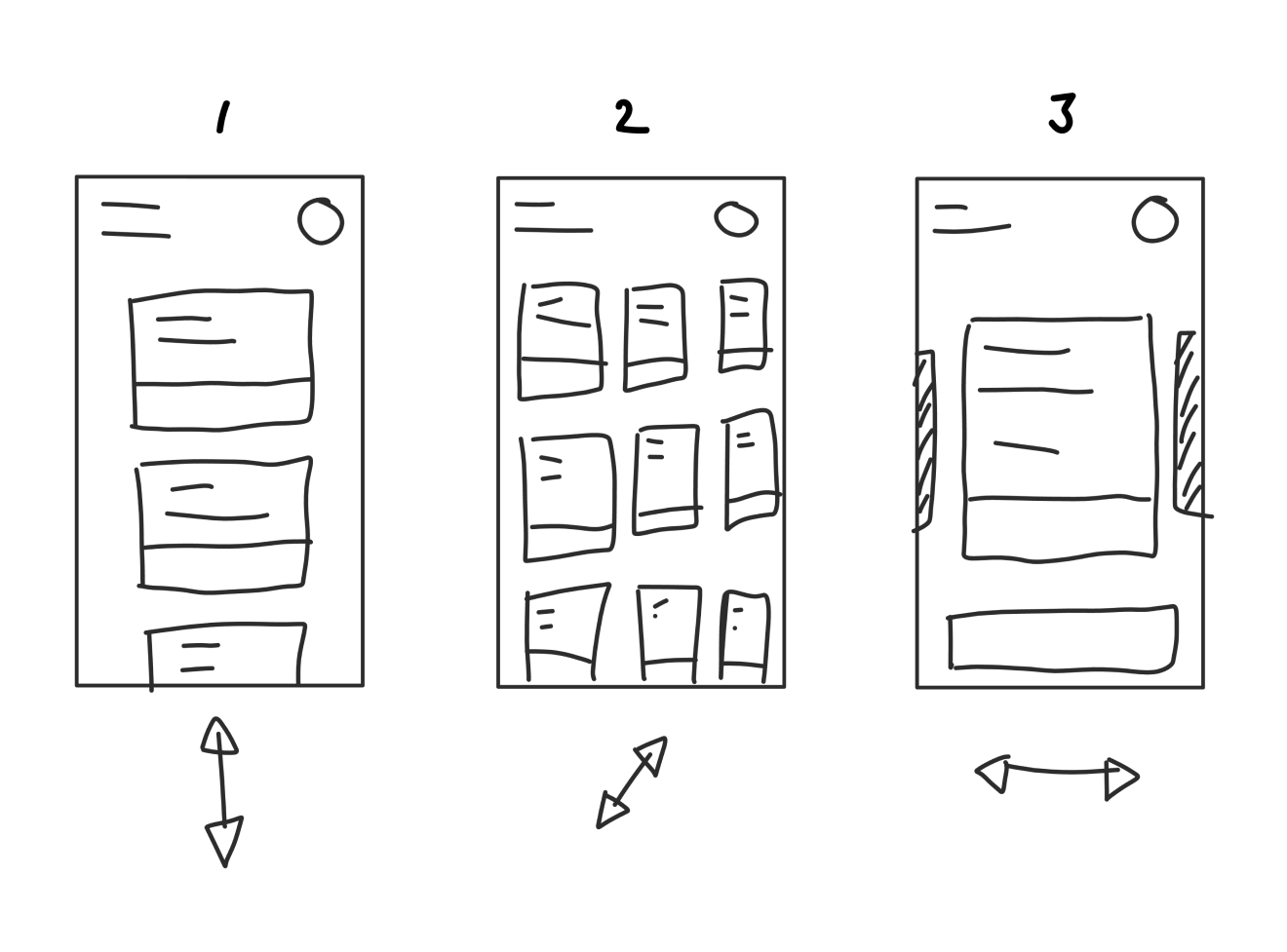
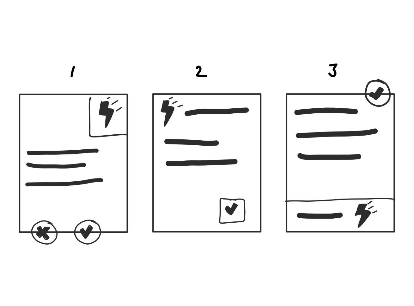
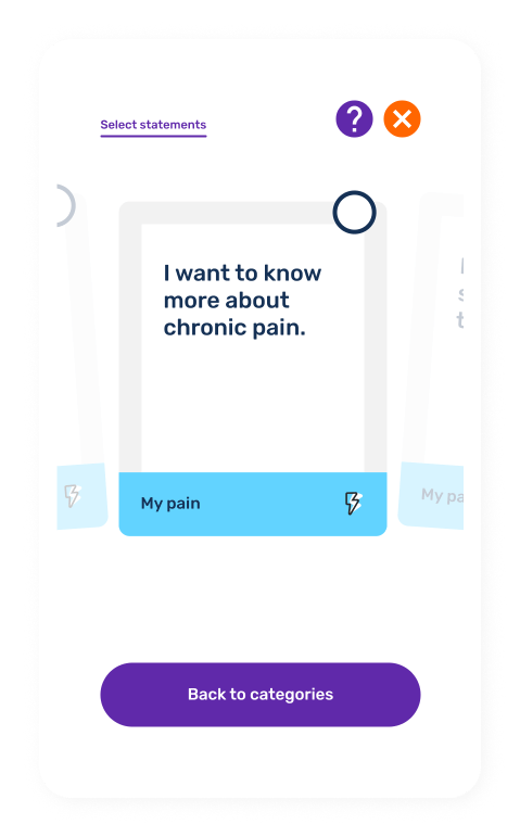
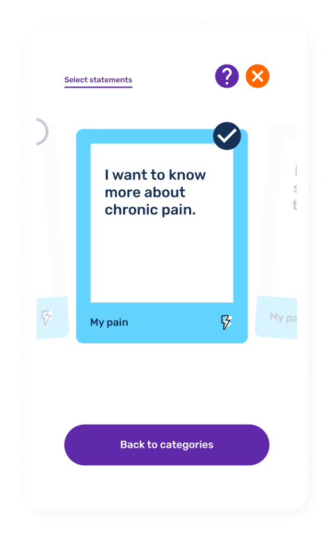
The three options for the card selection were sketched out. The first option made the user scroll up and down to view and select the statement cards they wanted. For the second option the user had to tap each card to view it in full and the final option was similar to the first but instead allowed the user to take advantage of the swipe gesture they are already familiar with on their phones. The third option tested the best with users.
Icons, icons and more icons
The icons carried a significant amount of importance. Each icon represented a particular category. These would be displayed on the category and card selection areas.
Now for the statement cards
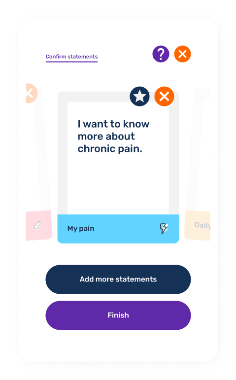
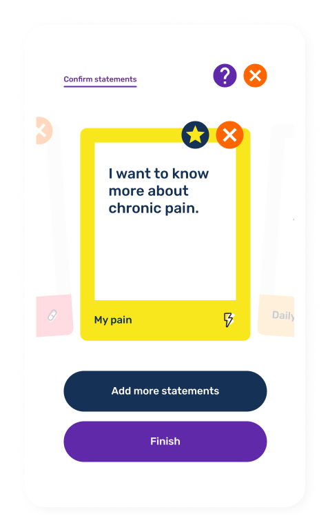
Each statement card represented an issue related to that particular category. The three directions for the cards resulted in similar feedback from users. This gave me the freedom to pick the direction we liked most. The third option was approved by NPS and the Create Studios team to be the final design.


The final design
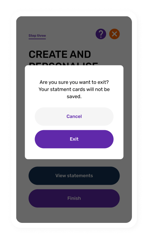
After the final drafts of the wireframes and iconography were confirmed I moved on to getting the final design completed. The final designs created were tested internally throughout their creation and apart from minor cosmetic changes, they remained almost identical to the wireframes and drafts that I created originally.
What happened next?
The project ended before the app could actually be built. As is the case with a lot of large projects like this one, requirements for the project changed and the app development had to be put on hold.
However, despite the app not going into development (yet), there had already been enough research, design and testing done to come up with a more simplified version of this tool as a part of NPS’ existing website. Working closely with the Create Studios team, a lot of the design elements as well as the iconography were incorporated into a smaller web version of the Chronic Pain Tool which was used for just over a year to gather further insights and feedback for the tool.