Creating Dubber’s accessible, data focused design system.
A fully documented, accessible design system that cut custom code from ~85% to ~20% and changed how design and engineering worked together at Dubber.
A fully documented, accessible design system that cut custom code from ~85% to ~20% and changed how design and engineering worked together at Dubber.
Joining Dubber as the head of product design meant that I had become responsible for a design system that consisted of a few basic styles and components, housed in an undocumented Figma file. Around 85% of what was being built by the engineering team was custom code, built in isolation while working on specific features for the product.
As someone who enjoys getting deep into systems and processes, I would’ve loved to just drop everything and work on a design system. But that wasn’t my reality, my design team was small and our workload was that of a team 3 times bigger. That meant the problem wasn’t to create a design system that helped us move faster, it was how do we do this while simultaneously working on core business projects.
Given their scope and focus, a few of these projects would allow us to grow the design system organically. Rather than focusing immediately on the “things” in the design system, it was important to prioritise the building blocks; the structure and the processes around it (contribution, documentation and accessibility).
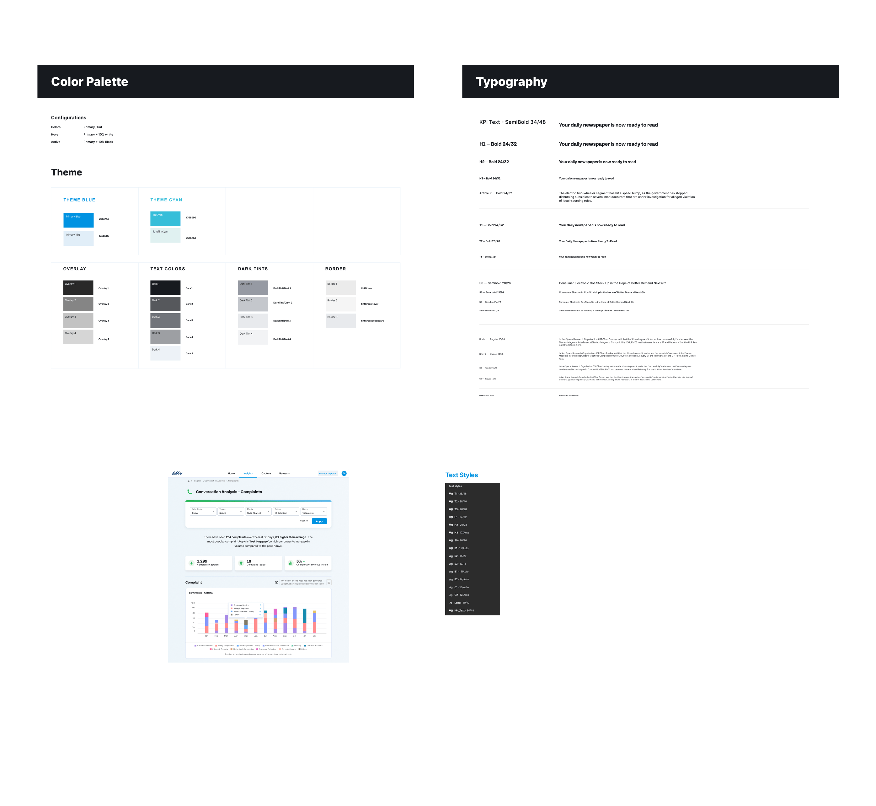
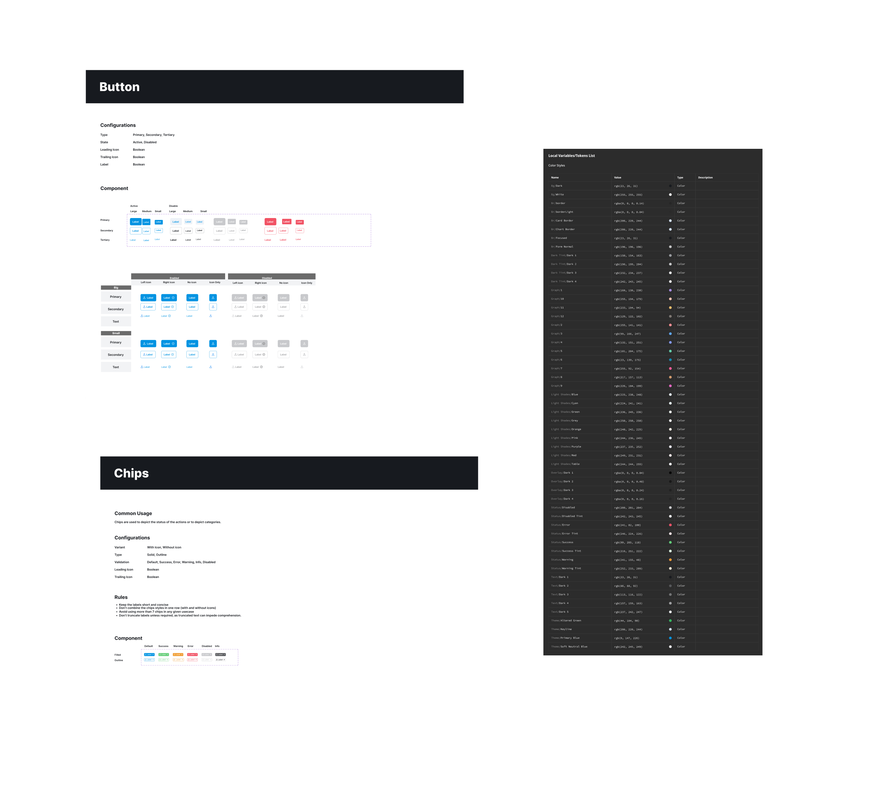
Fundamentals are what make a design system valuable. The most in-depth component libraries in the world don’t mean anything if your teams don’t know how to use them.
The structure of the design system was tailored to the product. Not how the product is in its current form, but the problem that the product was solving. This was a key distinction because the point of the system was that it would scale and grow with the business. It consisted of 4 layers: components, groups, features and views. Views allow the user to get all the context they need and perform whatever tasks needed to complete their objective. Each view is made up of features, groups and components. Each feature allows a user to perform a single task. To do this, the groups within that feature give the user the context they need to perform that task.
Here’s an example: a team manager at a call centre wants to put together a training deck for onboarding new agents using examples of complaints handling. They will use the complaints dashboard (view) to filter the data (using the action-bar feature which is made up of input components and a button group) so that they can see data charts (groups) relevant to their team and complaints queries.
I ran workshops to make sure our teams were aligned on the structure, each with different people and objectives. The first session, which involved the Global Product Director, CTO and key product/tech people, was about buy in for the structure’s concept and reasoning. The last session was about explaining the concept and it ended with a game where the designers split off with their engineering counterparts and deconstructed what was currently built in the product into the new structure. This helped make sure that everyone not only understood its importance, but also understood how to apply it.
Layers:
With the core structure in a good place, my next challenge was the processes of the design system. Much like the structure, these needed to be tailored to not just the problem but also our team. I focused on the processes around contribution first, because these would be critical in how we build the components in the design system.
The contribution process was framed around the idea that anyone in design or engineering could contribute to the design system. If you wanted to contribute, you would add it to the agenda of our weekly design review. In that design review you explain your reasoning behind this contribution, the team then critiques and analyses it. If this contribution made sense and was worth adding to the design system, you then get to implement it and own it.
Using this process ensured that everyone had true ownership over the design system. It also meant that if you couldn’t answer why, when, where and how to use a component, then it wasn’t ready to add to the system. Because this process was always going to happen while we were working on other business projects, it helped ensure that the team was building with purpose and only building the components we needed.
Documenting components is a very time consuming task. Existing Figma plugins provided varied outputs so using them as a starting point meant we would still need to spend time combining and standardising. AI couldn’t bridge that gap either and could only provide the same outputs. So I decided to build a dedicated Figma plugin specific to our workflows, components and design system.
I spent half a day working on the first version of the plugin. That first version automated all of the heavy lifting. It would take whatever components you selected and spit out a spec sheet. Figma’s Dev Mode covered a lot of the technical stuff, so the plugin didn’t extensively cover those elements, instead focusing on the most important things. It provided a really clear and detailed anatomy of the component, listed all the dependencies (other components used in this component) and provided all of the relevant sections for that component. For example, if a component had a hover interaction built into it, that interaction would be listed in the behaviour section. This meant that after running the plugin for a component, you would end up with a spec sheet pre-filled with everything that you needed to document it. All that was left up to the designer was to document the why, when, where and how in the relevant sections.
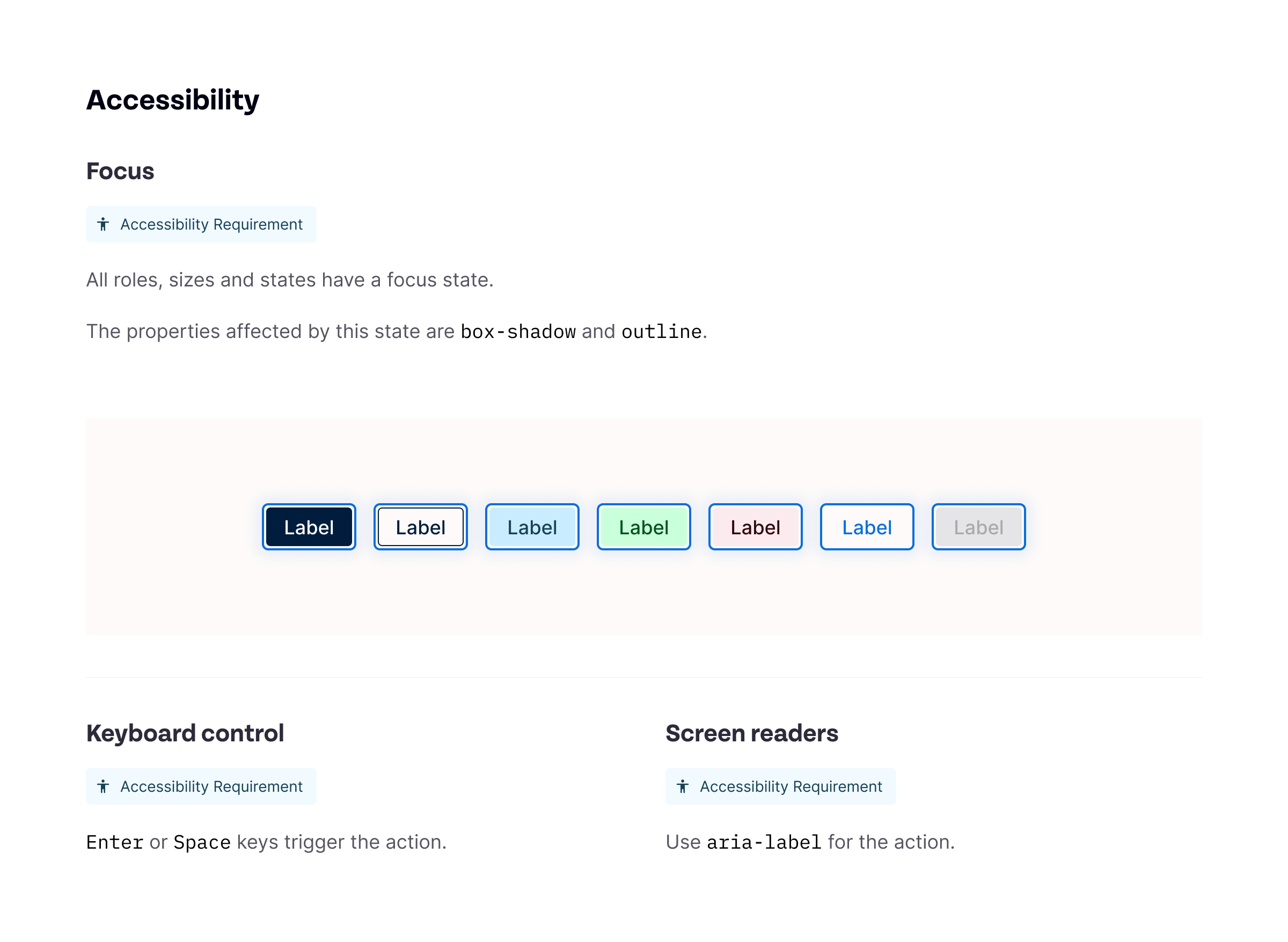
In this example, the plugin was used on the button component. It has prefilled every technical bit related to the ccomponent and has generated the relevant blocks for us to fill out the additional context.
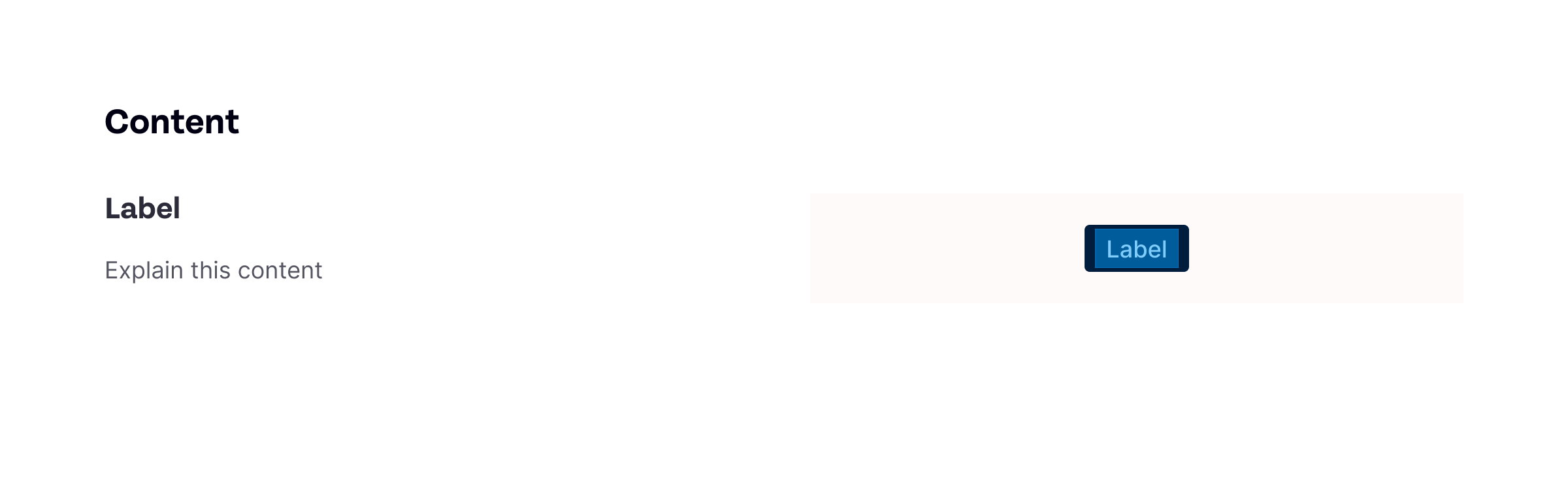
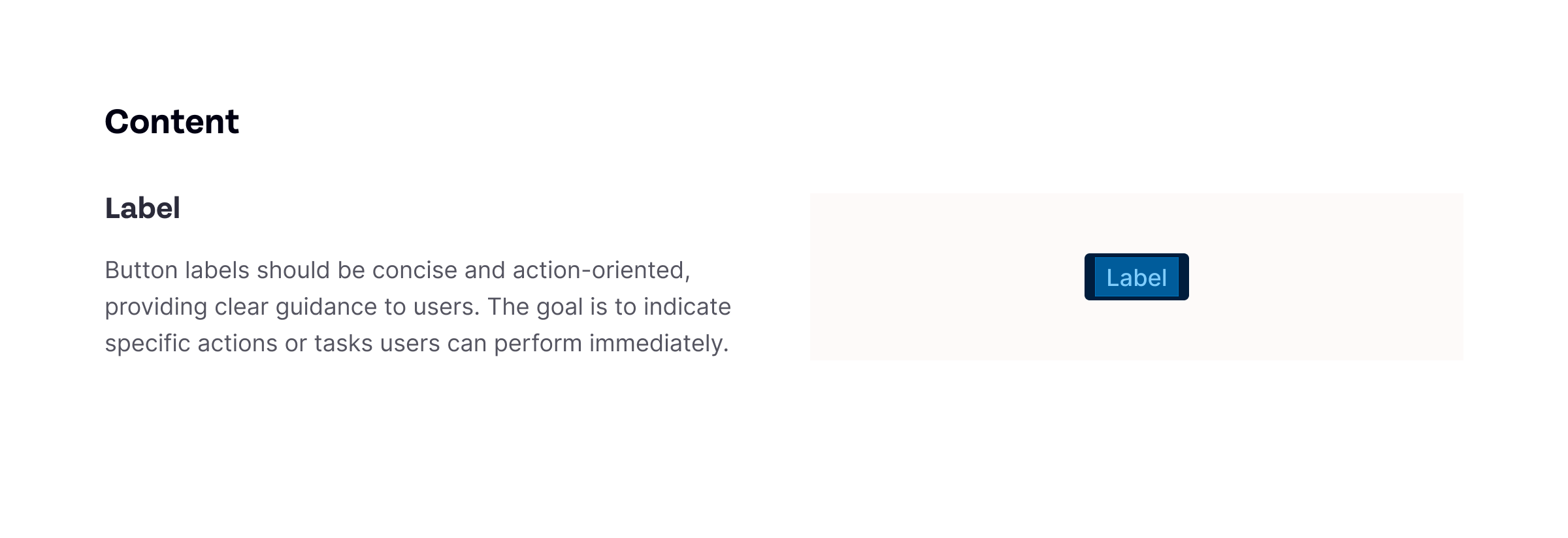
The final spec sheet now has all the additional context that the plugin had no way of knowing/extracting. Things like behaviour, usage and copywriting.
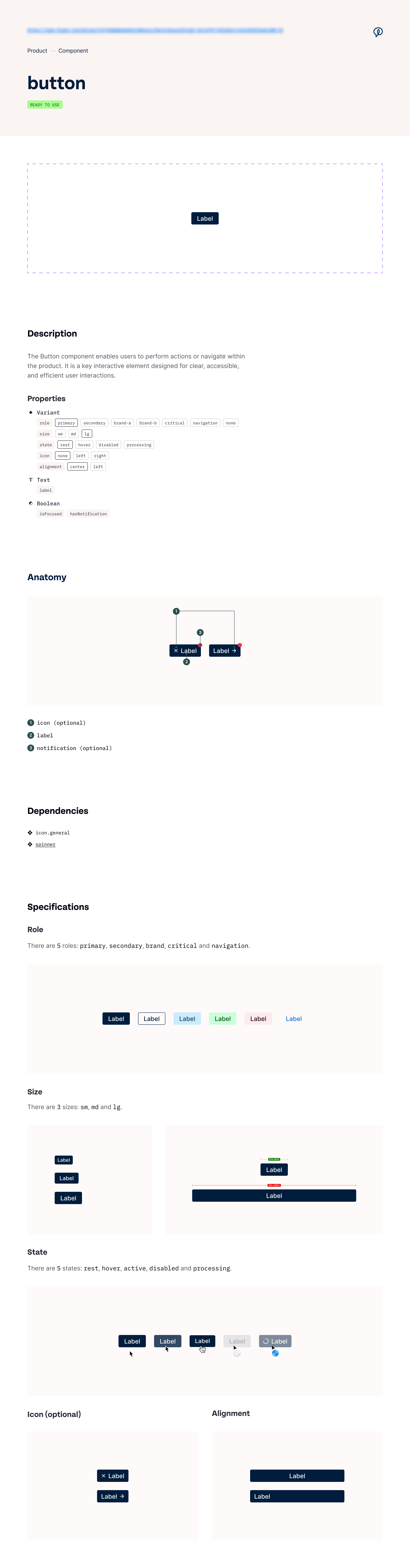
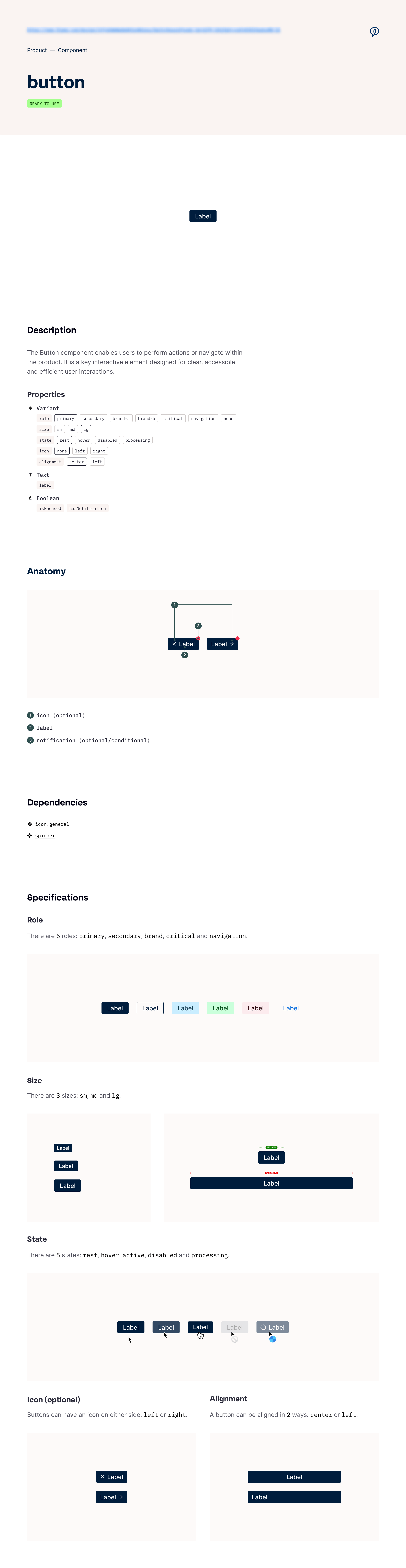
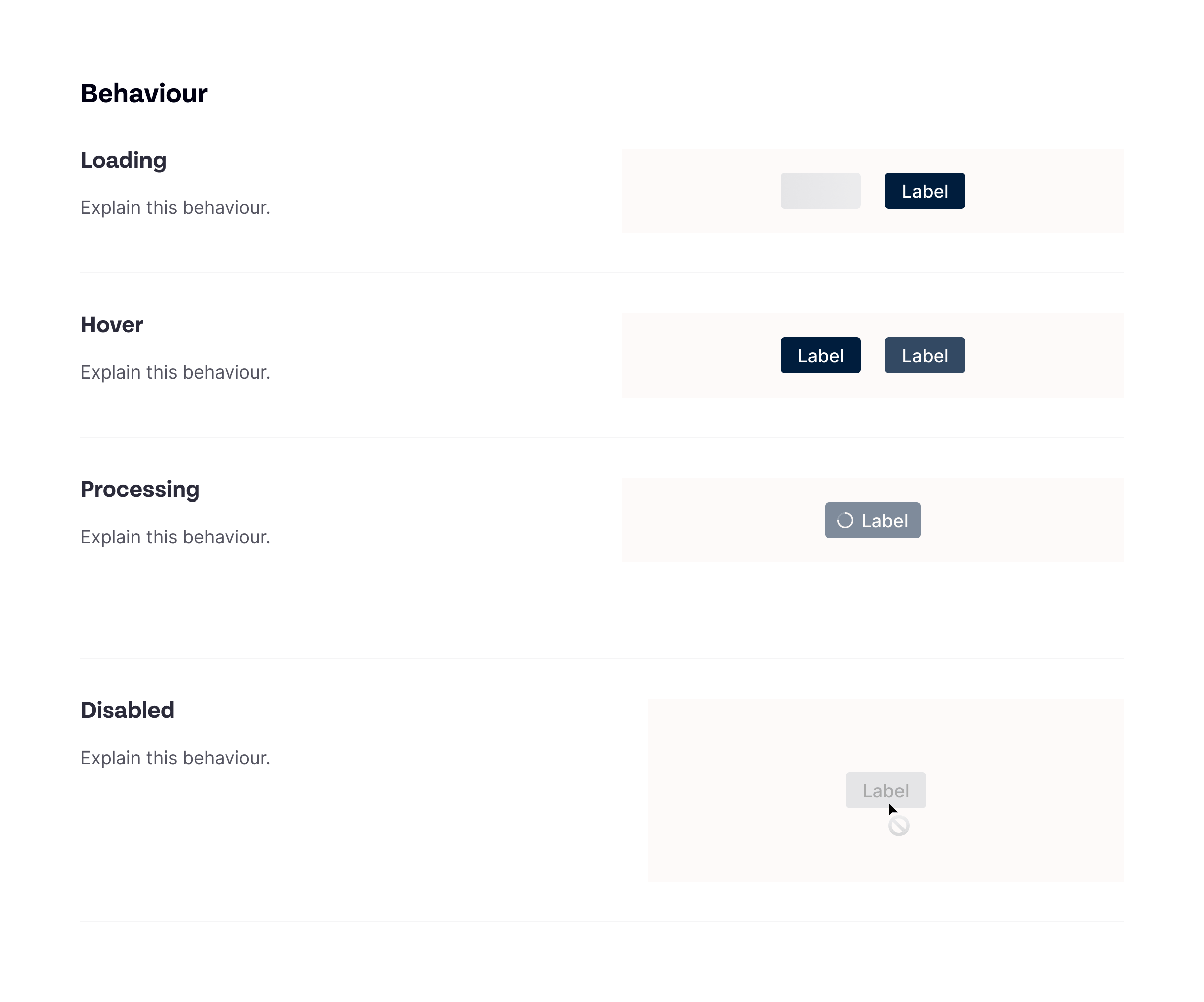
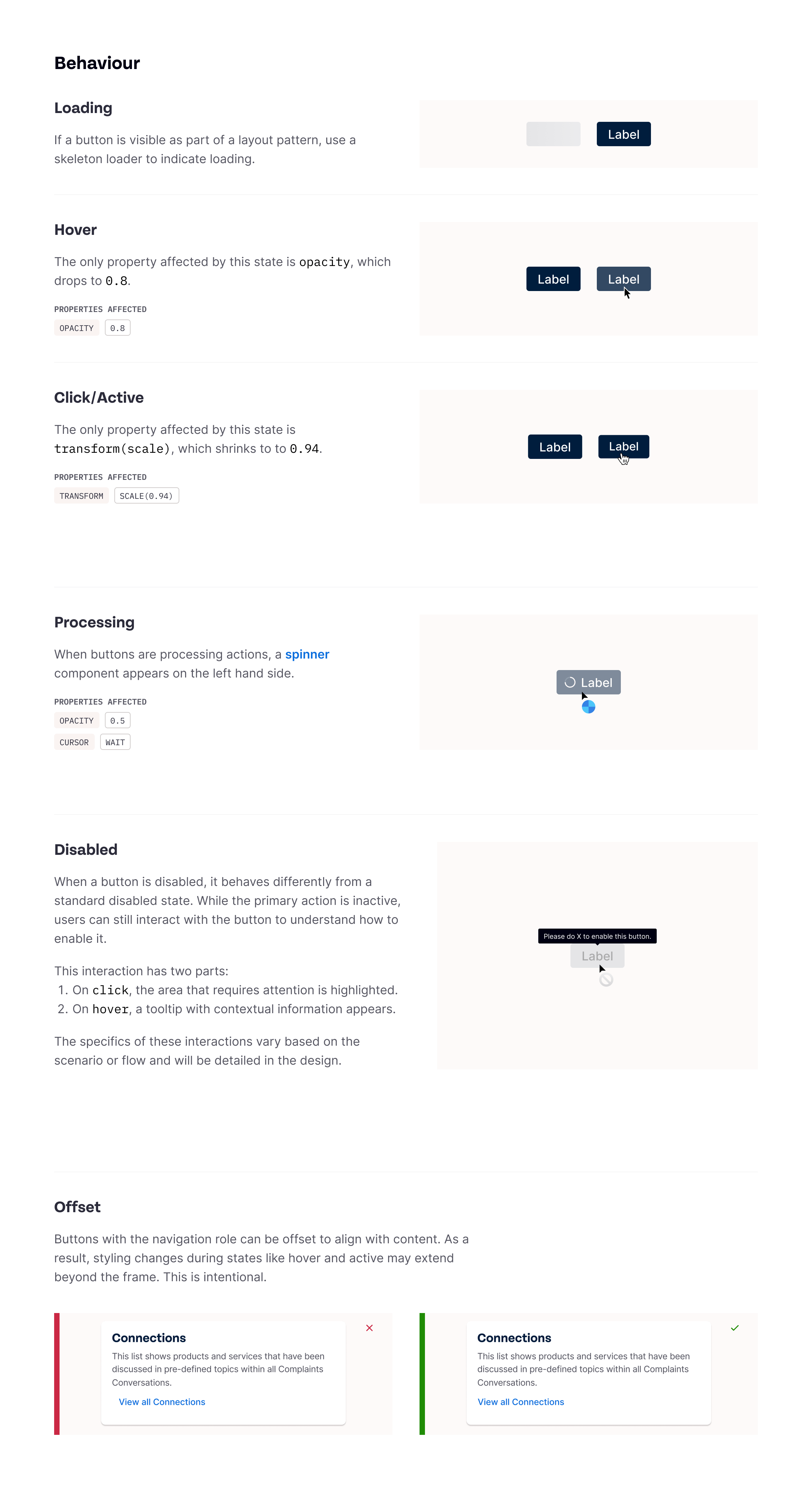
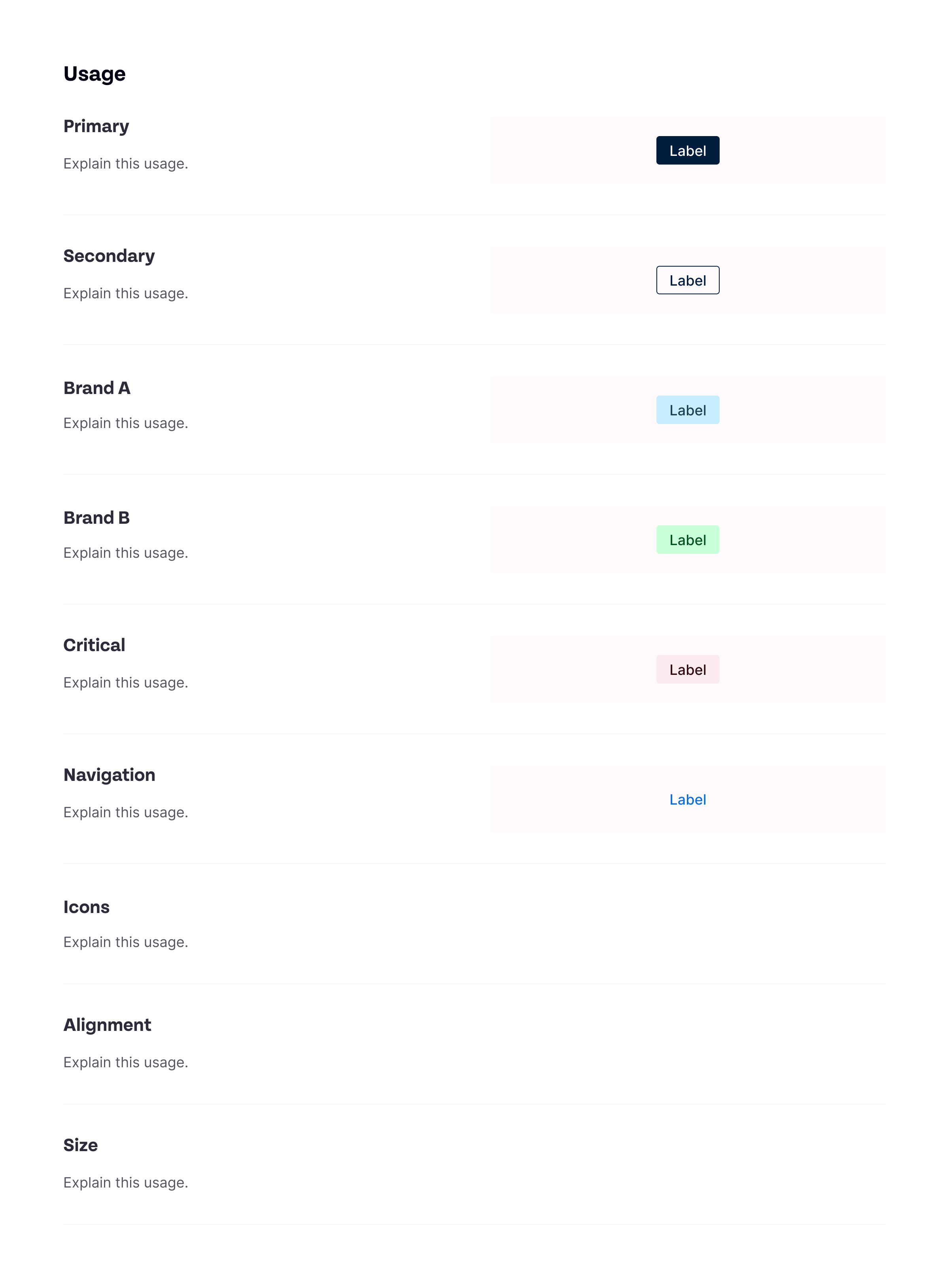
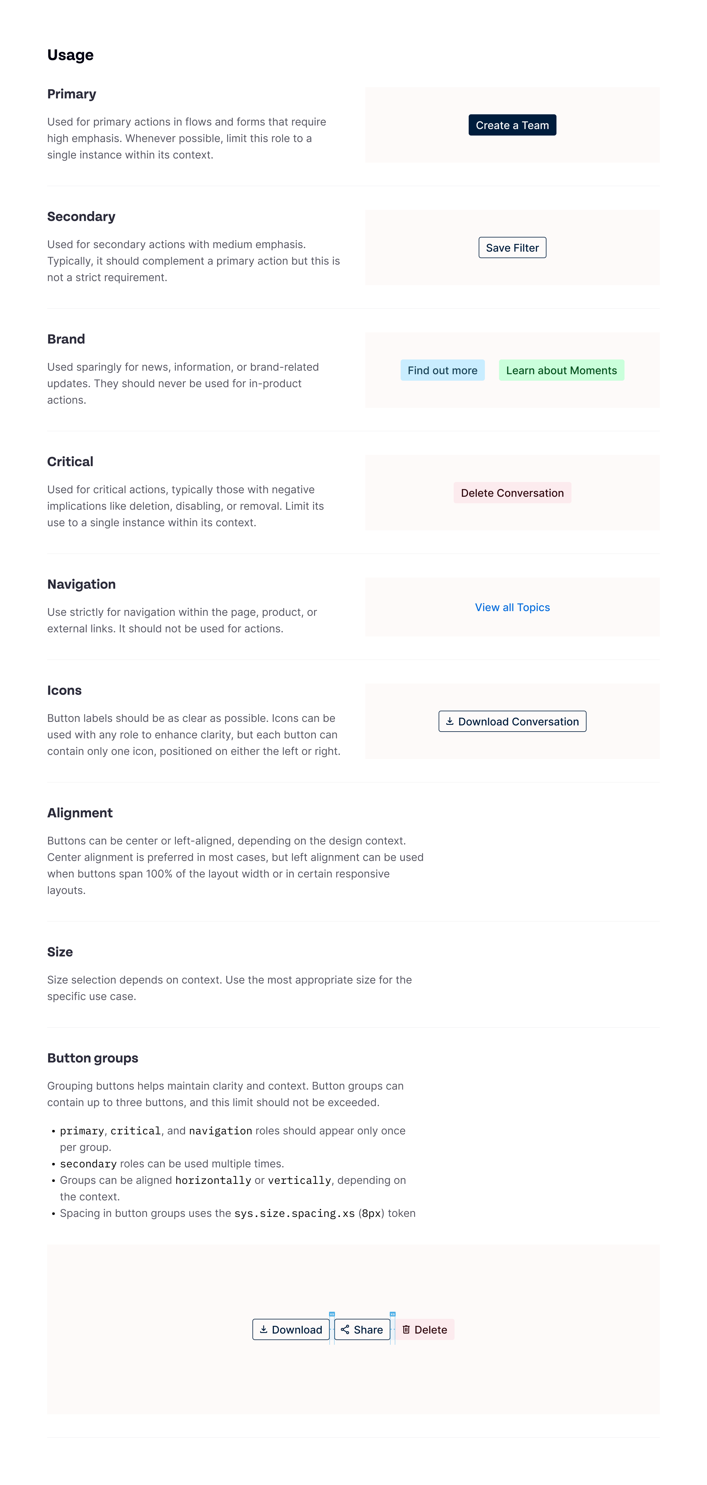
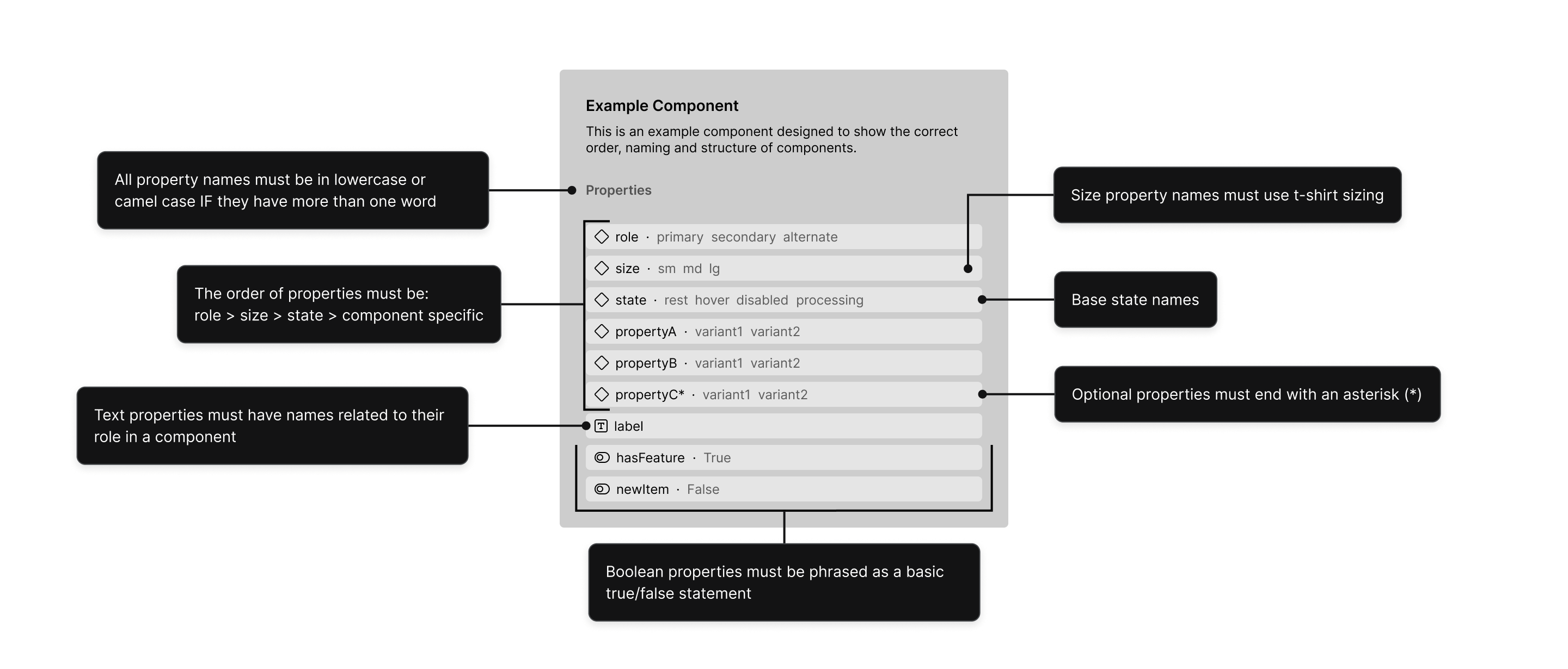
To ensure this plugin automation gave us the optimal output, I created a set of strict guidelines around the design and build of components in Figma, covering things like names for variants, boolean usage and specific interactions. The naming also reflected industry standards on the development side. This helped bridge the gap in handoff and the use of AI tools to build prototypes.
Building the design system without disrupting the current work in place was the next challenge. From the design side of things, we didn’t have to worry about core logic or any really impactful breaking changes, even if things broke, they were isolated in a design file. On the engineering side, this was something different. This was where our newly created and documented design system began to shine. I ran a kick off session with design and engineering to introduce the components and the documentation. Using the same method as before, I paired designers with engineers and asked them to spend time together over a few days finding components directly related to the work they were doing. Then we all got back together and assigned components/patterns to each initiative.
Every time work was being done on a project, we’d build a few components alongside it. That didn’t mean that every single component would be applied immediately, it just meant the component would be built and ready for use. Then at every opportunity we had, we’d start applying the components.
The first and most impactful thing we did was bring the tokens into the build. Bringing tokens in meant that the design and engineering teams now had a shared vocabulary when it came to fundamental things like sizing and colours. While this was not a component and the result was not visible, the outcome of this change substantially improved handover efficiency. A token used in the design system translates to a CSS variable. Same name, same value, same structure.
Of the projects we were working on at the time, three gave us opportunities to start using elements from the design system. Connections used components like labels and data (progress bar), migrating users from the old portal allowed us to focus on login flows and navigation, which used input, button and sidebar components, and an AI overhaul of data presentation focused on charts and graph components. All of these projects also allowed us to start using the design system tokens. Given that these projects covered different areas of the product, we could cover significant ground across the system simultaneously. Even if that meant that one flow used a new component while the other flow used an old component, this was not a dealbreaker for me. We would never have a chance to stop everything just so we could make sure that we fully implemented the design system, so progress had to be brick by brick.
The design system was currently being built and we could already see improvements to our workflows and output, but from the org’s perspective outside of a few updates about progress, there wasn’t enough visibility about the design system. We were a few weeks away from releasing the first official version of the design system so I wanted to make sure the organisation understood the significance of what we were about to release. The problem was that it didn’t have a name yet and referring to it as a design system was technical and cold. Along with my design team we had a very informal and fun session where we brainstormed potential names and ideas around it.
We came up with some great names (including giving it a human name because we all thought that was dumb and funny) but we eventually landed on something that resonated with us, Switchboard. The design system is all about communication, it’s all about making sure you end up in the right place with the right information and historically that’s what switchboards were all about. Dubber is a conversation intelligence company. Recording calls, analysing their value, working with telephony technologies. A switchboard felt like the right fit.

Switchboard 1.0 shipped. The first version included tokens, patterns, base illustrations and iconography, guidelines for copy within the product and over 30 fully documented components (not counting helper and internal components). Handover sessions were more efficient than ever, communication between design and engineering became smoother and most importantly, custom code at the time of this release had gone from around 85% down to around 20%. The product, design and engineering teams were thrilled about this monumental release. Given the size of the teams and our existing workload, this was one of the proudest moments of my time at Dubber.
A design system is a continuous piece of work, so whenever we had an opportunity, we would build it out further. That work continued until the current version of 1.3.1. While Switchboard was being developed and shipped, the company’s leadership changed drastically — and despite its success, I lost my entire design team and over 70% of the product team. I won’t bore you with my opinion on Dubber’s current leadership, this is just what happens when those in charge have a fundamental lack of understanding about how integral product and design are to the success of a product.
Ready to get in touch?