Designed Echo’s first version of the web experience.
Echo had only ever existed as an app. This was the first time patients could get in any other way.
Echo had only ever existed as an app. This was the first time patients could get in any other way.
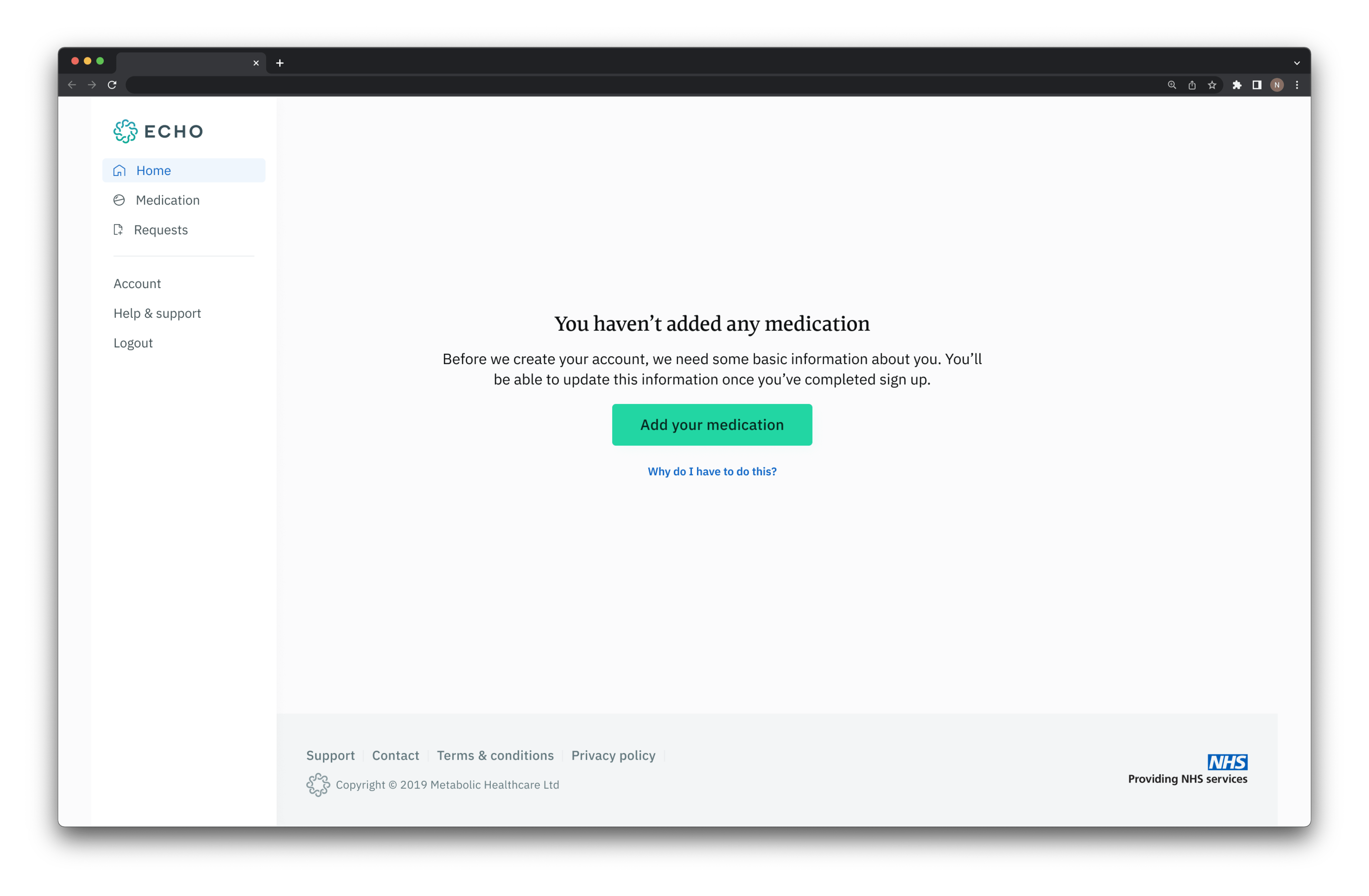
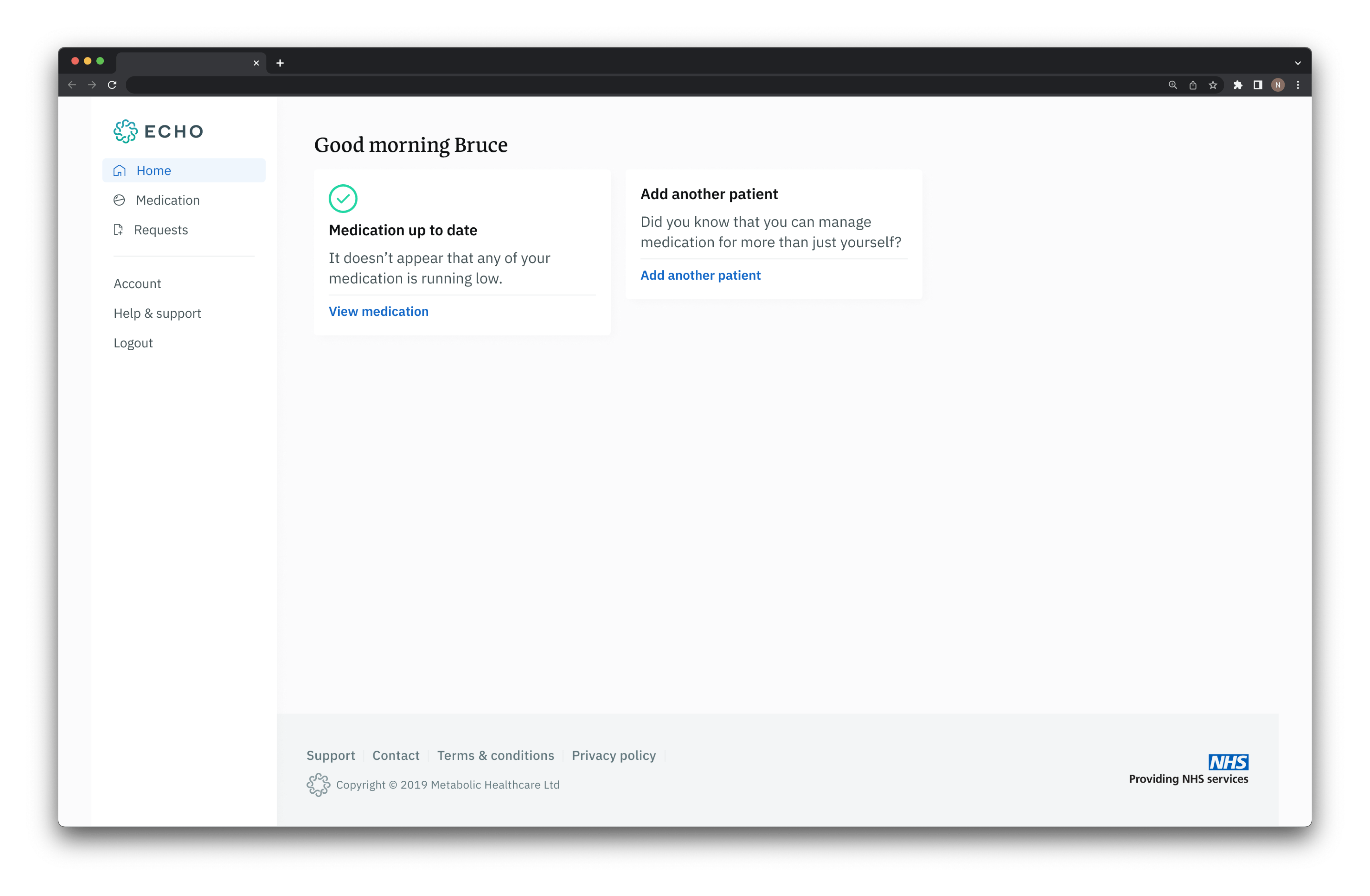
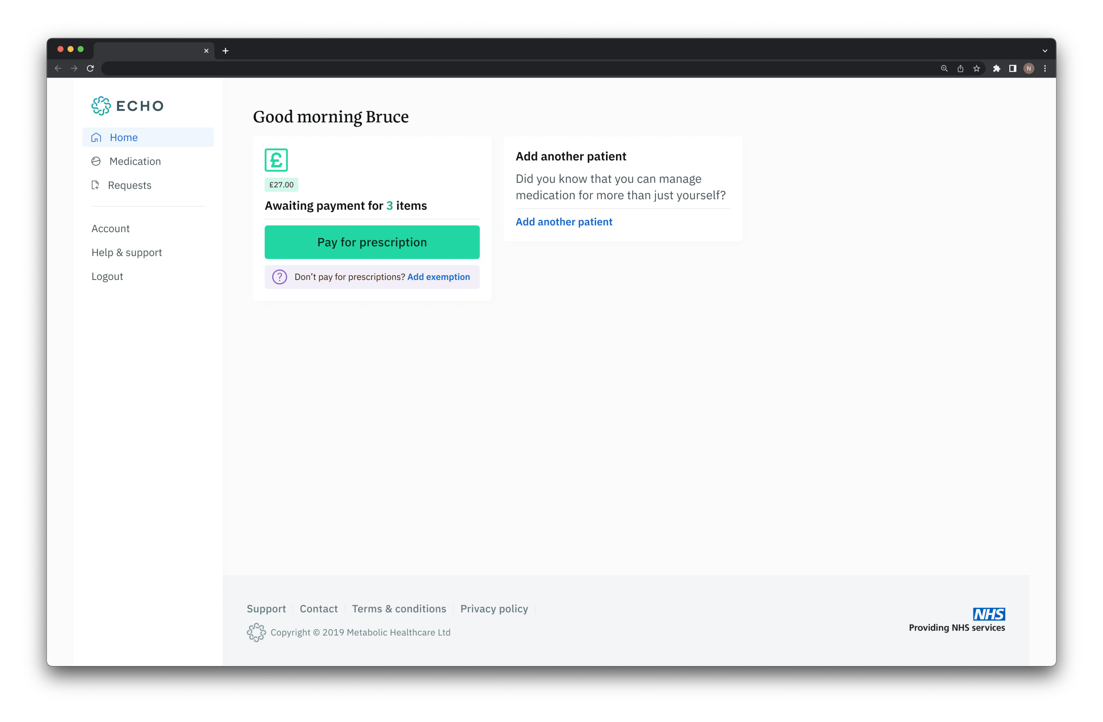
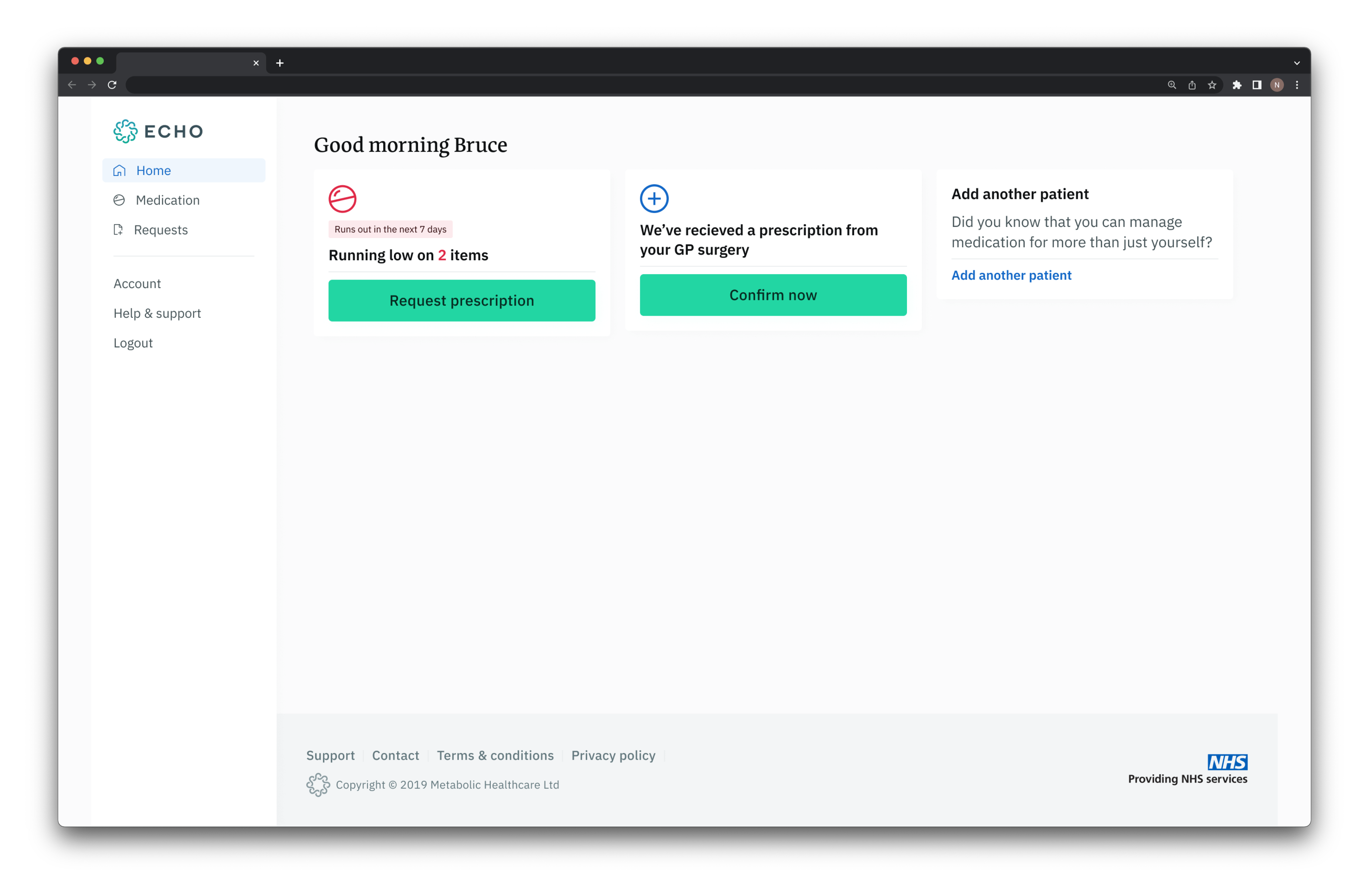
My primary project after starting at Echo was to design the brand new web app. Up until then, Echo was an app-only product, and that app looked extremely techie and cool — excellent if you were tech-savvy and on the younger side, less so for everyone else. The web app was a way to widen the audience and lower the barrier to getting started.
Working alongside a great user researcher and product owner, we started planning our approach. We brainstormed what we thought the core user wants would be, the potential issues, and the main flows.
Then we ran some basic initial user interviews to find out whether our planning was on the right track. One of the strongest themes to come out of them was concern over patients just getting whatever medication they wanted.
In reality this couldn’t happen because everything is checked with the patient’s GP surgery. However, it raised an interesting point about presenting the product so people clearly understood we weren’t handing out access to anything and everything.
While the research was ongoing, I started on basic wireframes and concepts. For the second set of user interviews, we wanted to present our idea for the product visually, so we could get feedback on it.
I created a very basic wireframe that doubled as a click-through prototype, visualising the journey for the patient. I also started working on how we’d let the patient focus on the task at hand. Other than sign-up, the add and request medication flows were complicated. Unlike regular ecommerce flows, they had parts that needed the patient’s full focus.
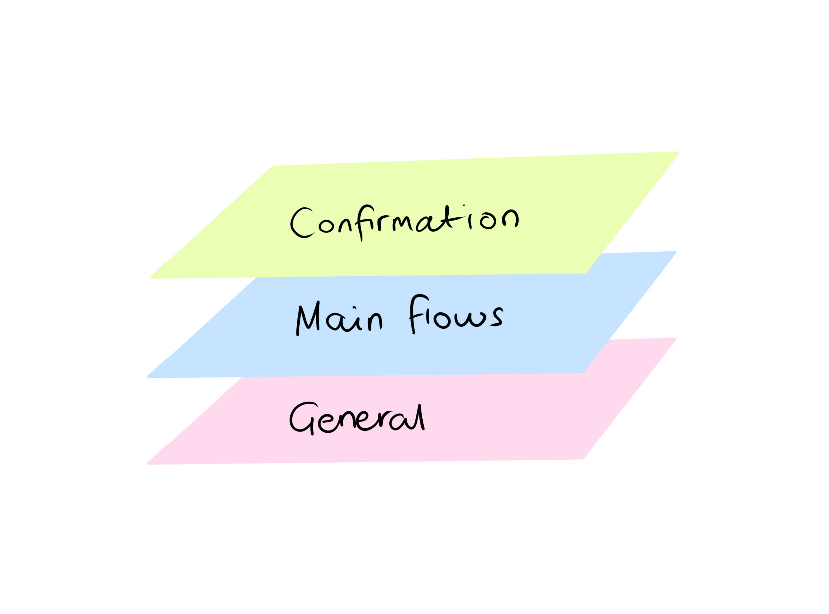
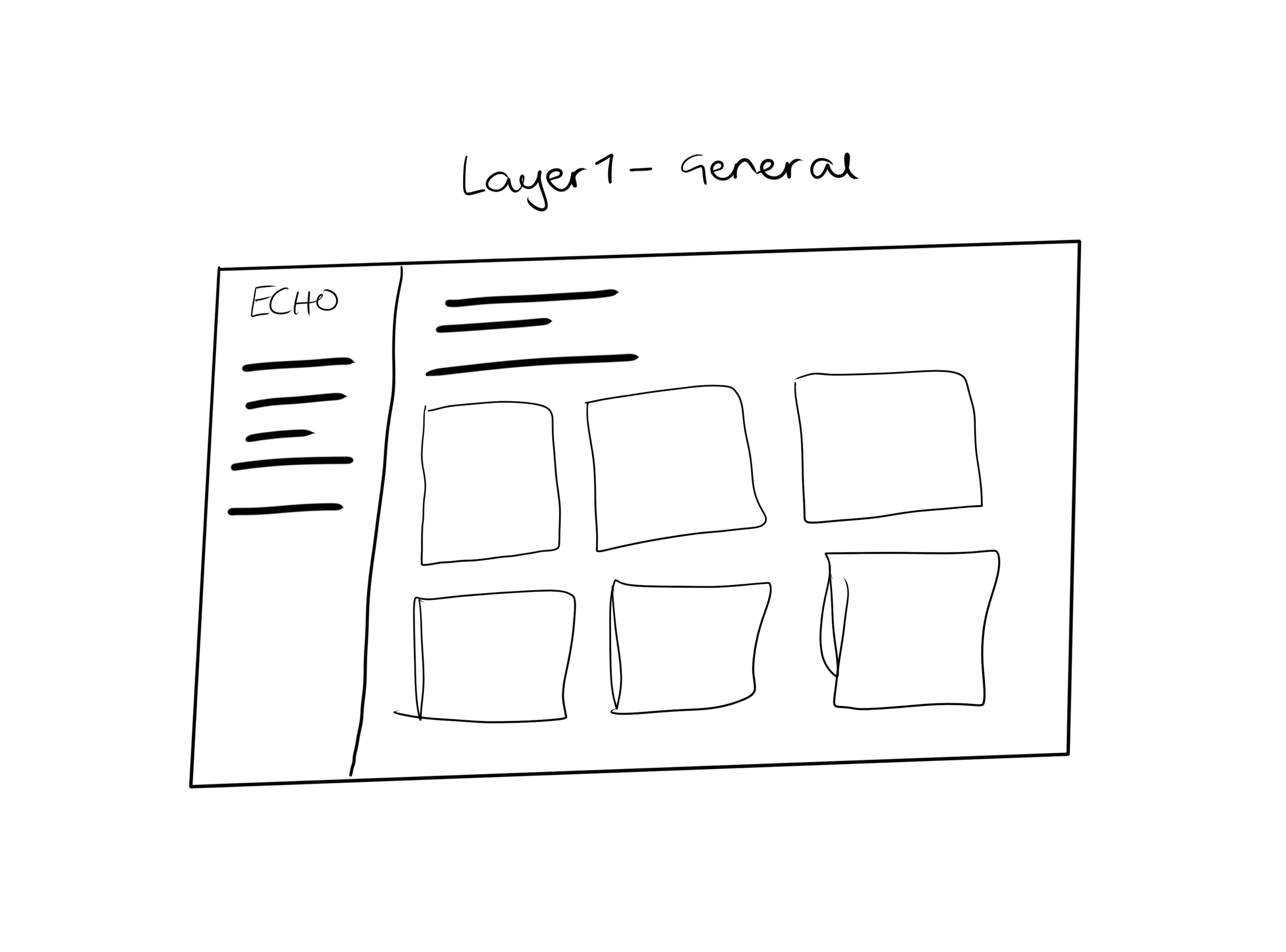
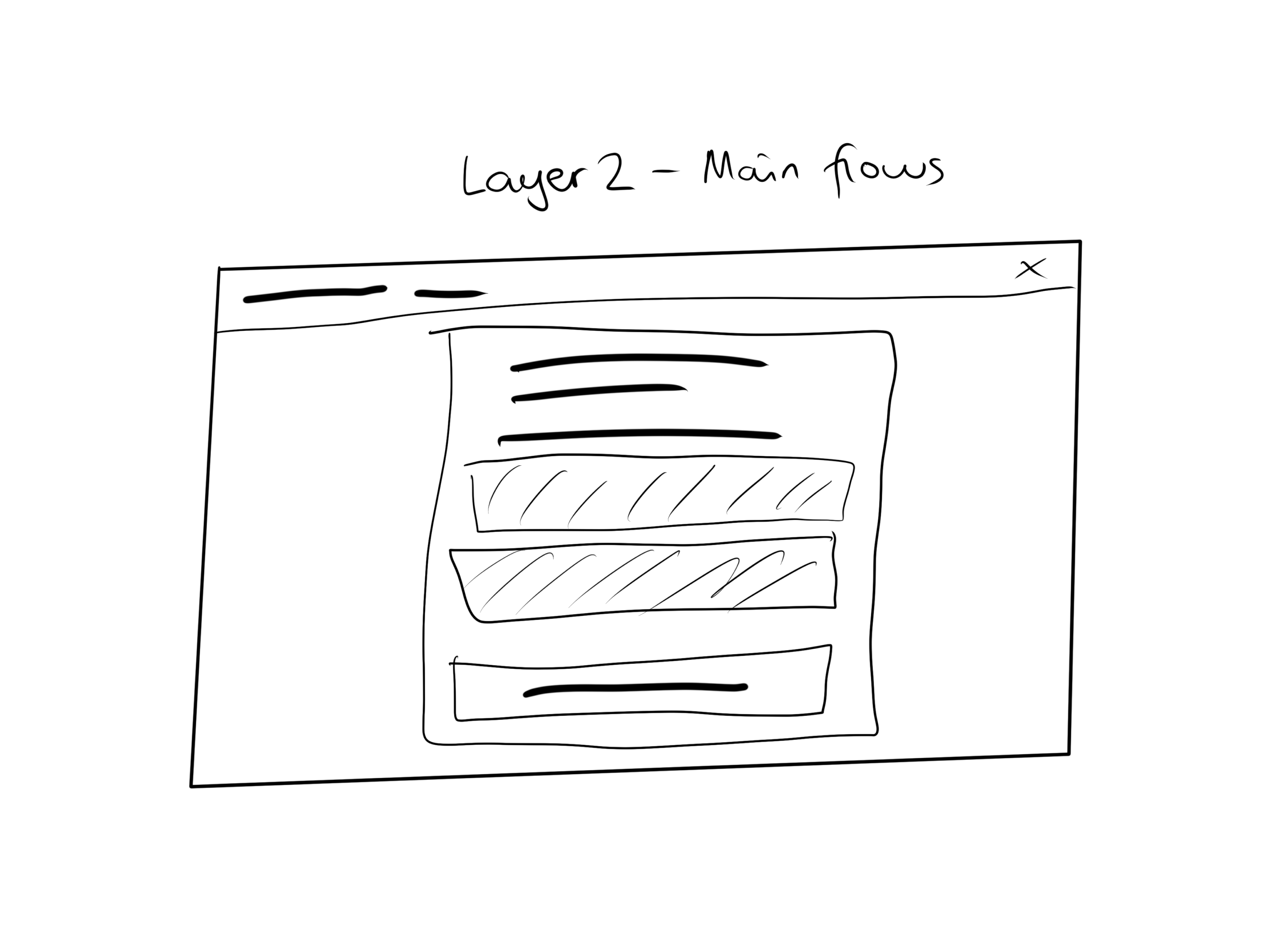
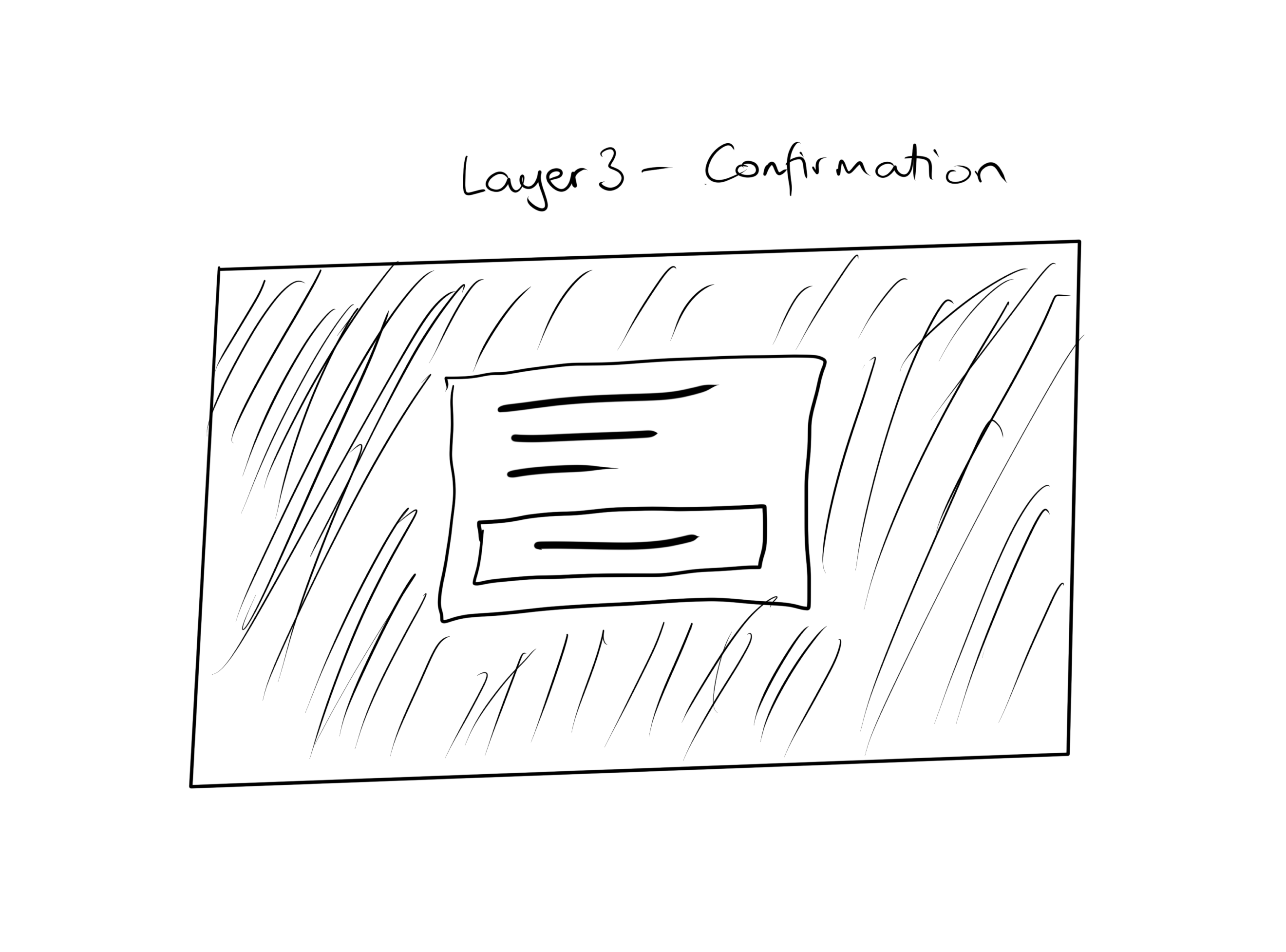
This got me thinking about the web app in terms of layers. The first layer was the general app interface, areas where flows can be initiated. The second was the flow layer, where the patient progresses through the flow, fills out forms and so on. The final layer was the confirmation layer (basically a modal layer) where a patient confirms actions.
After the second set of interviews with the basic wireframe prototype, I moved on to the final designs. Most of the research outcomes were positive, with the negatives only around things we hadn’t visualised in the wireframes — like brand trust and security.
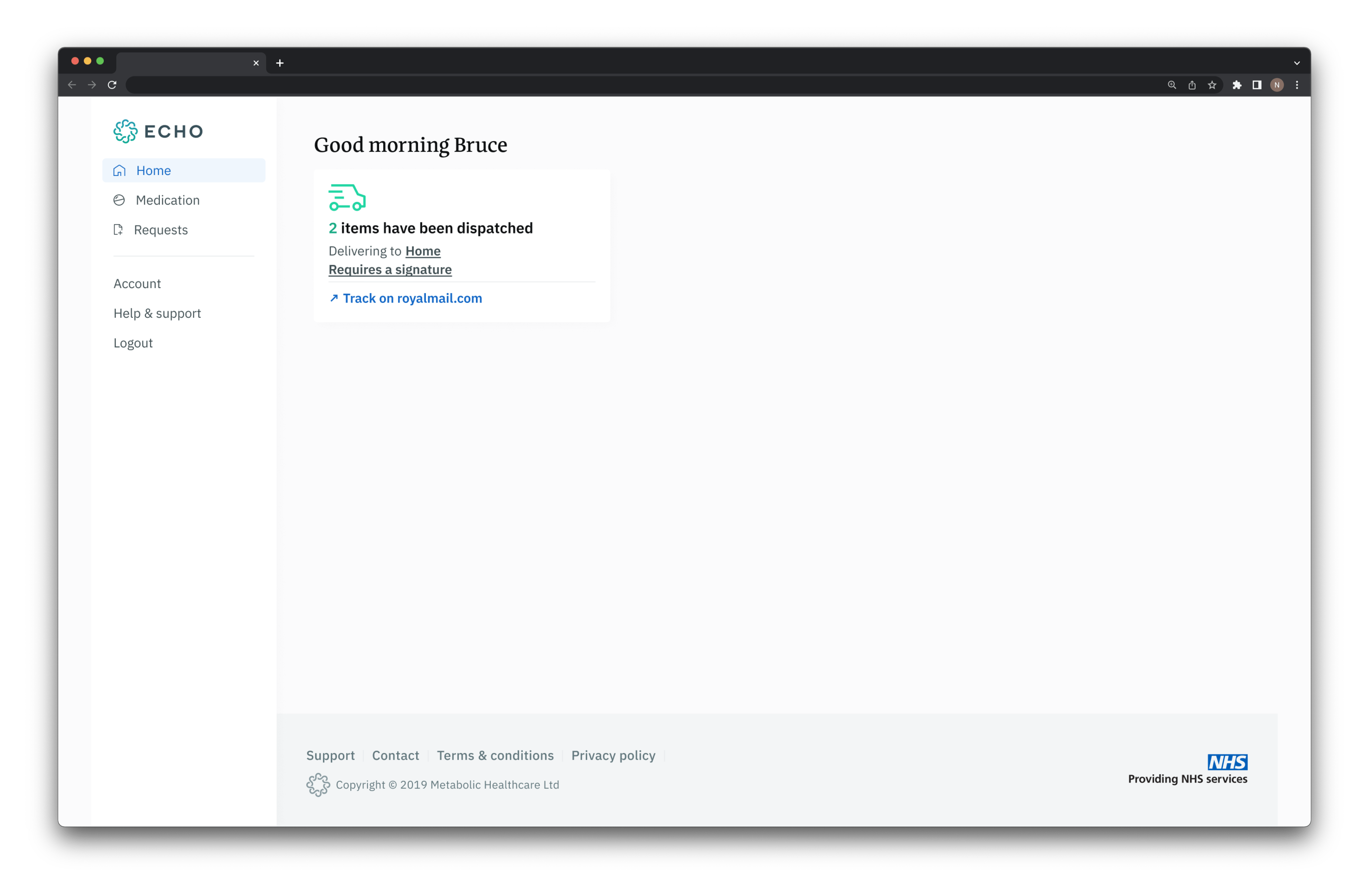
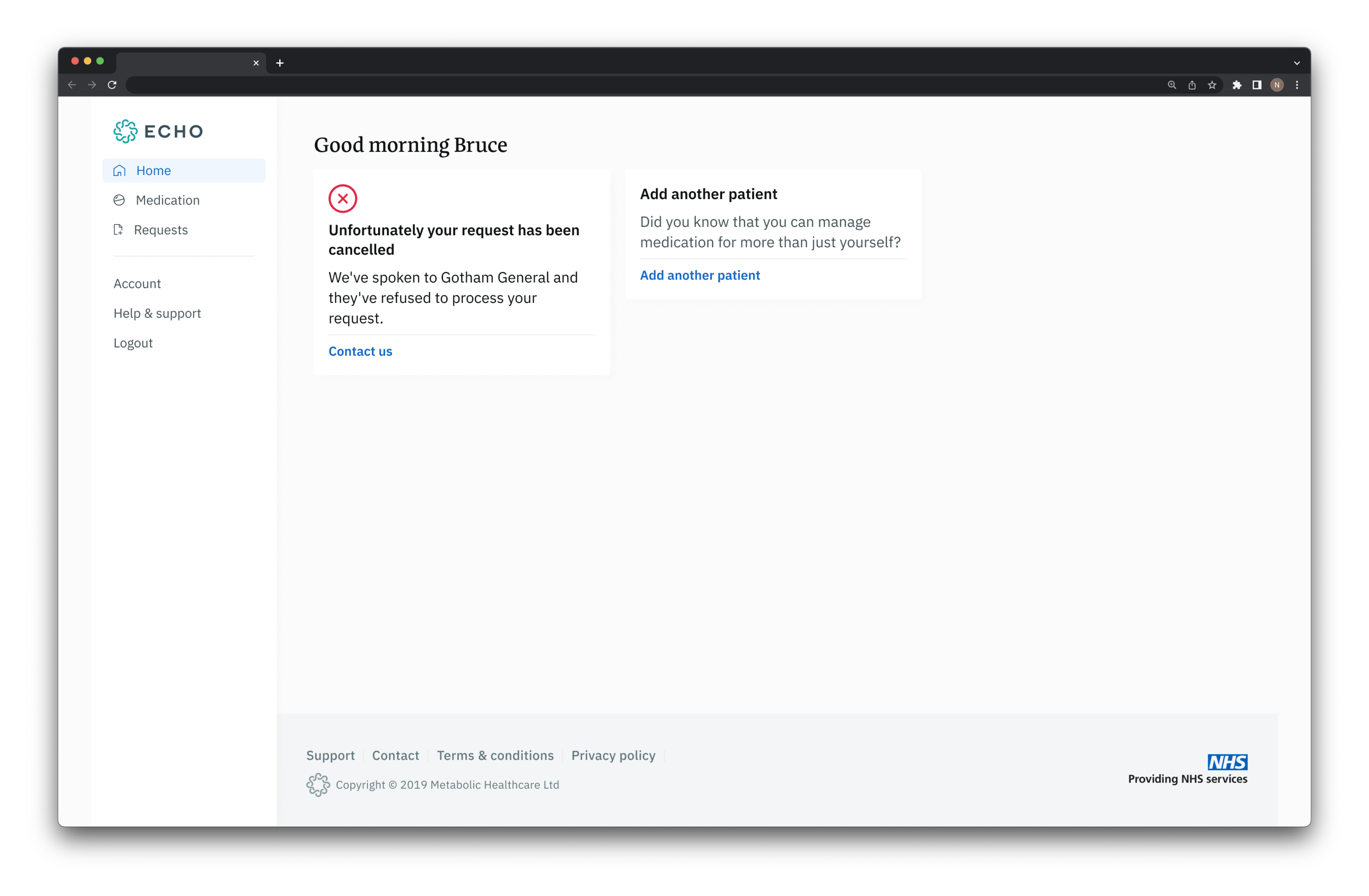
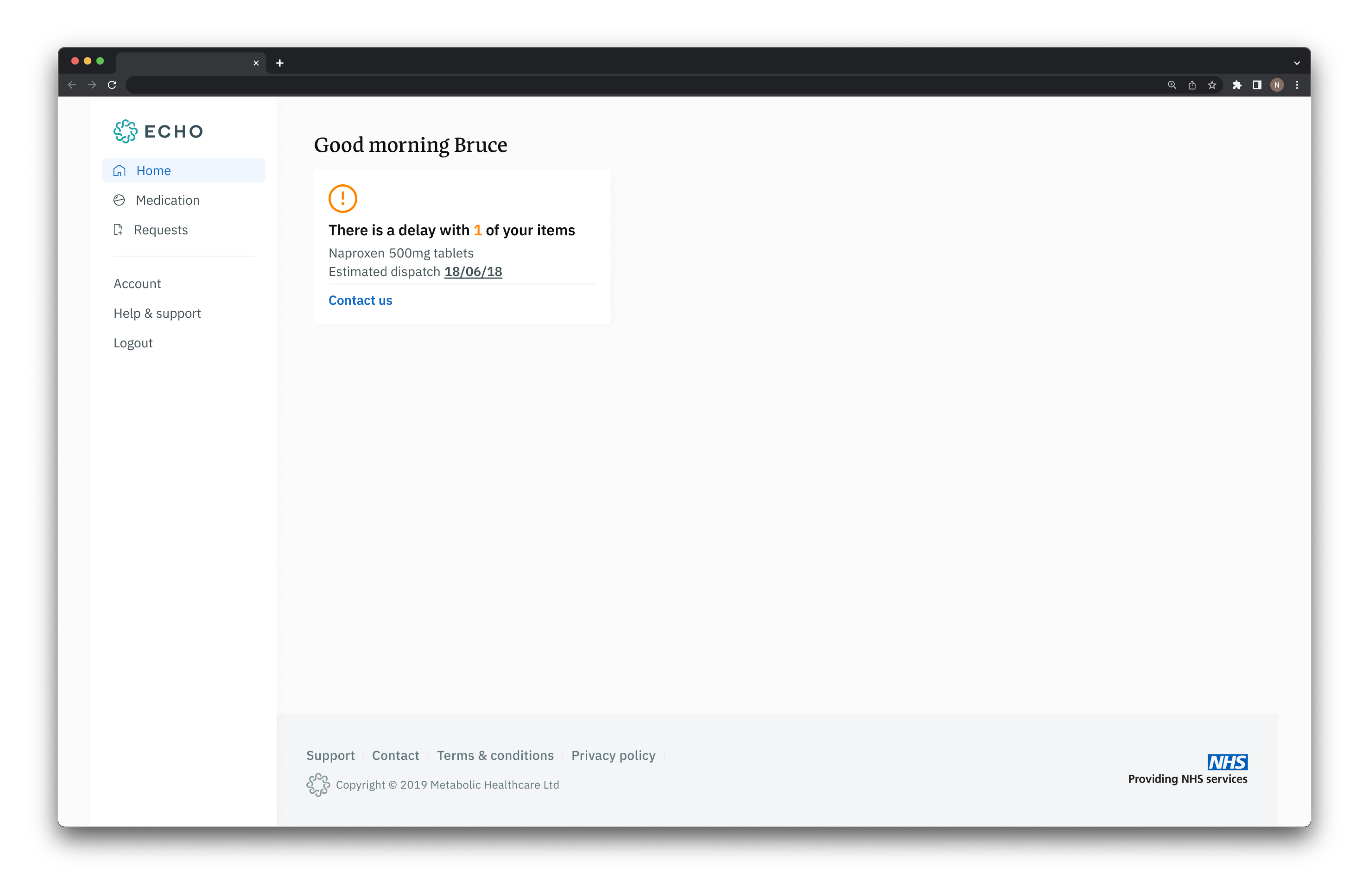
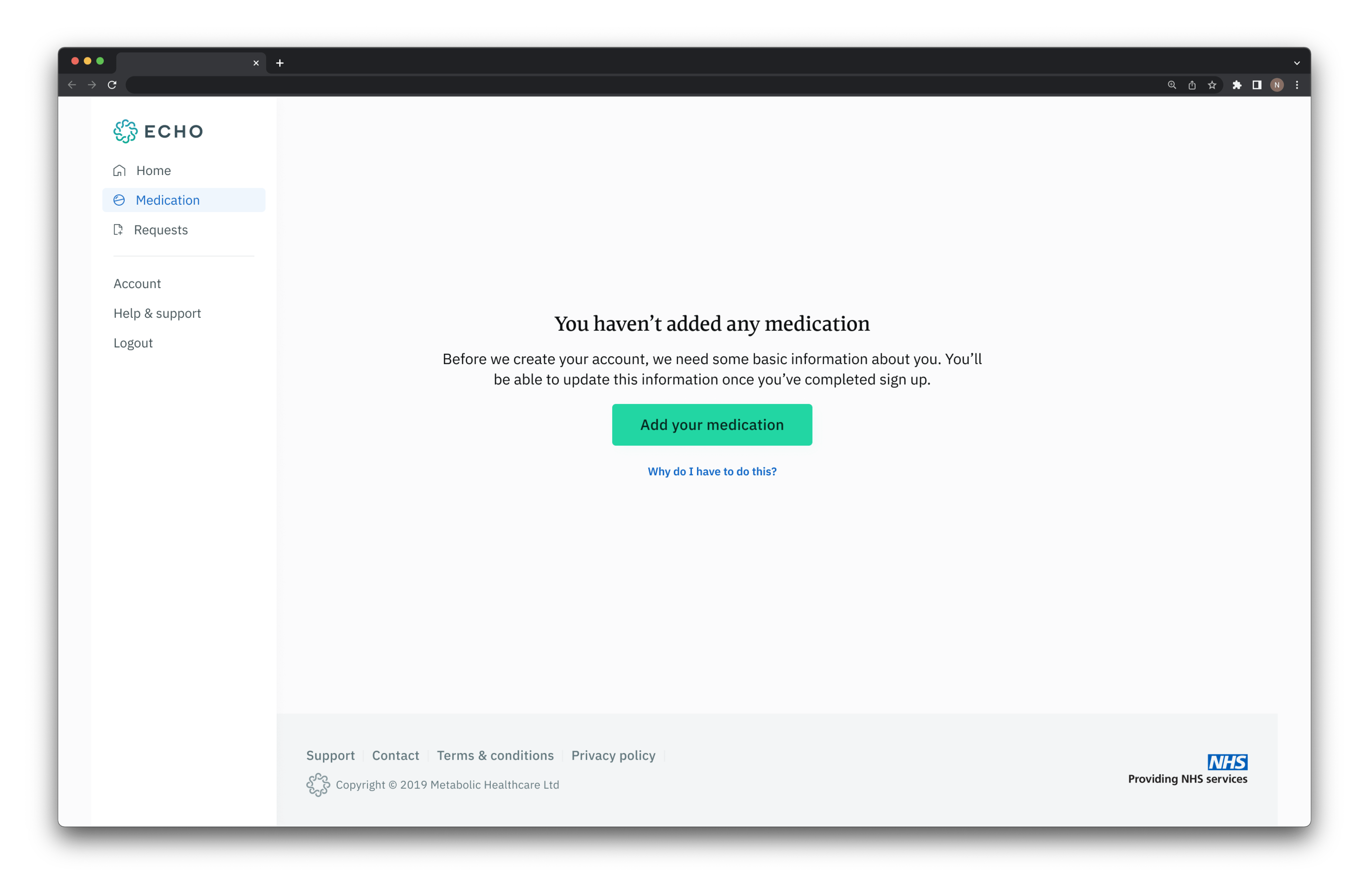
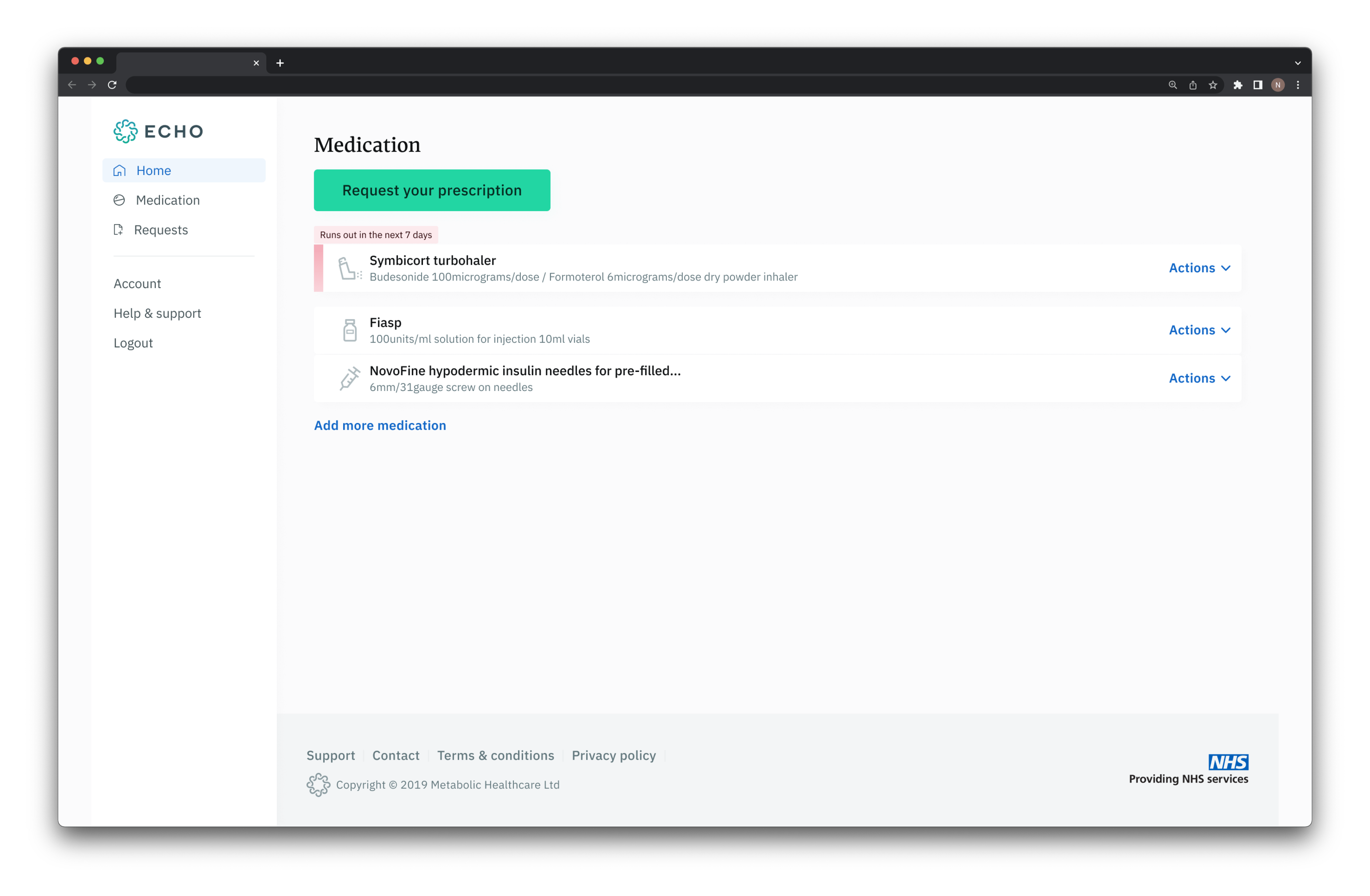
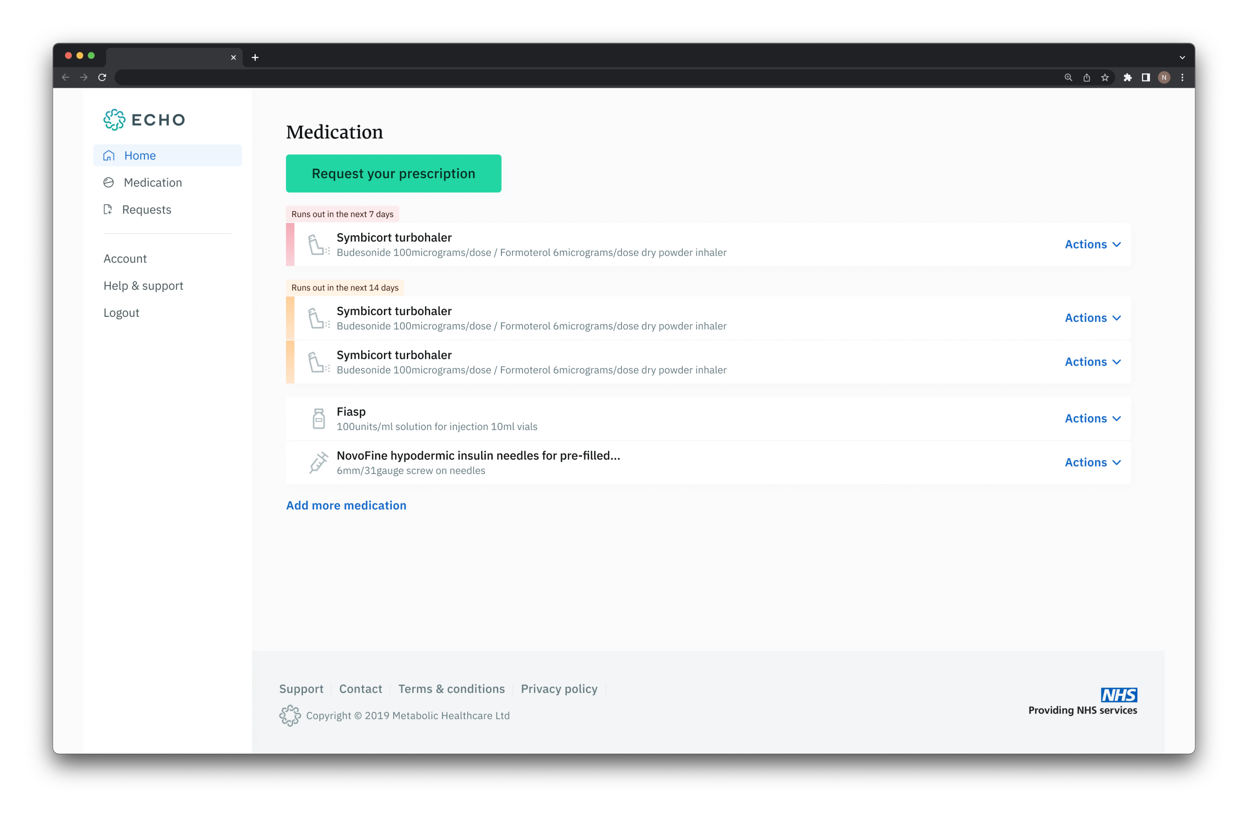
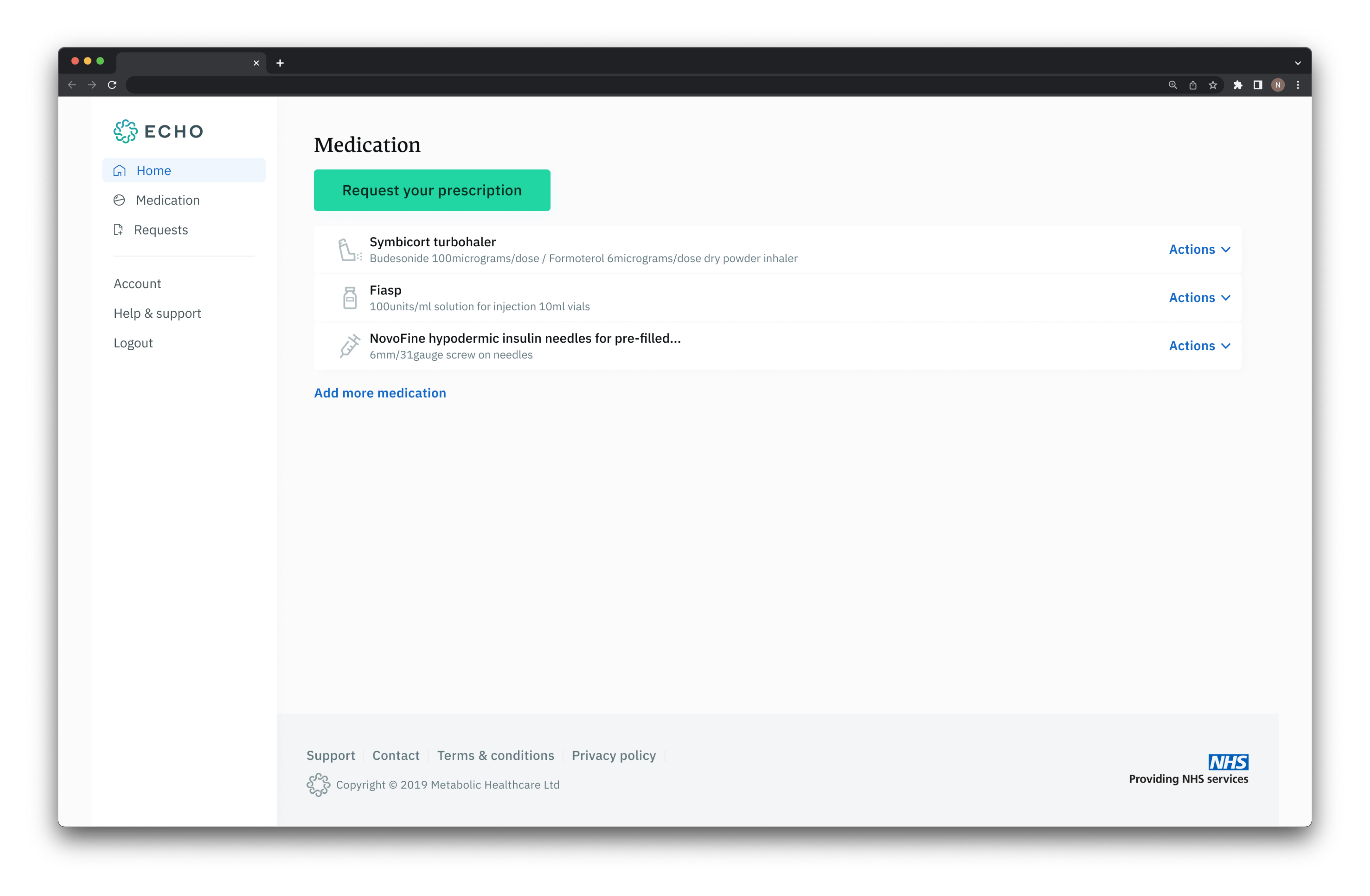
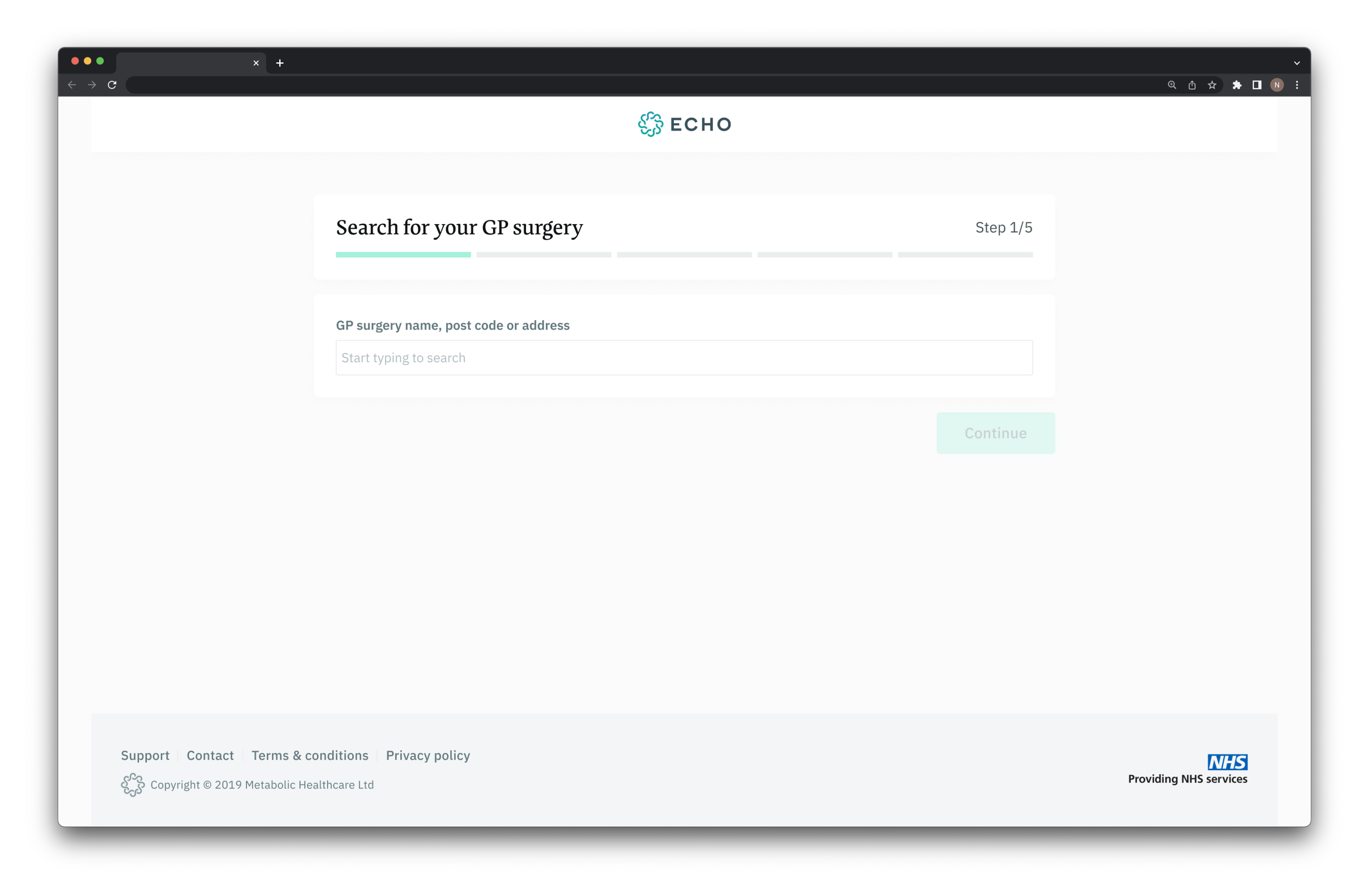
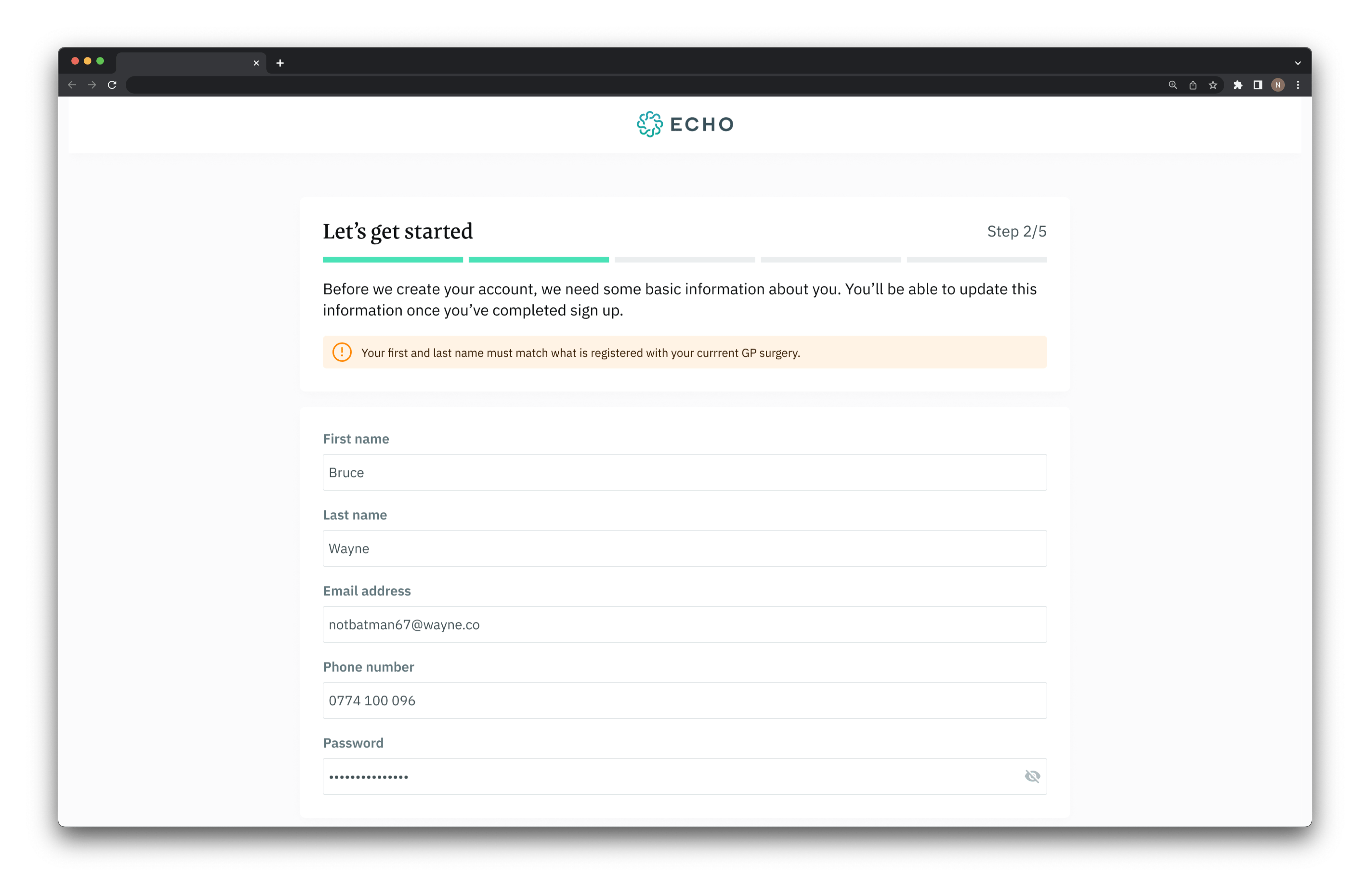
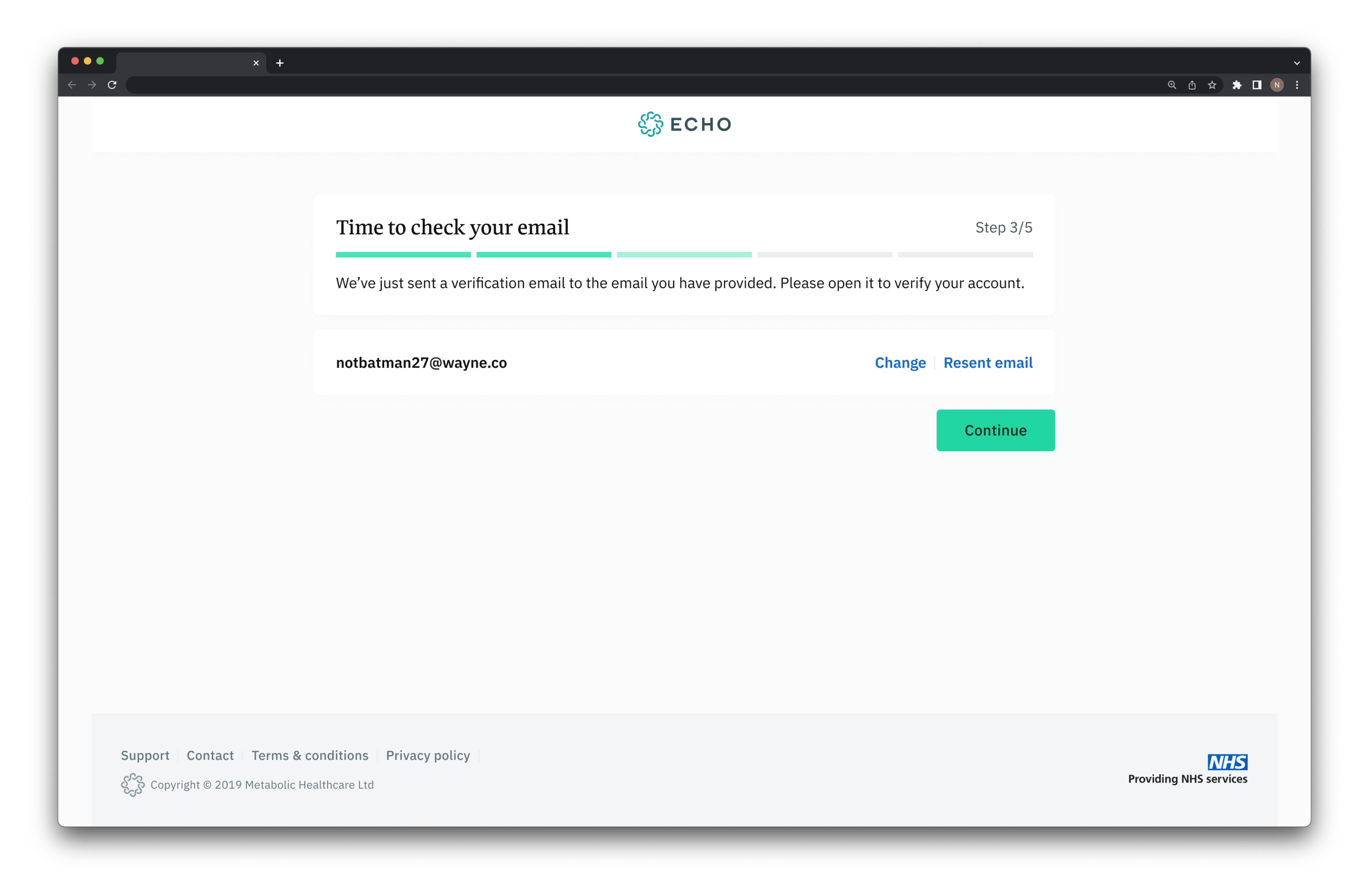
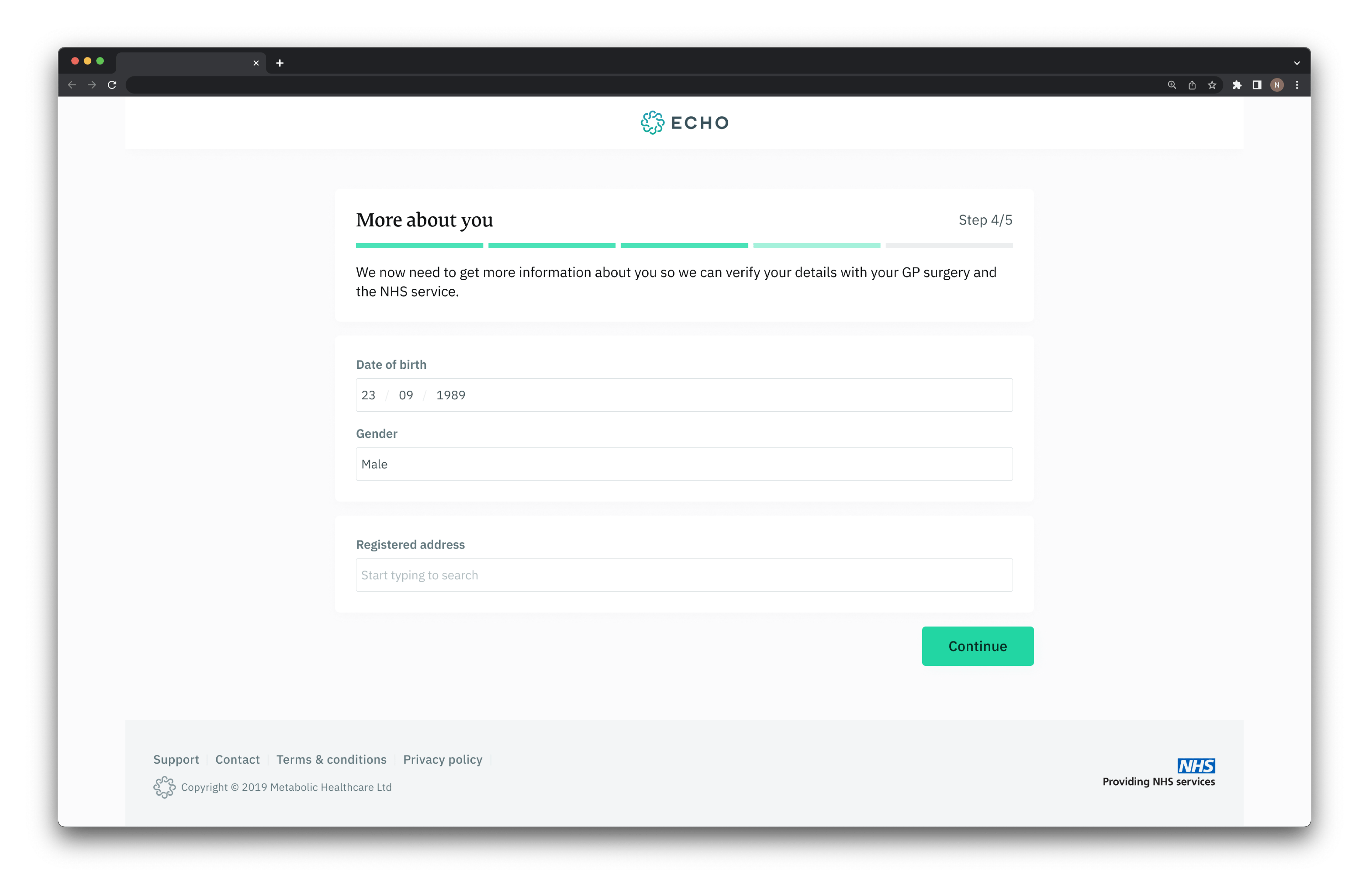
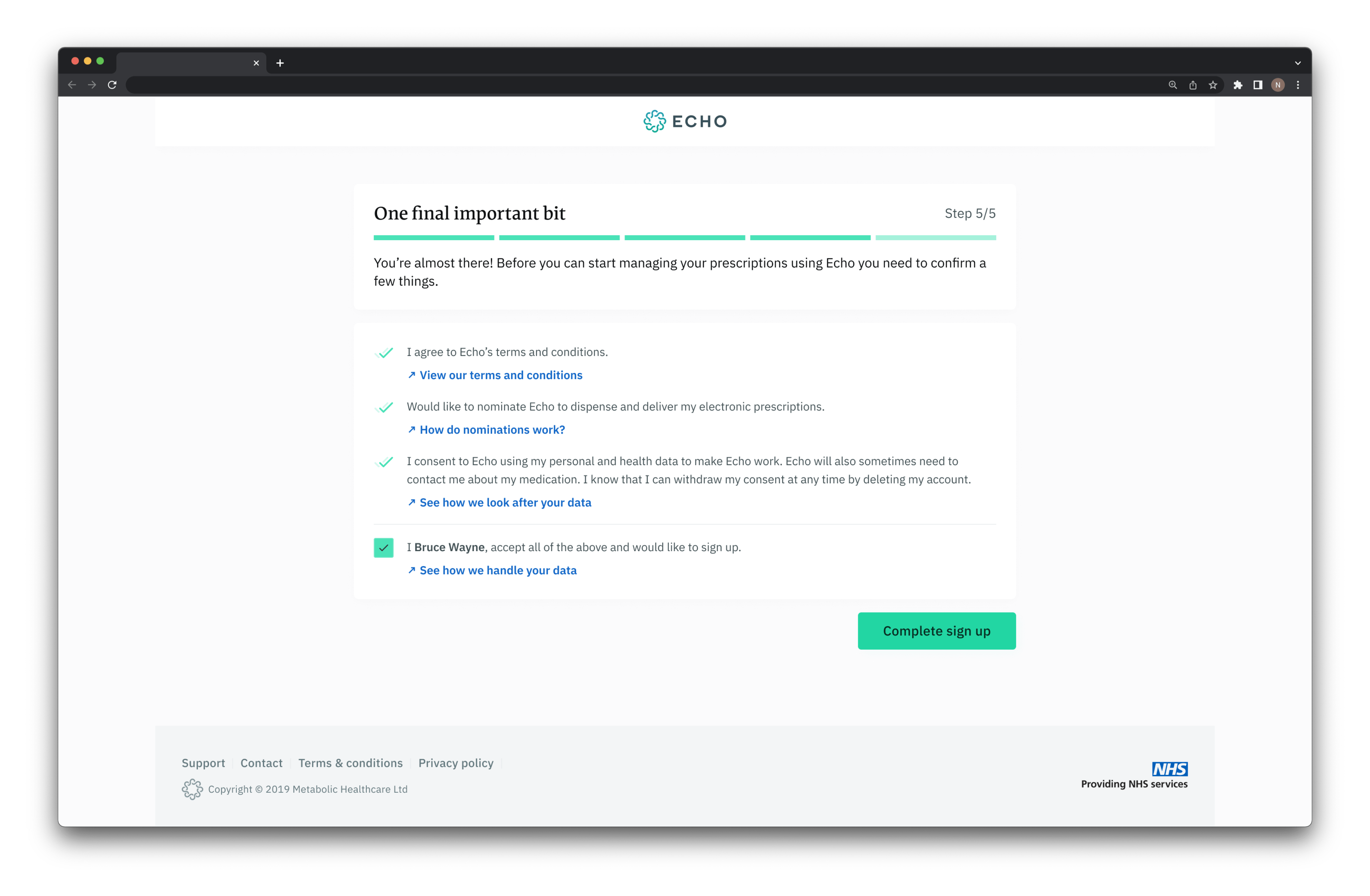
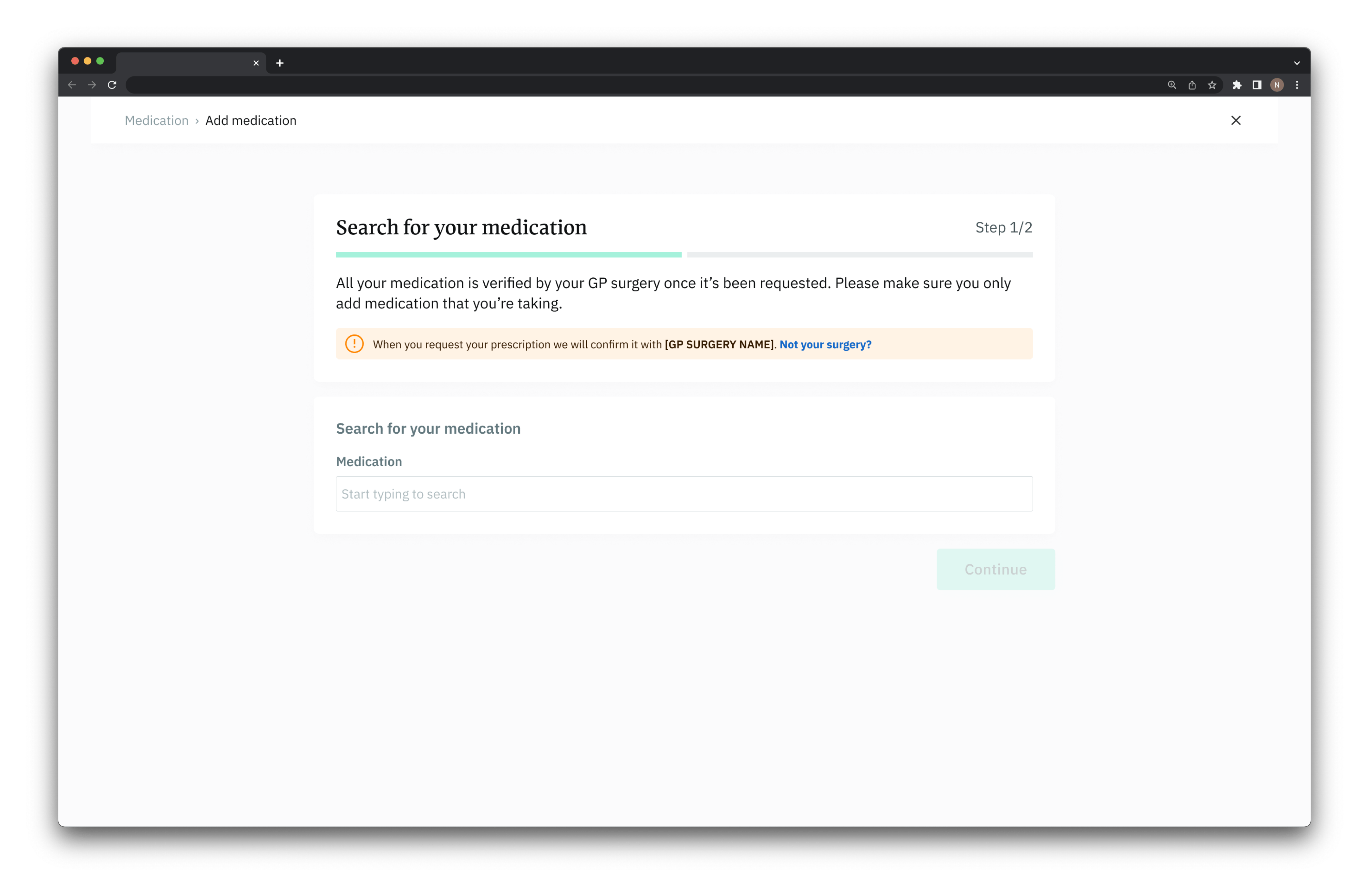
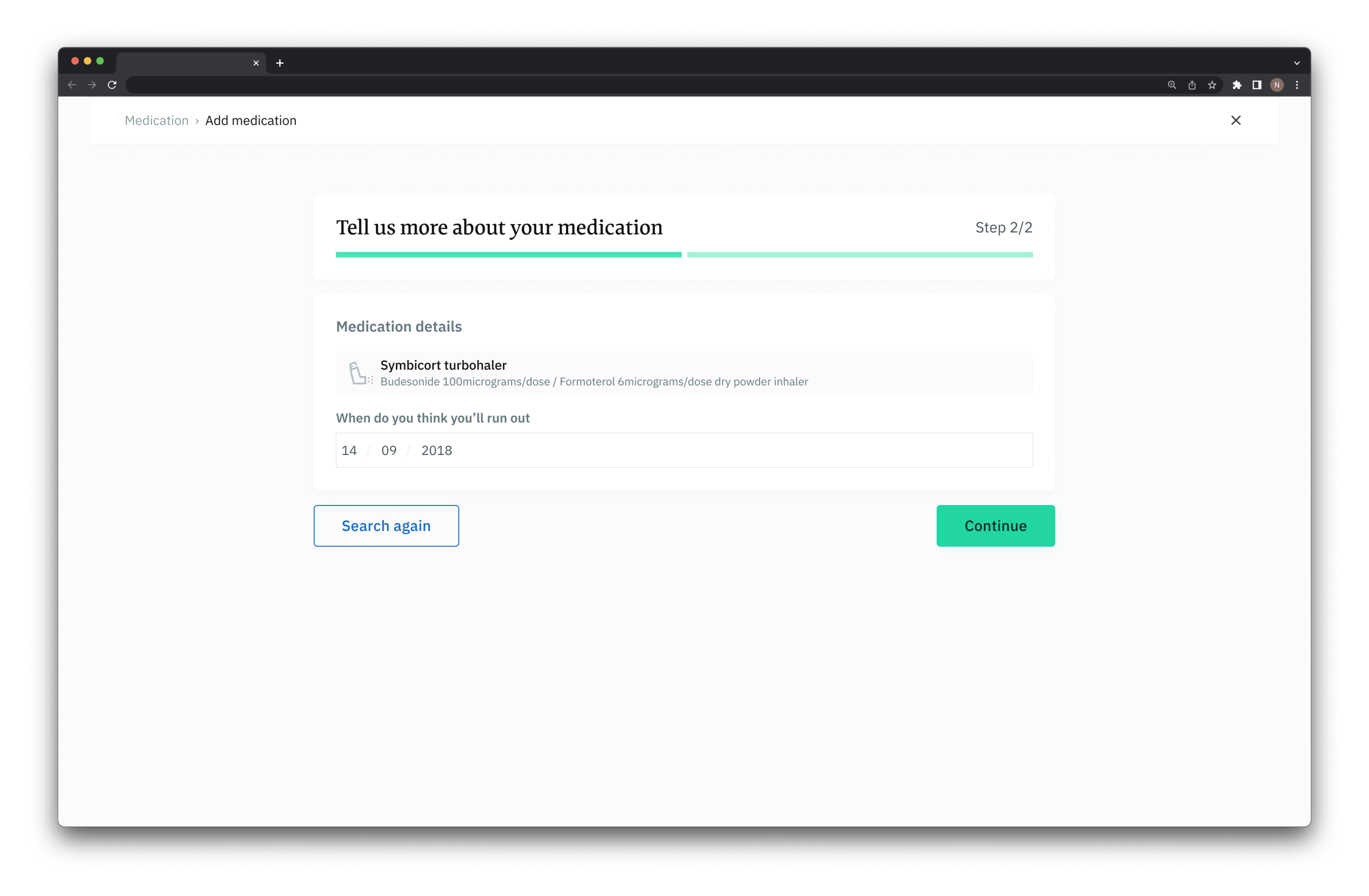
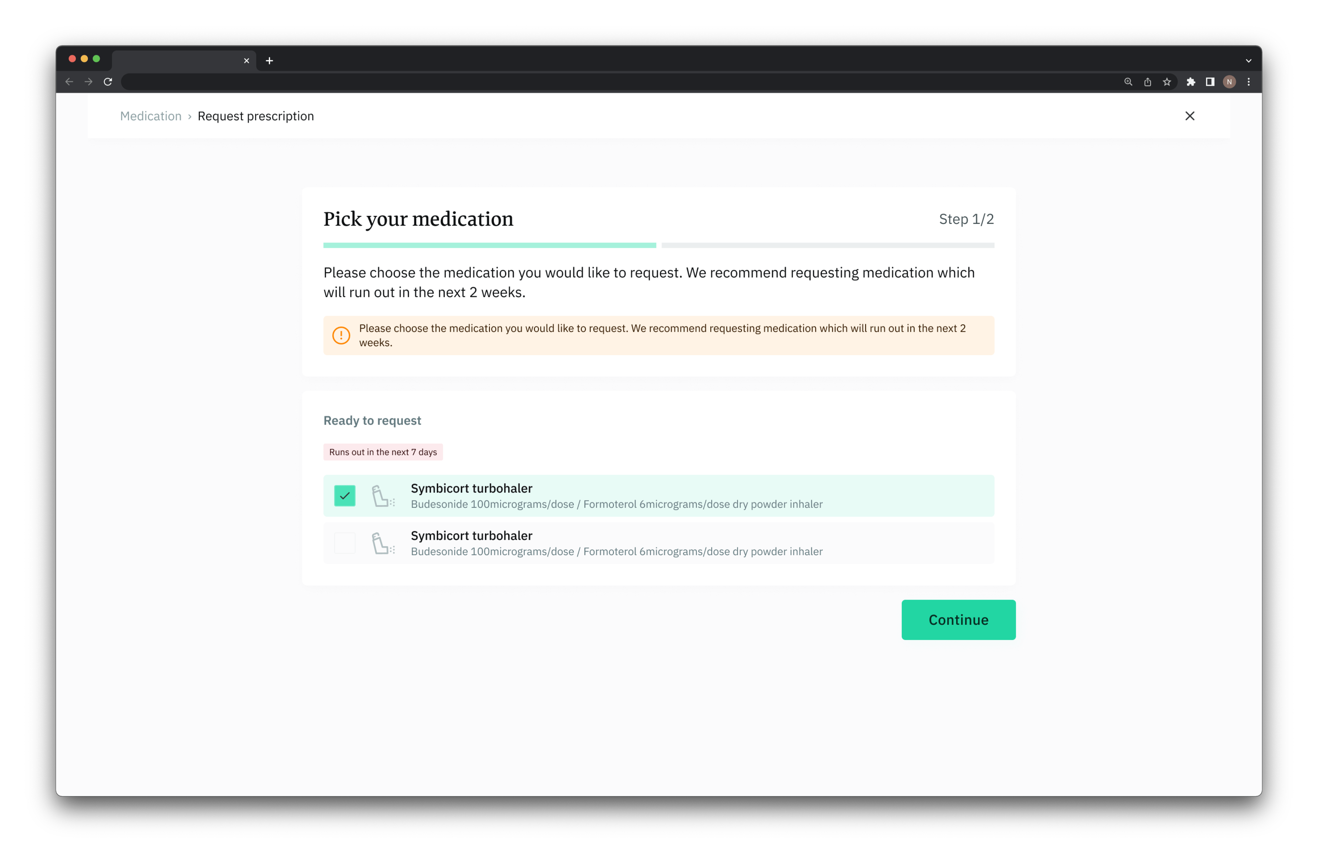
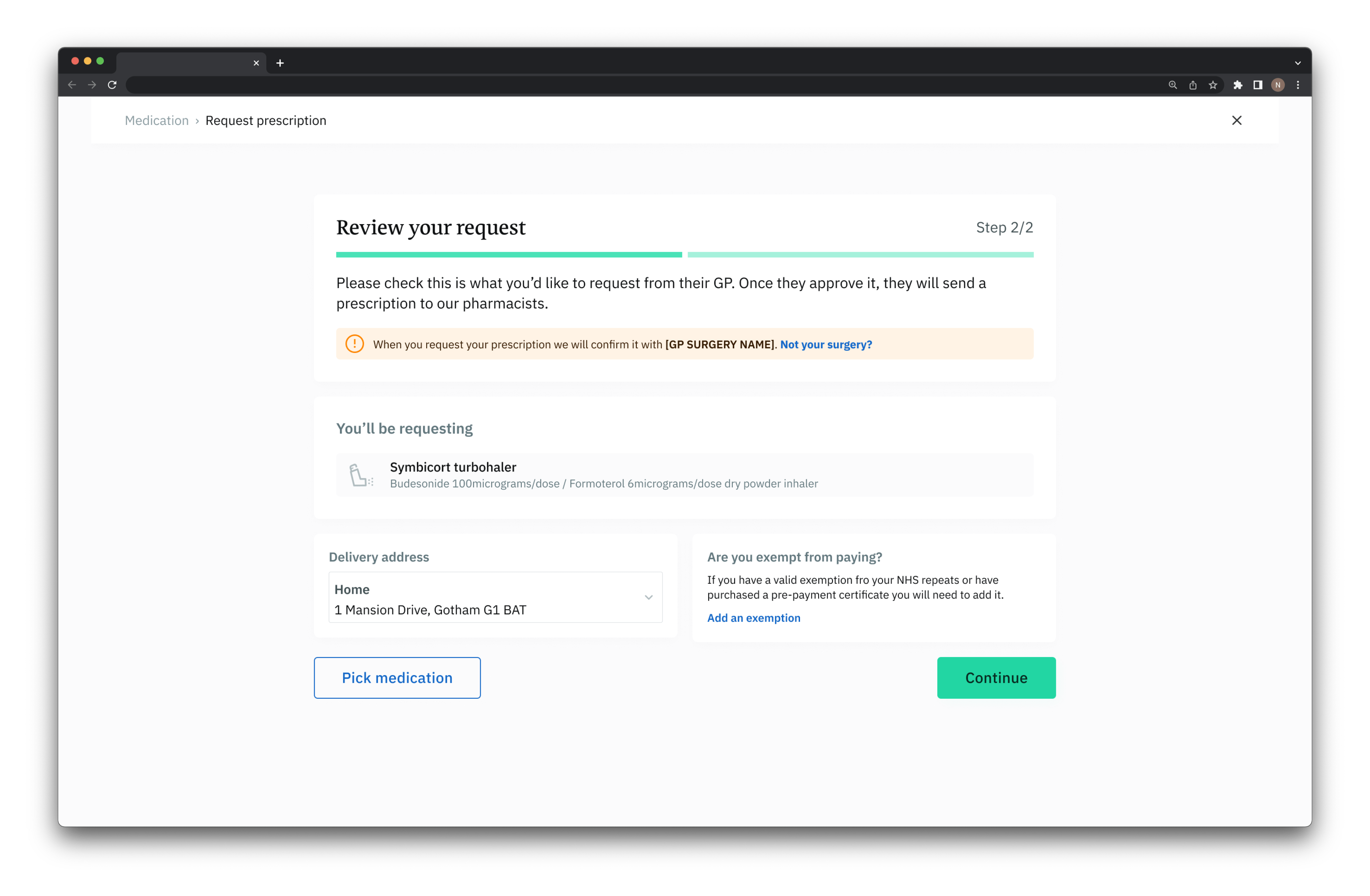
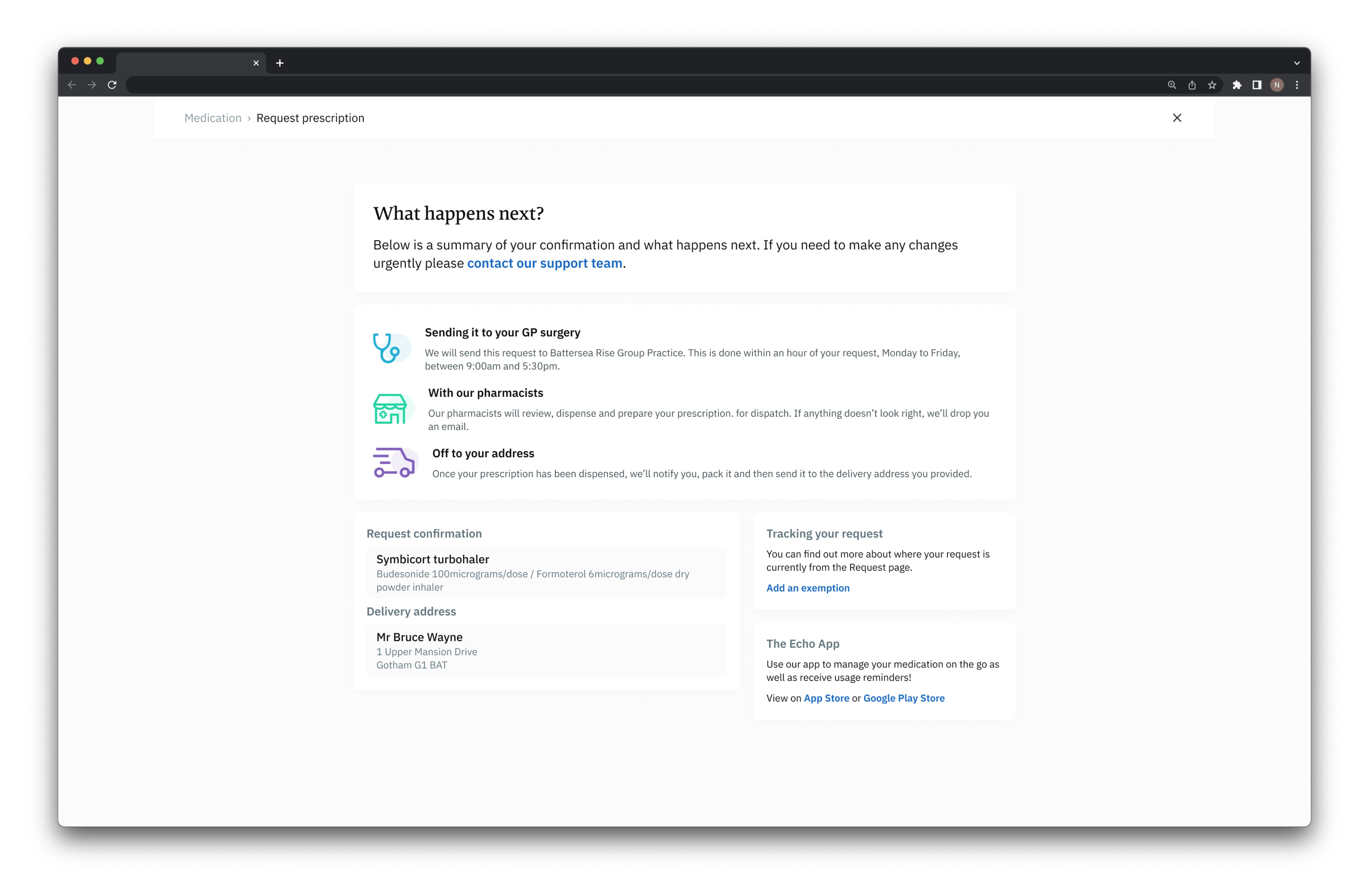
Since we already had an existing user base, we decided to build the request flow first and release it to a group of our existing patients to get data back.
Once it was out, we gathered data for two weeks from hundreds of patient requests. The feedback was overwhelmingly positive, so we carried on with the partial-release plan. Next up were the sign-up and add medication flows. With those three flows built, we could start bringing in new patients entirely via the web.
After three months of further design revisions and development, the MVP was built: the three main flows plus a basic settings area. Since then, more features have been added. Features like additional patients per account for carers and family members, and IM1 integration, which allows direct communication with the GP surgery.
Ready to get in touch?