Created the experience for an NHS prescriptions app.
Half the UK is on repeat prescriptions and a third forget to reorder. Of course we can solve this with an app.
Half the UK is on repeat prescriptions and a third forget to reorder. Of course we can solve this with an app.
In the UK, 1 in 2 people are on long-term repeat prescriptions and 1 in 3 often forget to order them. That’s where our NHS app comes in.
The web app had recently had work done before I arrived, so the focus shifted to the NHS app first — it hadn’t been touched since it was built. It was riddled with UX issues and couldn’t handle the influx of new NHS patients.
The goal was a better experience for the NHS product, plus a patient area that could serve all areas of the business, not just the NHS. We decided the MVP would focus on the main NHS flows: sign up, add medication and request medication.
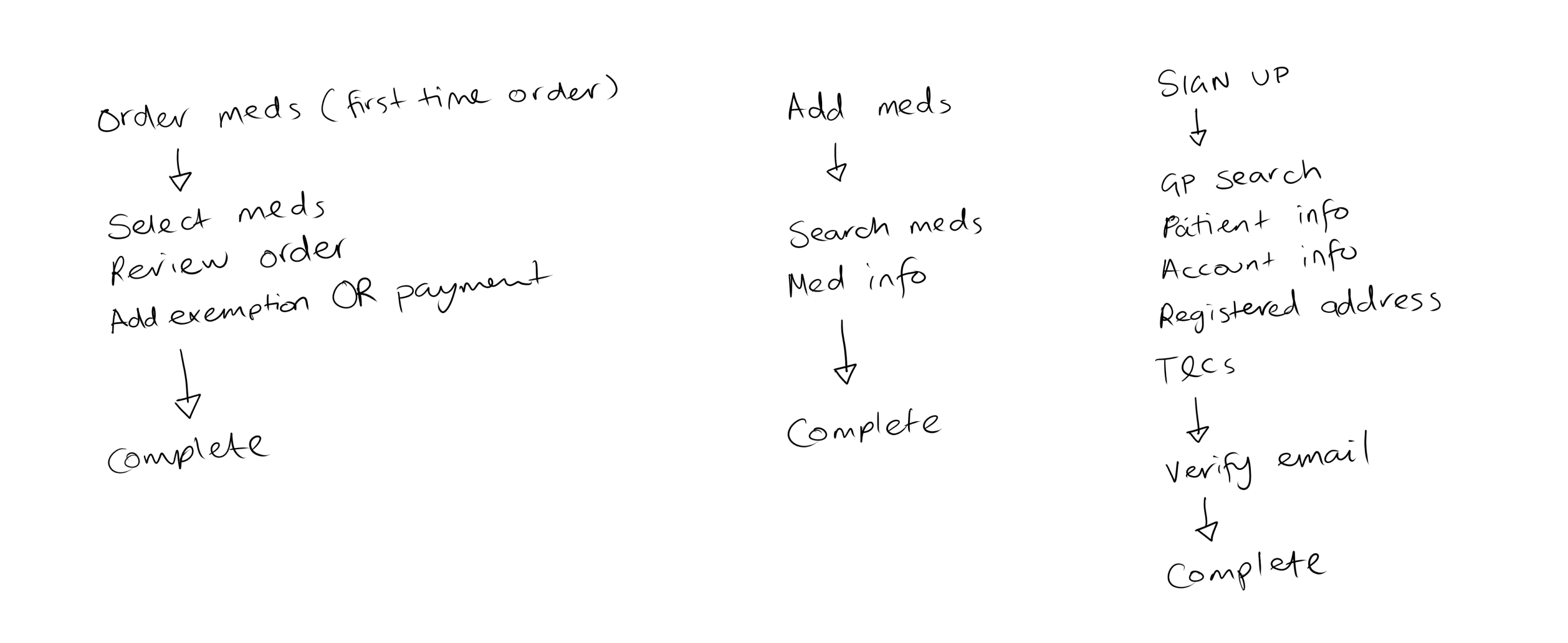
I started by looking at the existing NHS repeat-prescription apps. Given NHS regulations and the specific nature of these apps, mapping out the common patterns felt like the right place to begin.
Like us, most of our competitors didn’t have IM1 integration. IM1 let us connect directly with the patient’s GP surgery and cut down the amount of information the patient had to give us. It also let them request their repeat straight from their GP, without having to search for and add their medication manually.
Our IM1 integration was still in its very early stages, so I needed another way to reduce what the patient had to provide up front. Not many competitors could do this, so I saw it as a way to give us a leg up at sign-up.
Starting with the app played to something we already wanted: a mobile-first approach. Over 70% of our patients accessed the web app on a mobile, so apart from a few mobile-only features and specifics, we could reuse most of the components designed for mobile on the web app too.
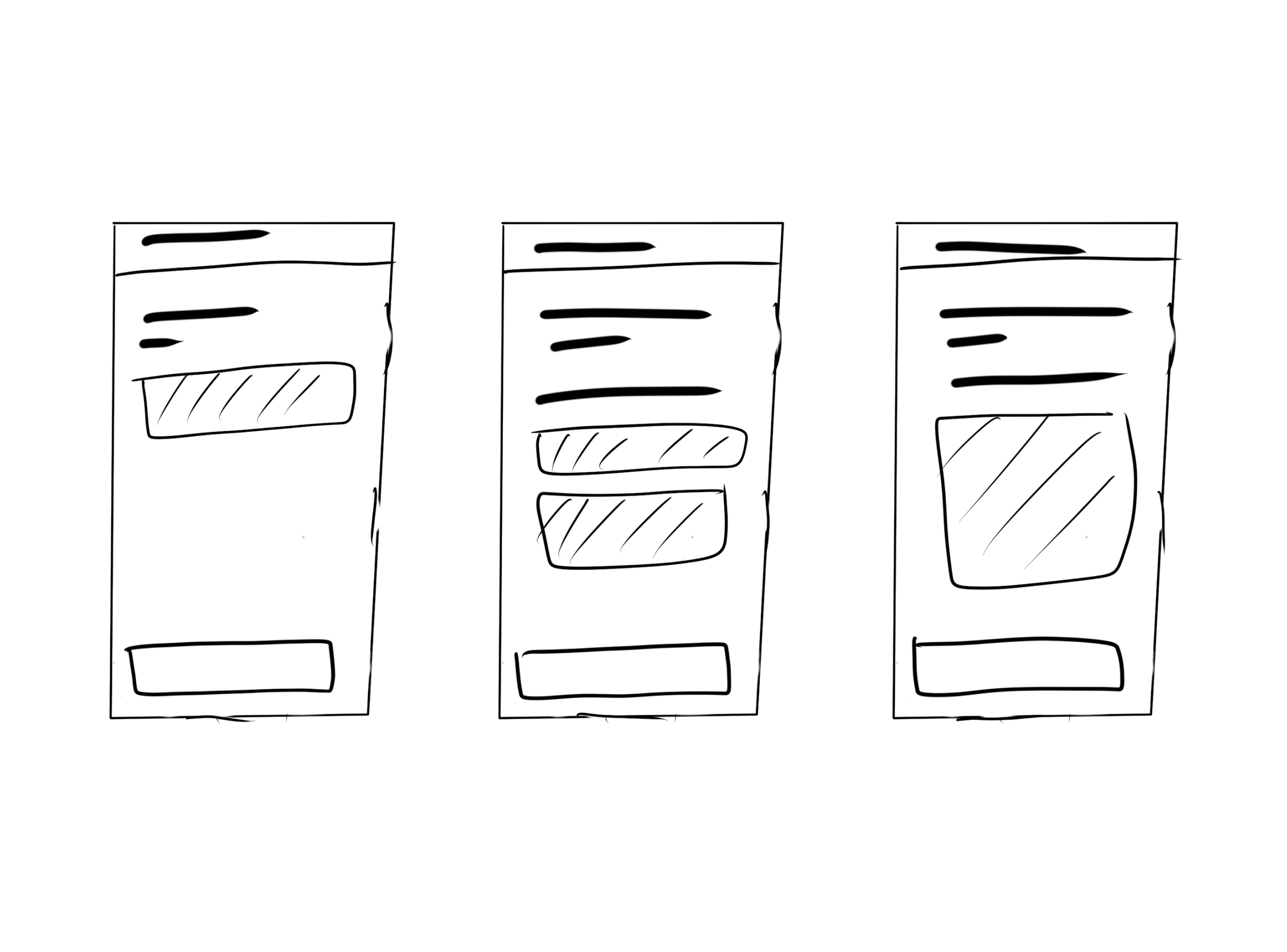
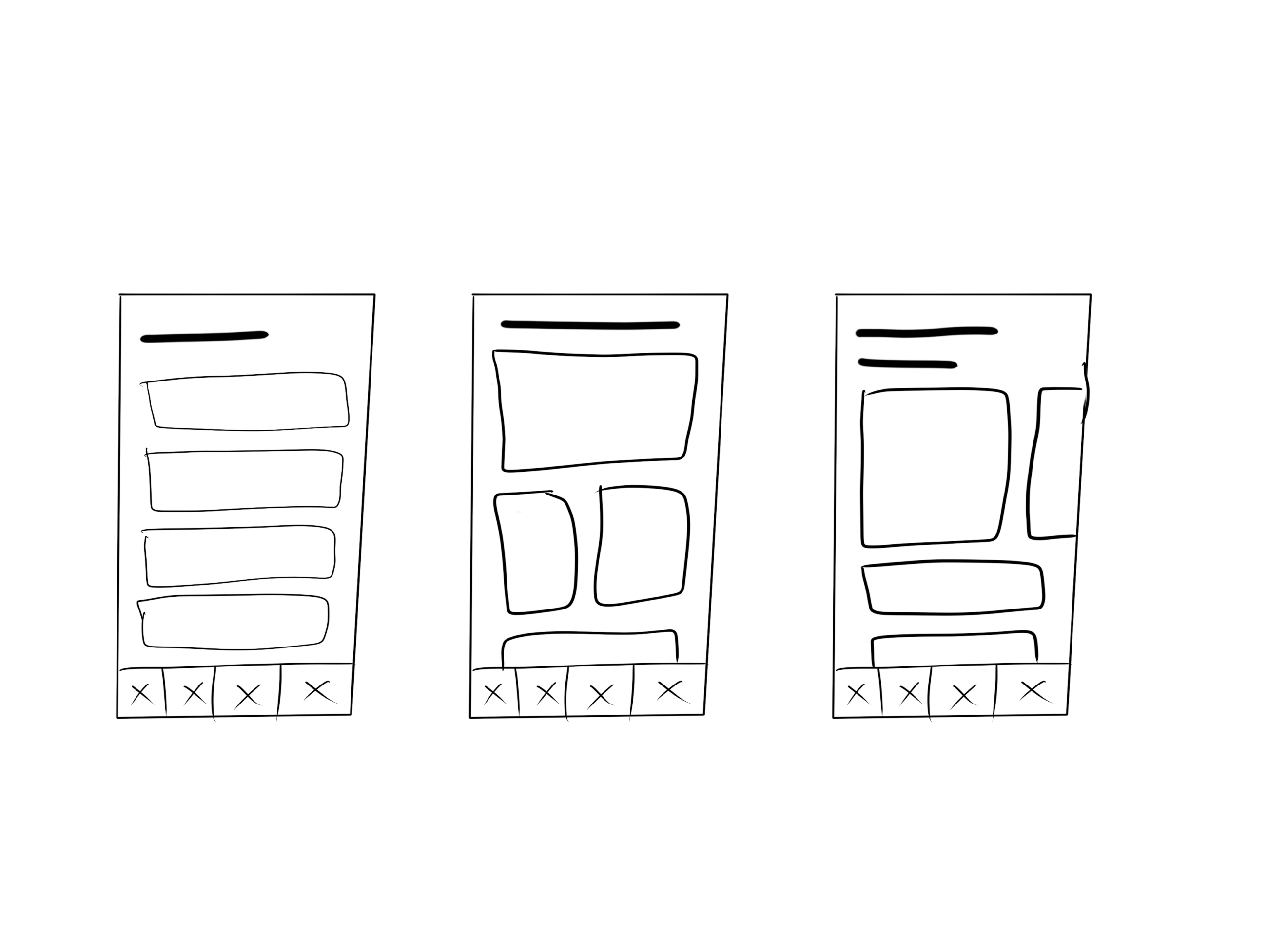
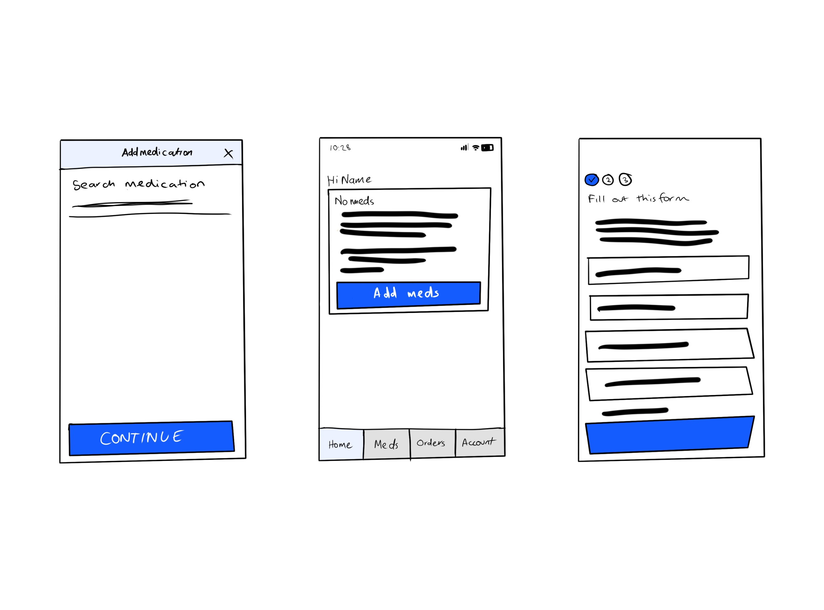
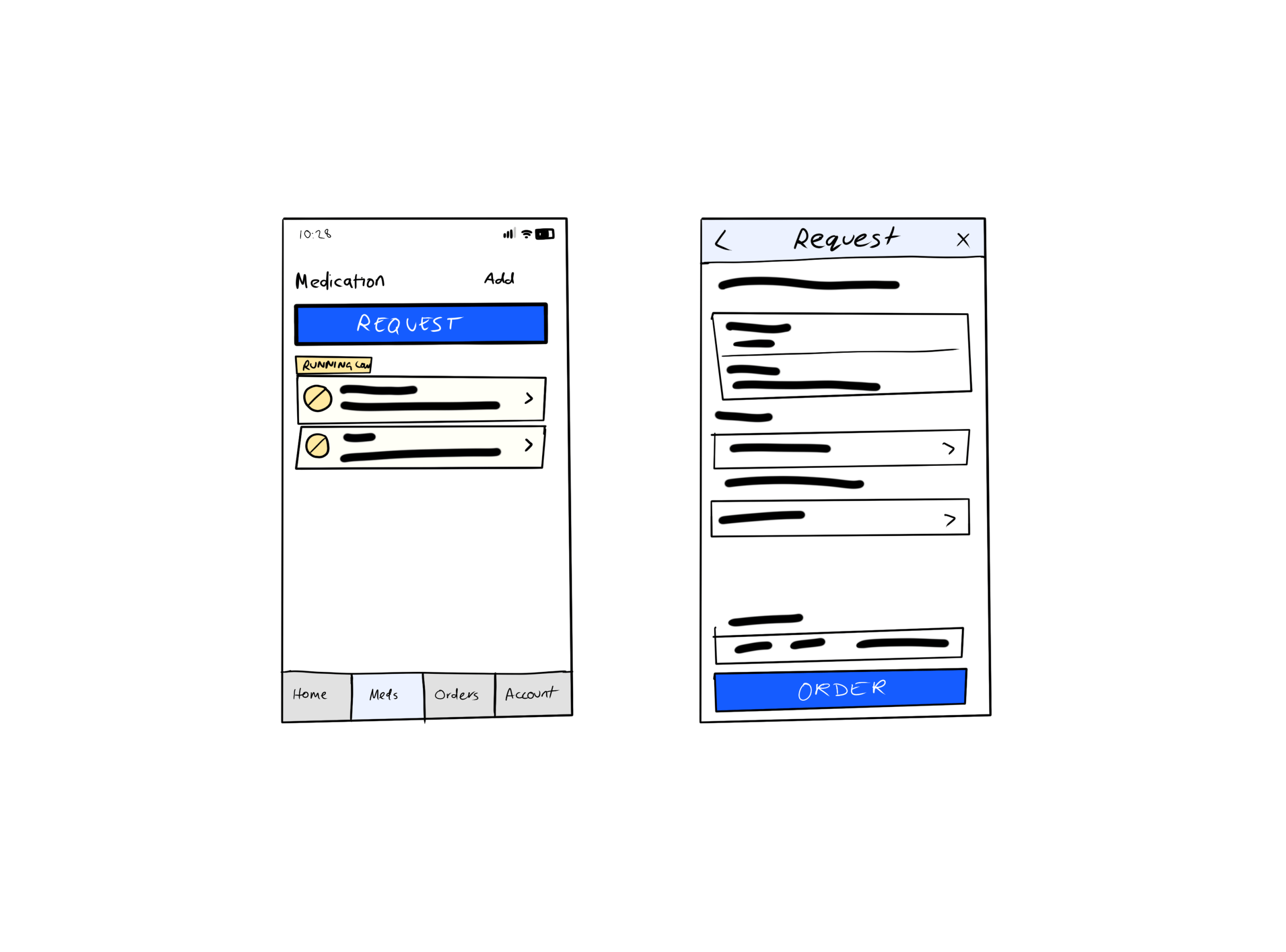
I built a basic wireframe and prototype for the core flows to test the concept of reducing the key pieces of information. After several usability tests and user interviews, it was clear the concept landed. The amount of information the patient provided was the same, but placing it across different areas of the main flows made it feel quicker and less of a commitment up front.
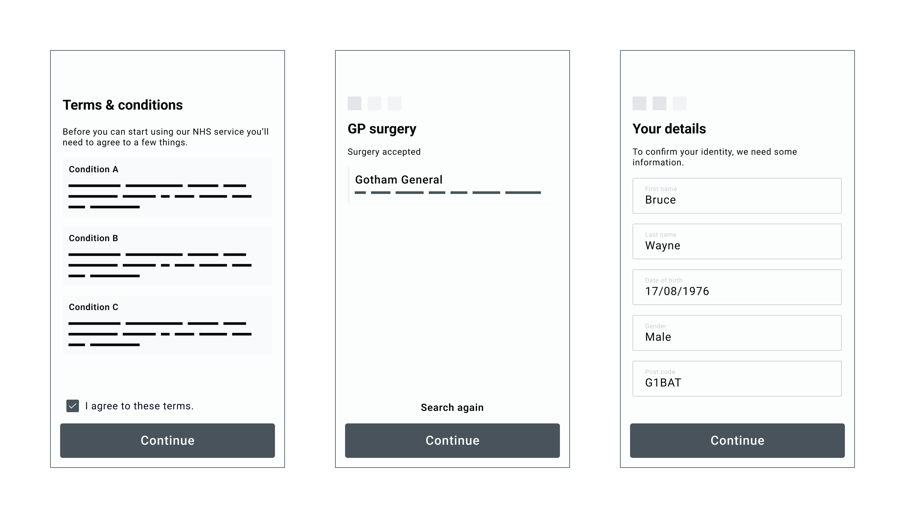
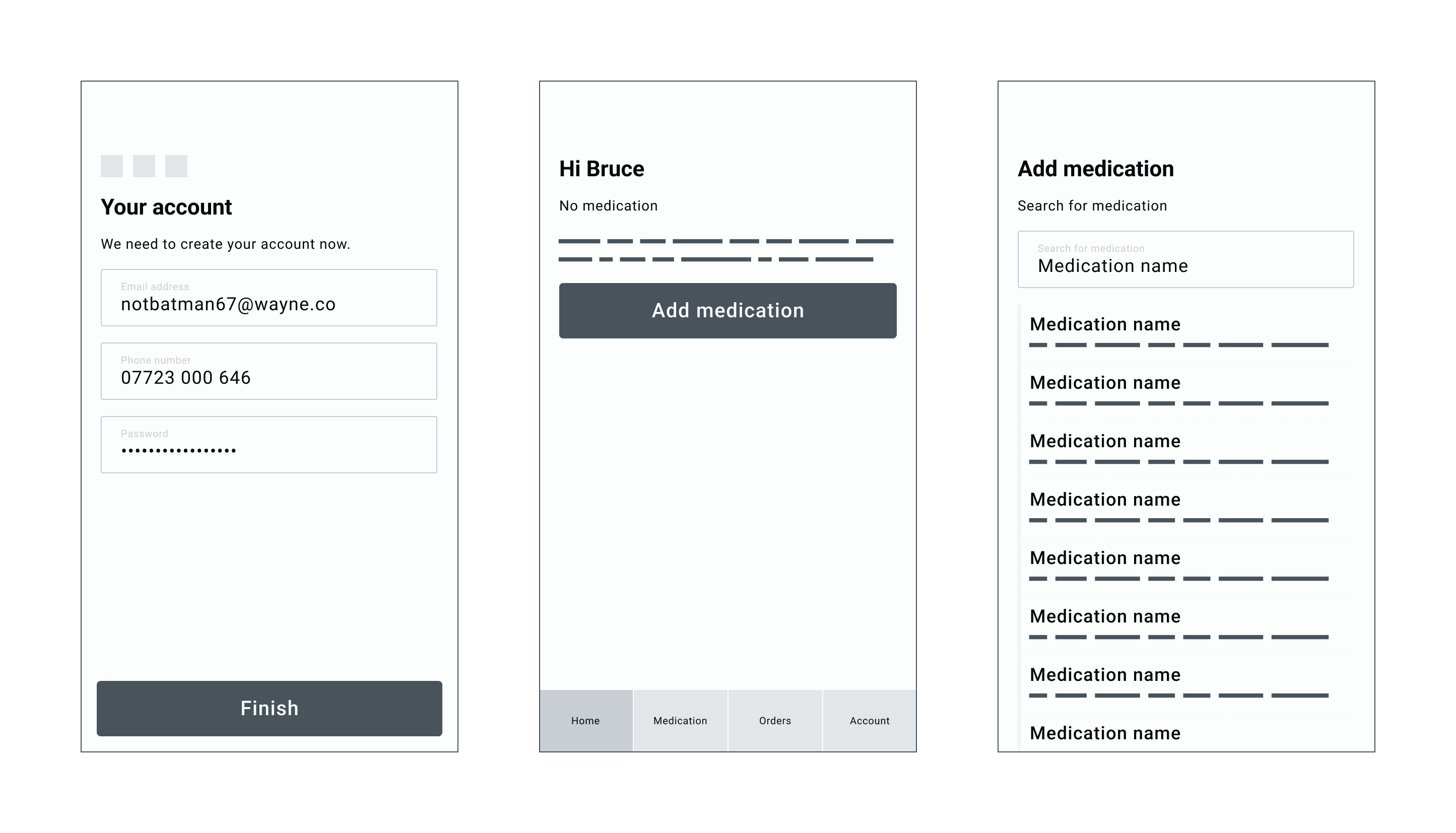
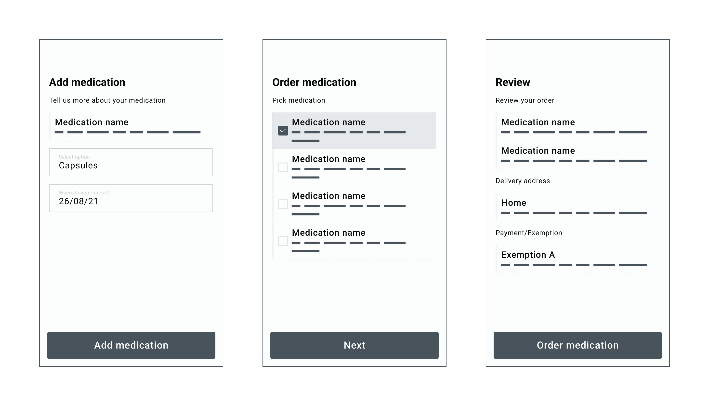
With the concepts finalised, it was time to start on the final designs. I wanted to keep the app as clean and minimal as possible.
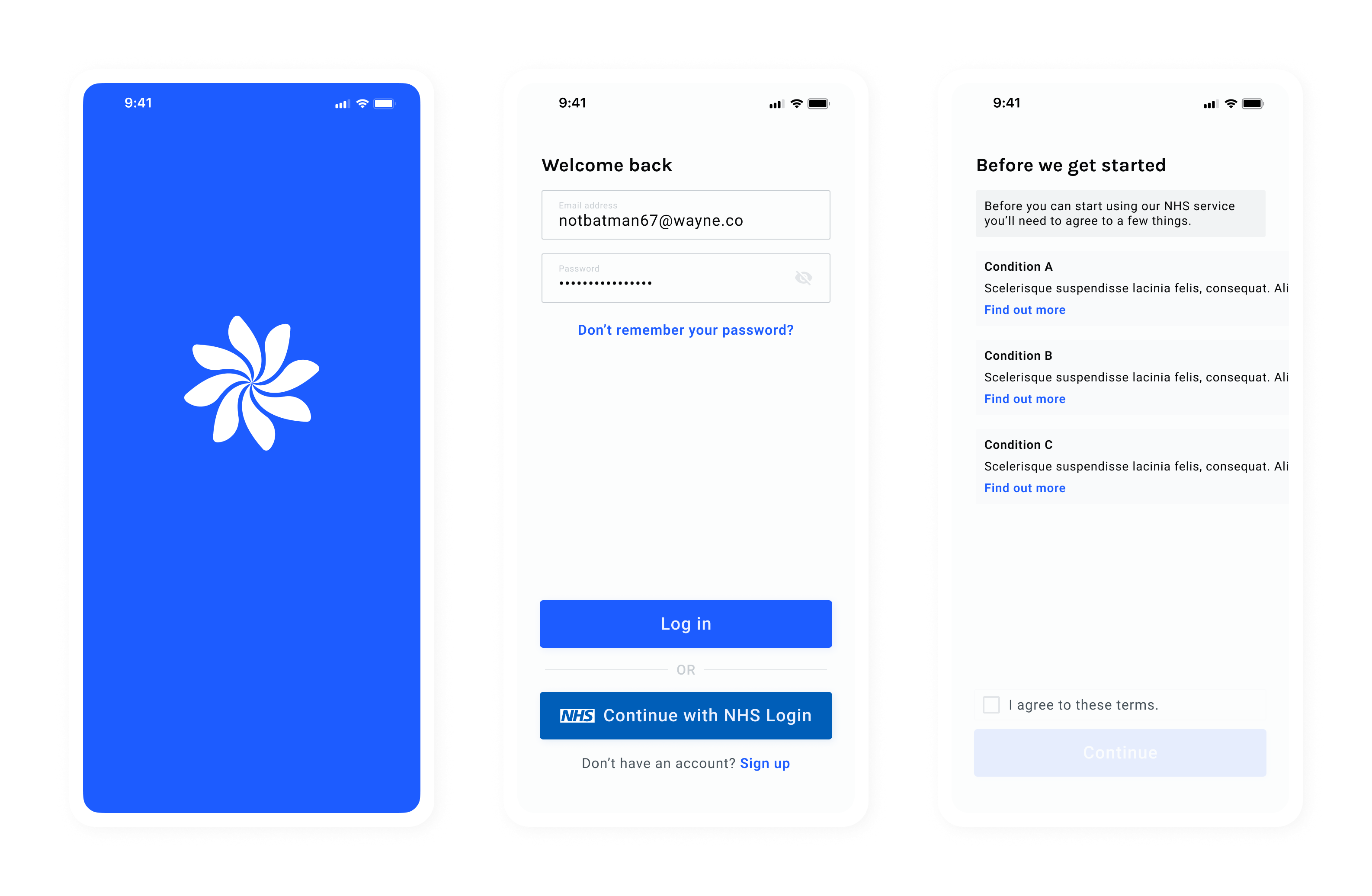
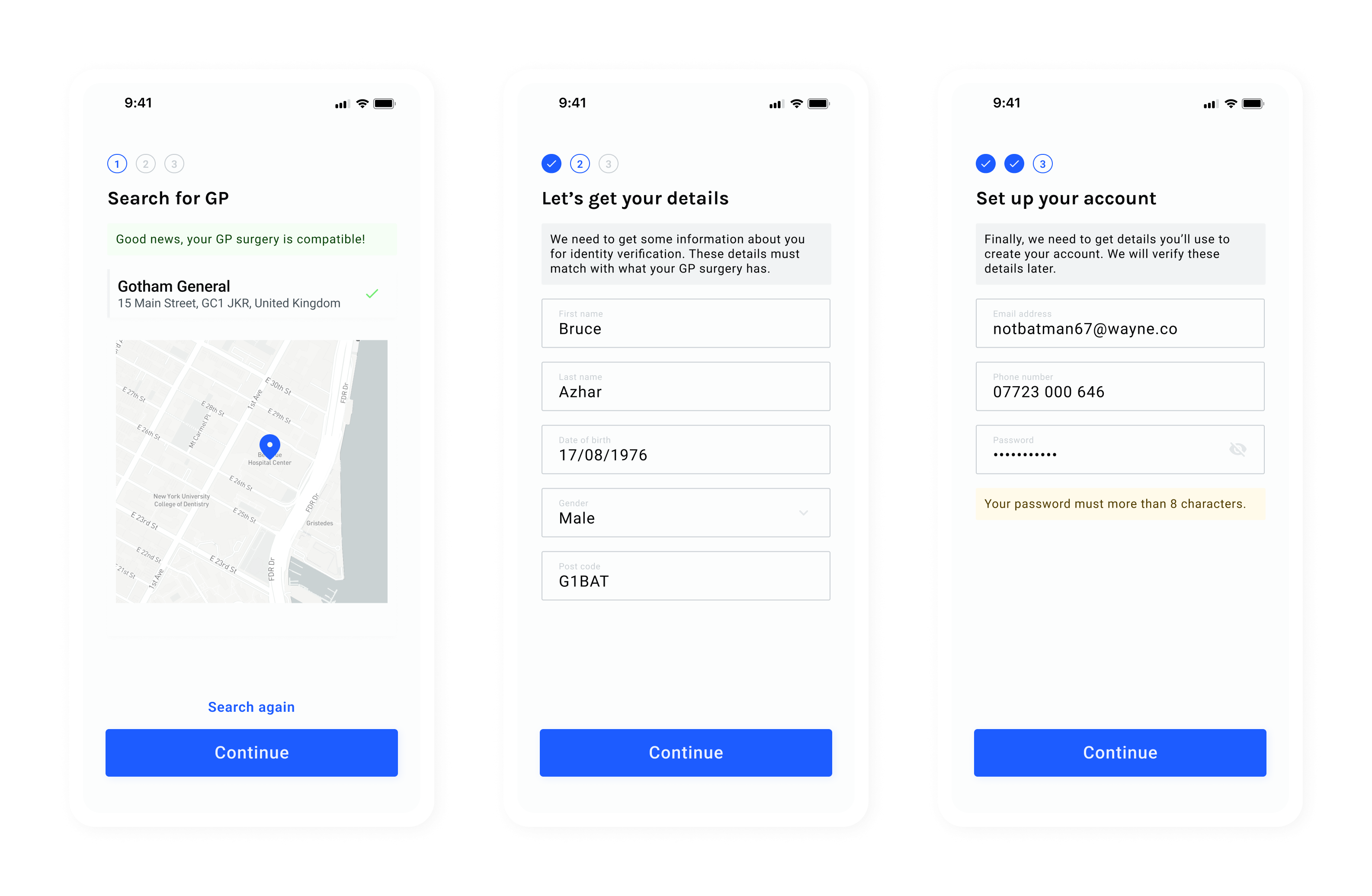
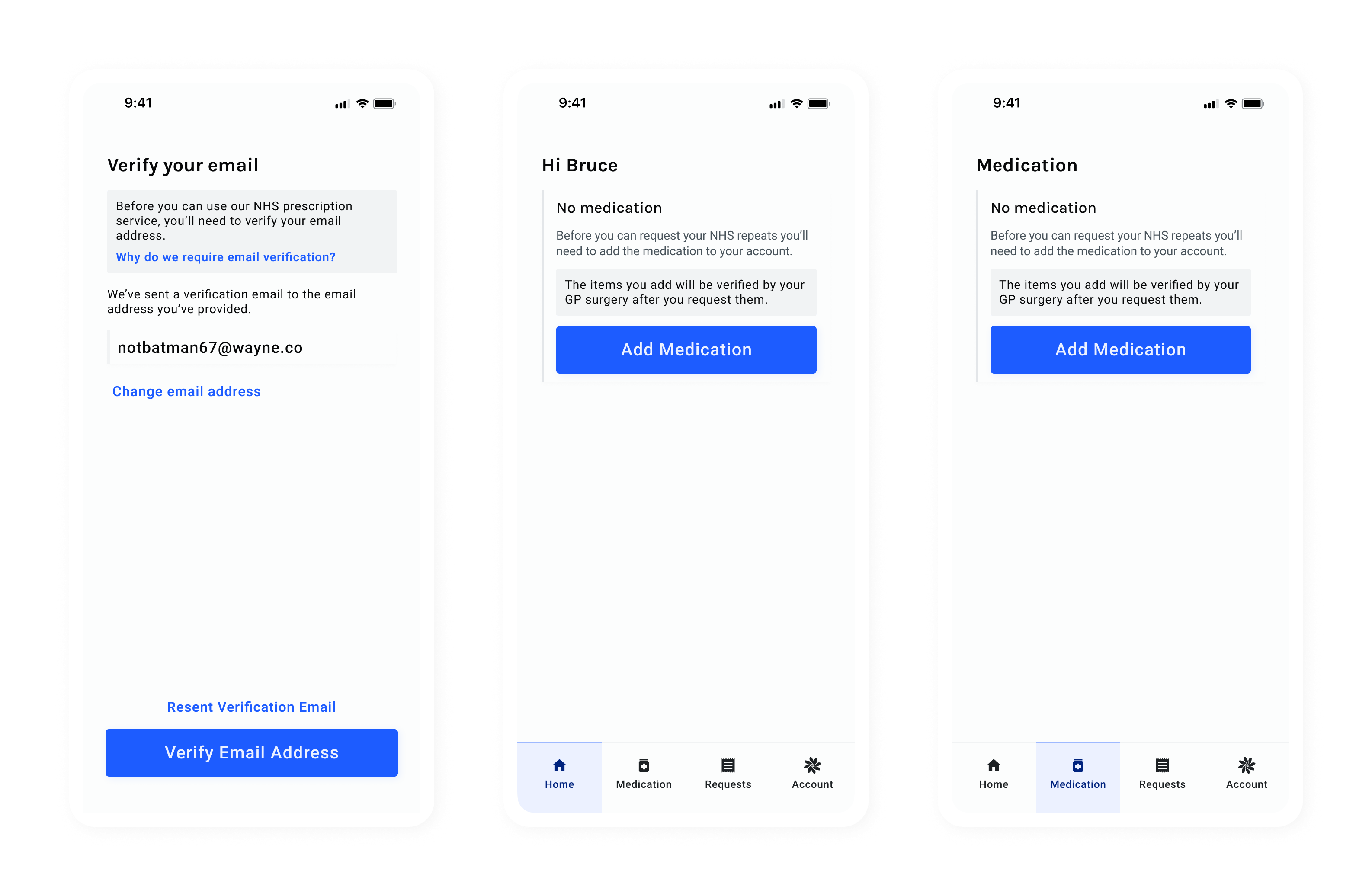
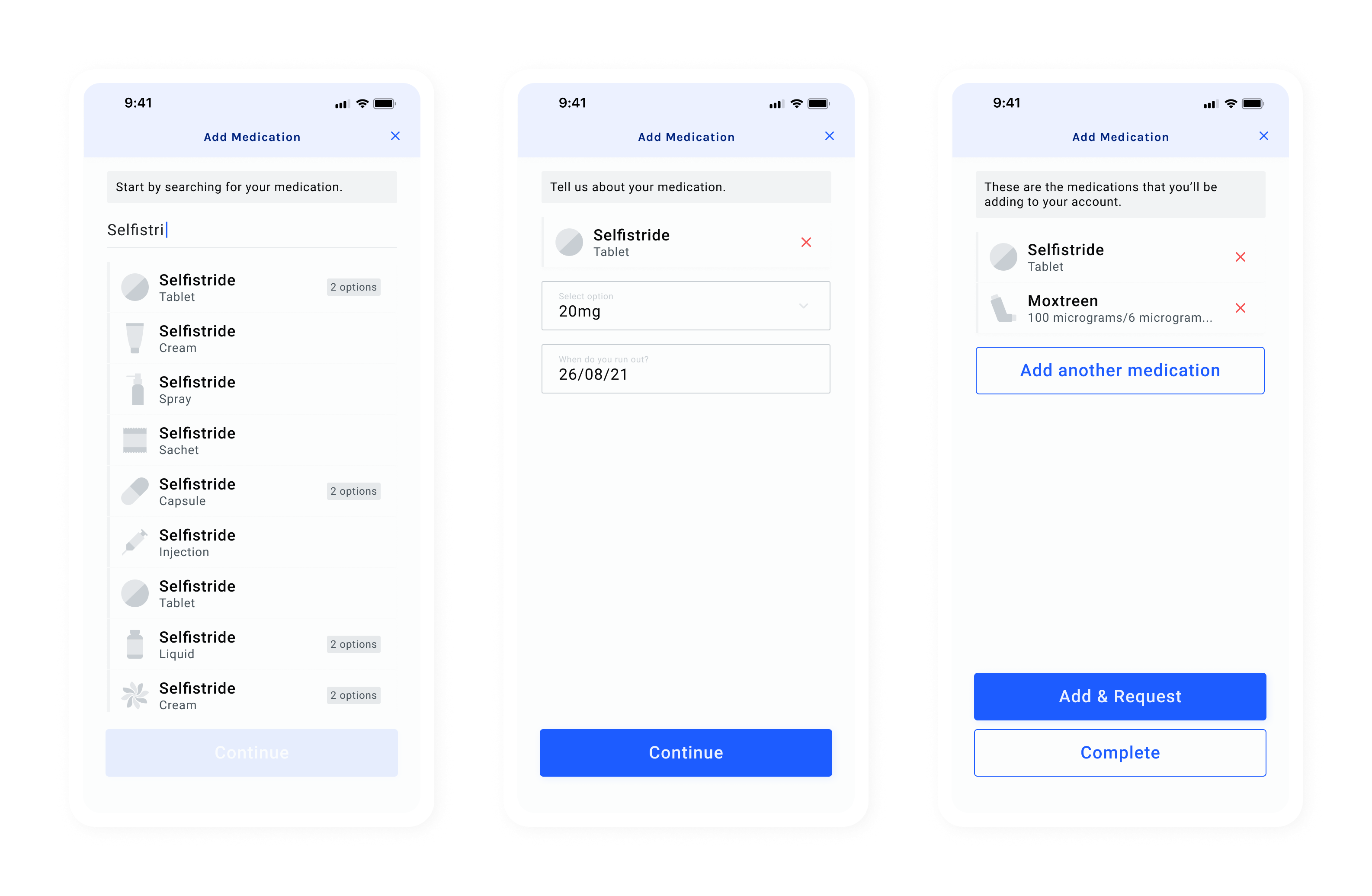
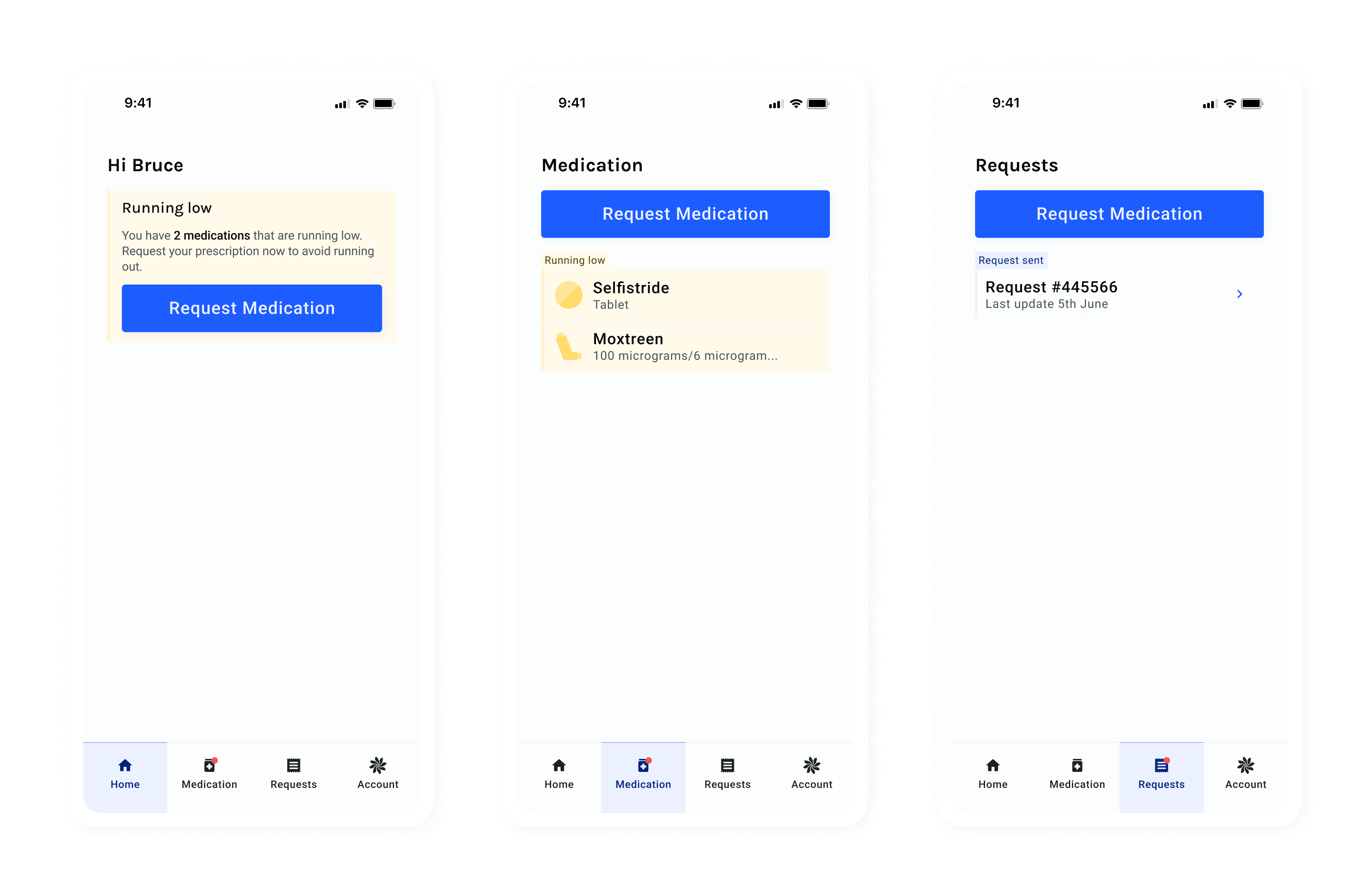
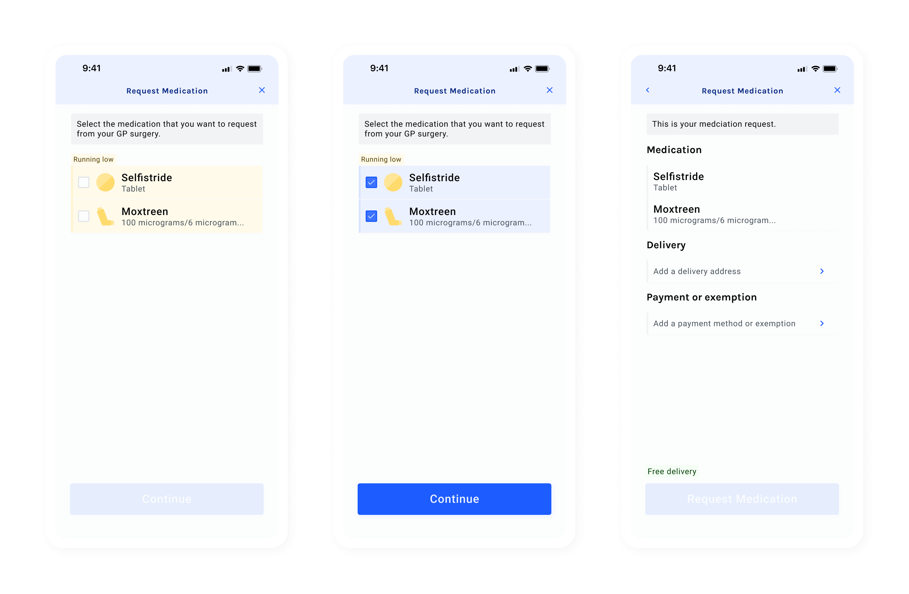
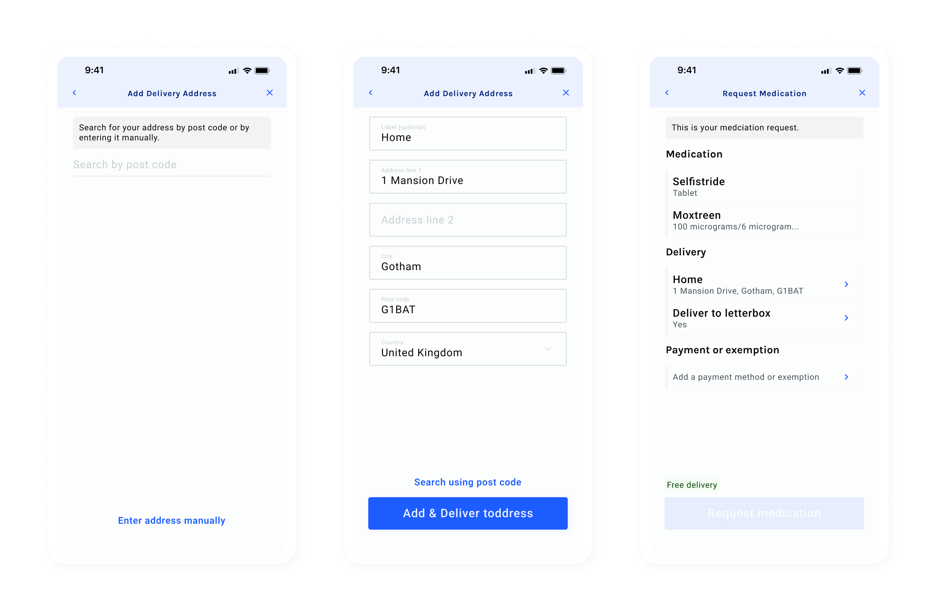
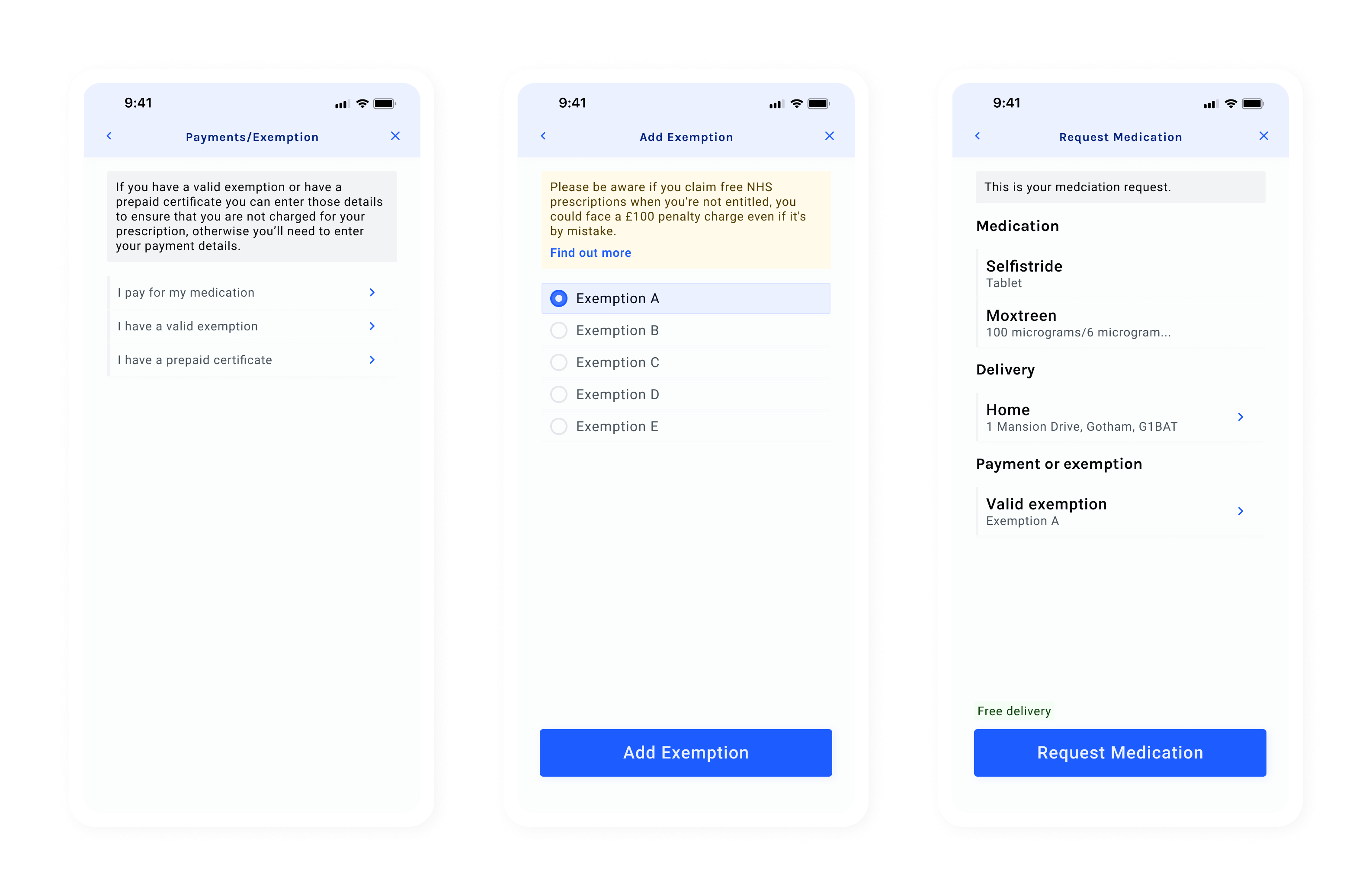
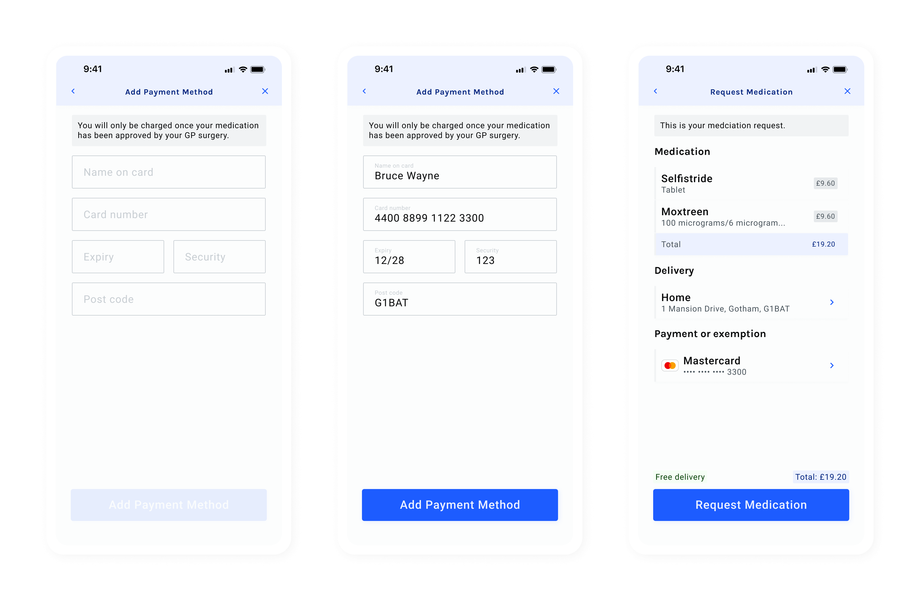
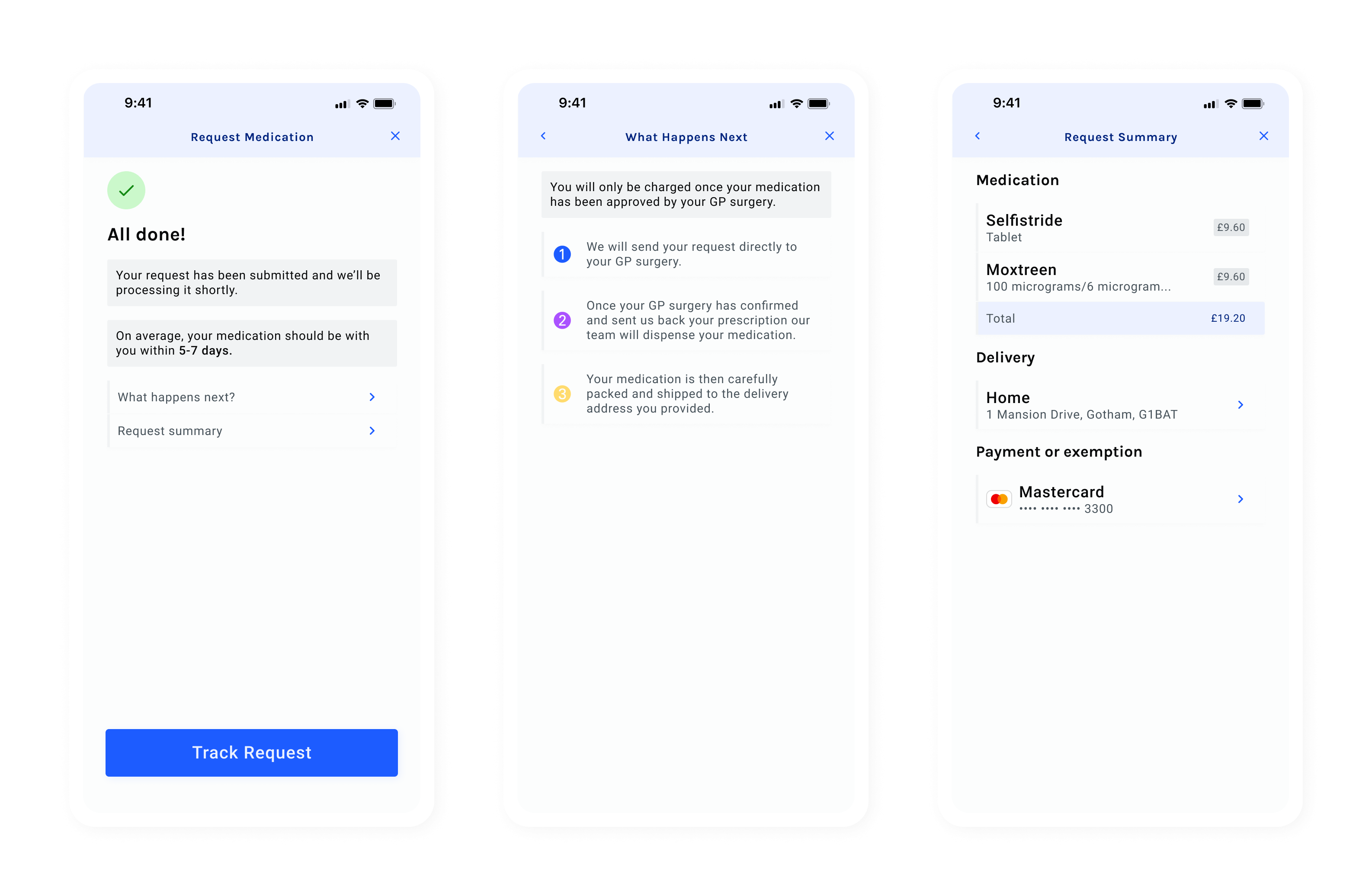
I also wanted to make sure it didn’t look designed for one specific audience. Our product was for anyone on repeat prescriptions — so the design had to cater to everyone.
Now for the sad part. After the app was designed and a lot of progress had been made on the front end, problems on the backend brought development to a halt. For a range of reasons (including the old backend system not being able to handle many of the new system’s requirements), we couldn’t carry on.
We hit a point on the front end where there was nothing more we could do until the new backend was finished. So I shifted focus to projects that didn’t rely on engineers, since their efforts were now entirely on the backend system.
Ready to get in touch?