Refreshed the brand for the digital pharmacy.
The old brand was a mess of inconsistent variations. The refresh gave it one clear, consistent story.
The old brand was a mess of inconsistent variations. The refresh gave it one clear, consistent story.
The previous brand didn’t accurately reflect what Simple Online Pharmacy was about. The business was entering a new phase and needed a brand that reflected that, and made it clear to people what it meant.
The old brand was never consistent either. It showed up across the products in different variations, the visual style was never properly defined, and it got misused internally. The goal of the new brand was to convey where Simple Online Pharmacy sat in a market full of online pharmacies. Some competitors focused on cheap, others on premium. We sat in the middle: affordable and dependable, that’s what the new brand had to reflect.
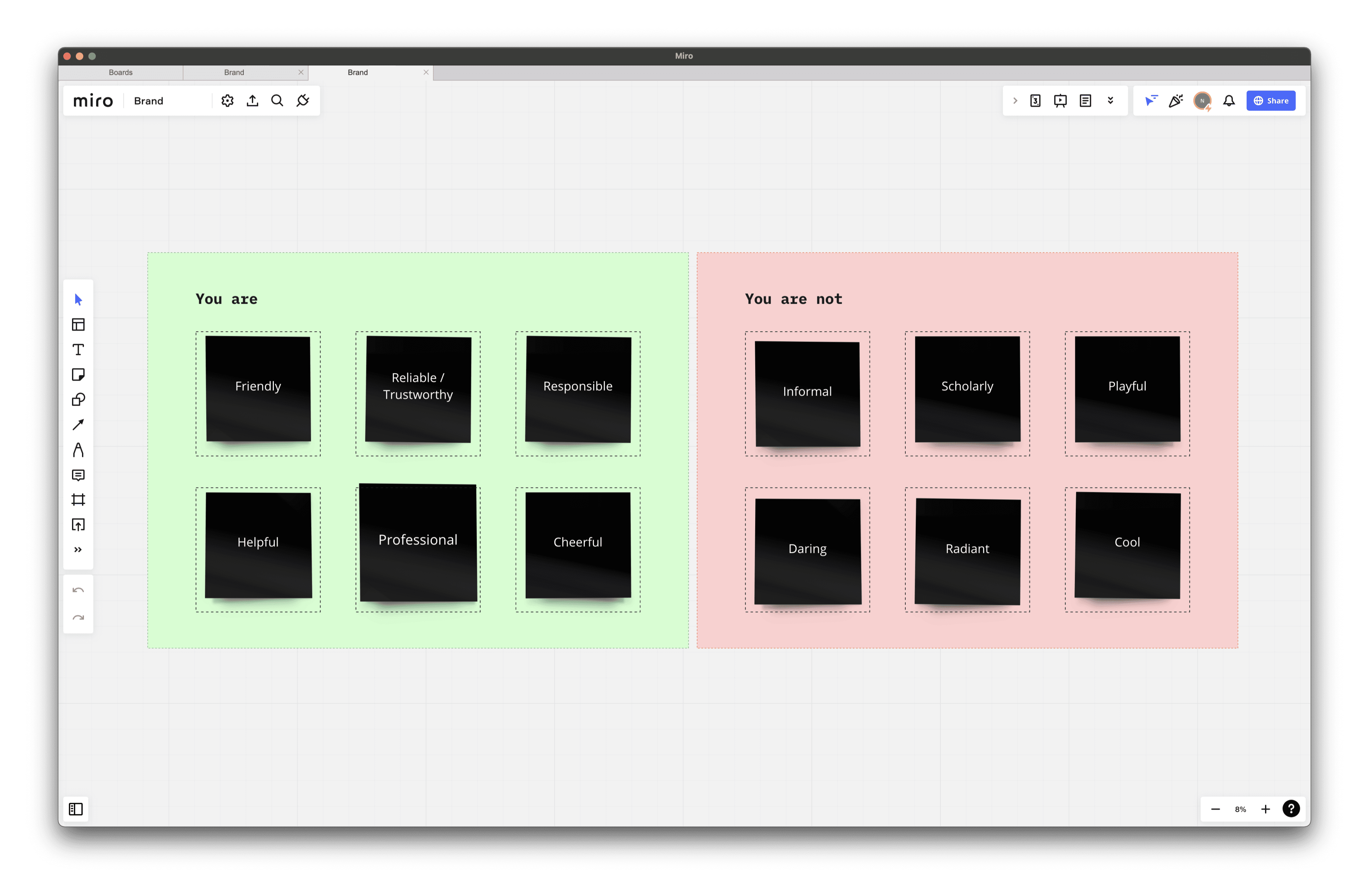
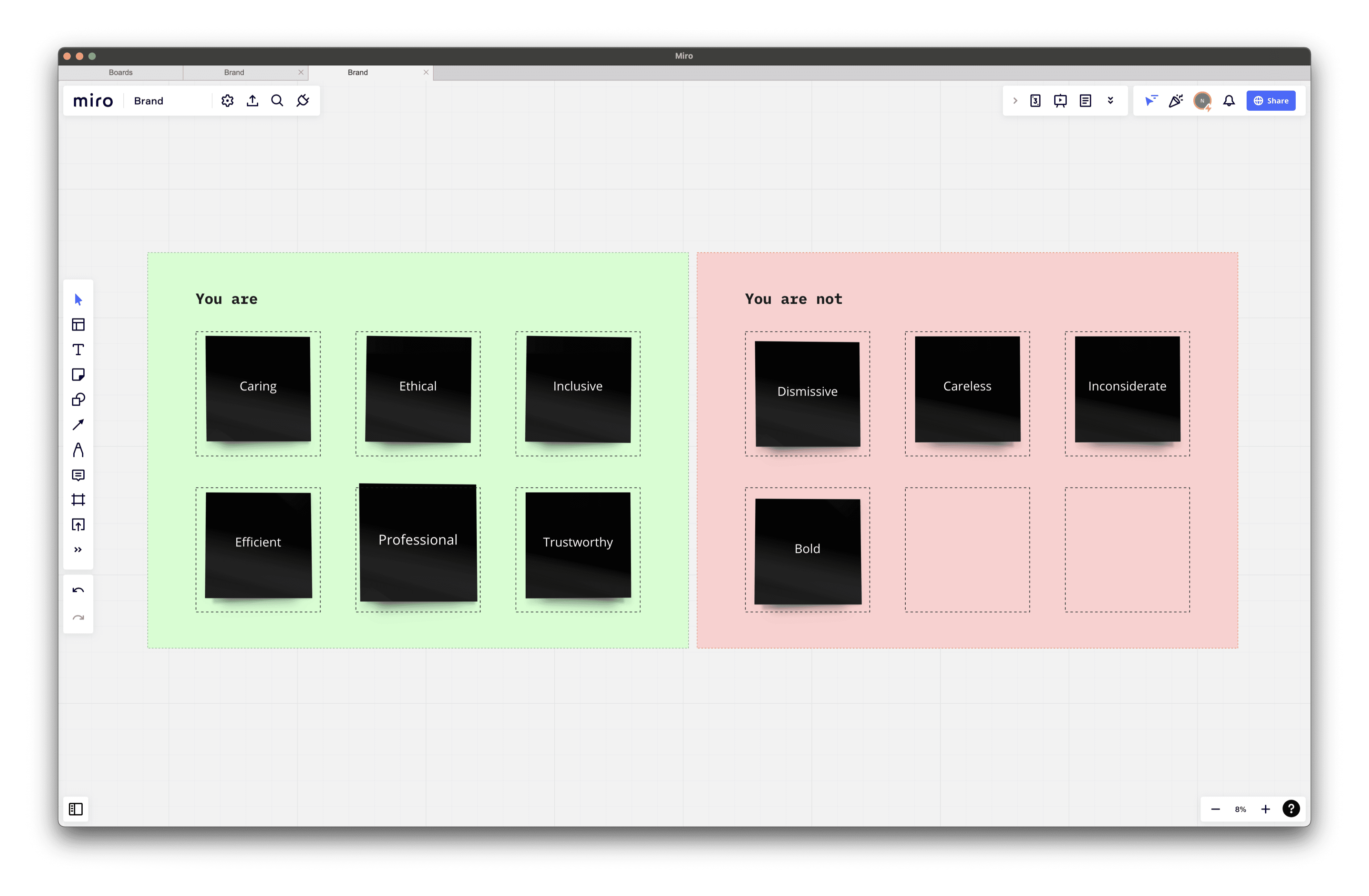
The co-founders had a clear idea of what the brand represented, so to make the most of that I ran a short workshop with both of them to explore Simple’s vision, purpose and mission. I left them with homework: each co-founder had to come up with a set of adjectives for what the brand was, and another set for what it wasn’t.
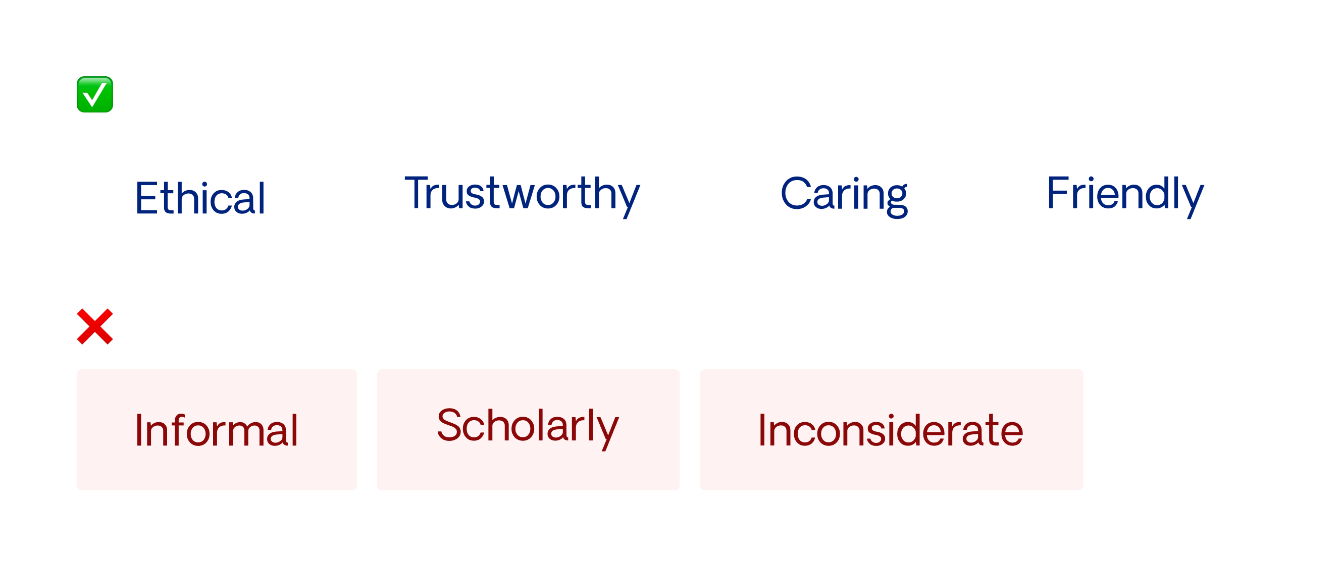
In the next session we dug into that homework and refined the adjectives down to four for what the brand was and three for what it wasn’t. This was an important step — it’s what defined the brand’s tone and personality.
My first idea was to rename the brand. Something more memorable and less wordy, something that could work globally and give the brand more of a healthcare feel than just a pharmacy.
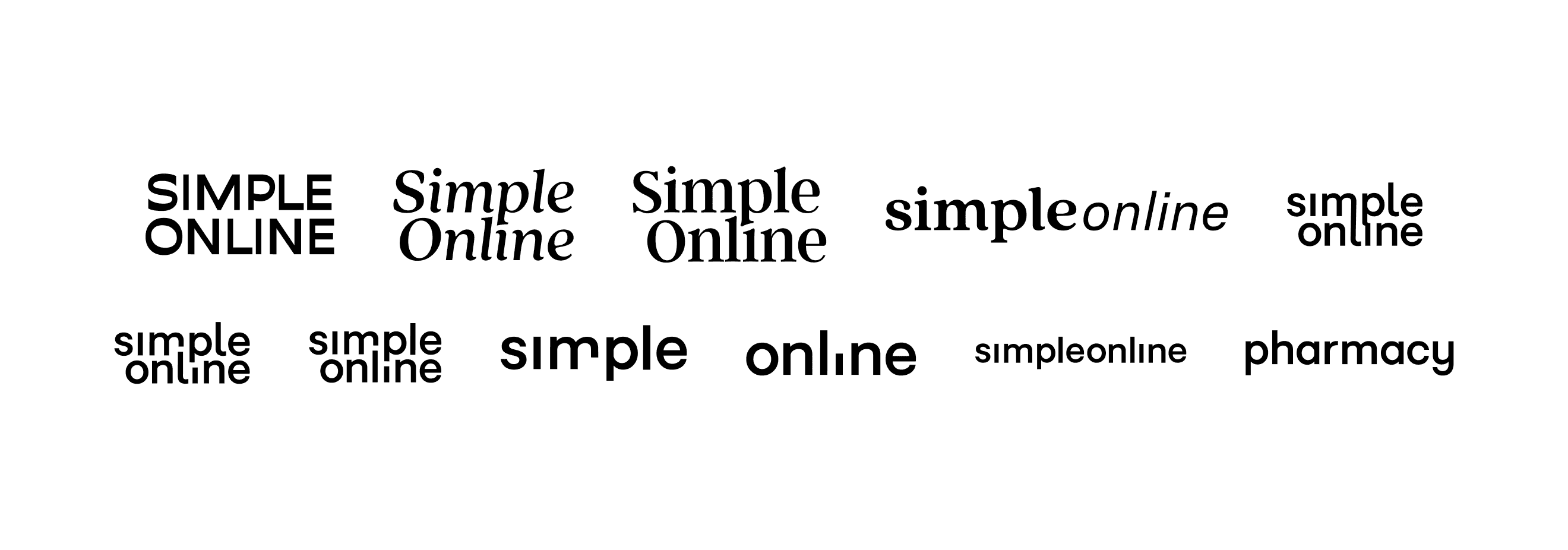
After several discussions and pitches to the co-founders, the name change was a no-go. It was too central to the SEO strategy and too high a risk to change at that stage of the business. So we had to rebrand with the existing name.
I needed a mark for Simple Online Pharmacy that could hold everything the company stood for, stay memorable and modern, and not need redoing every time trends shifted.
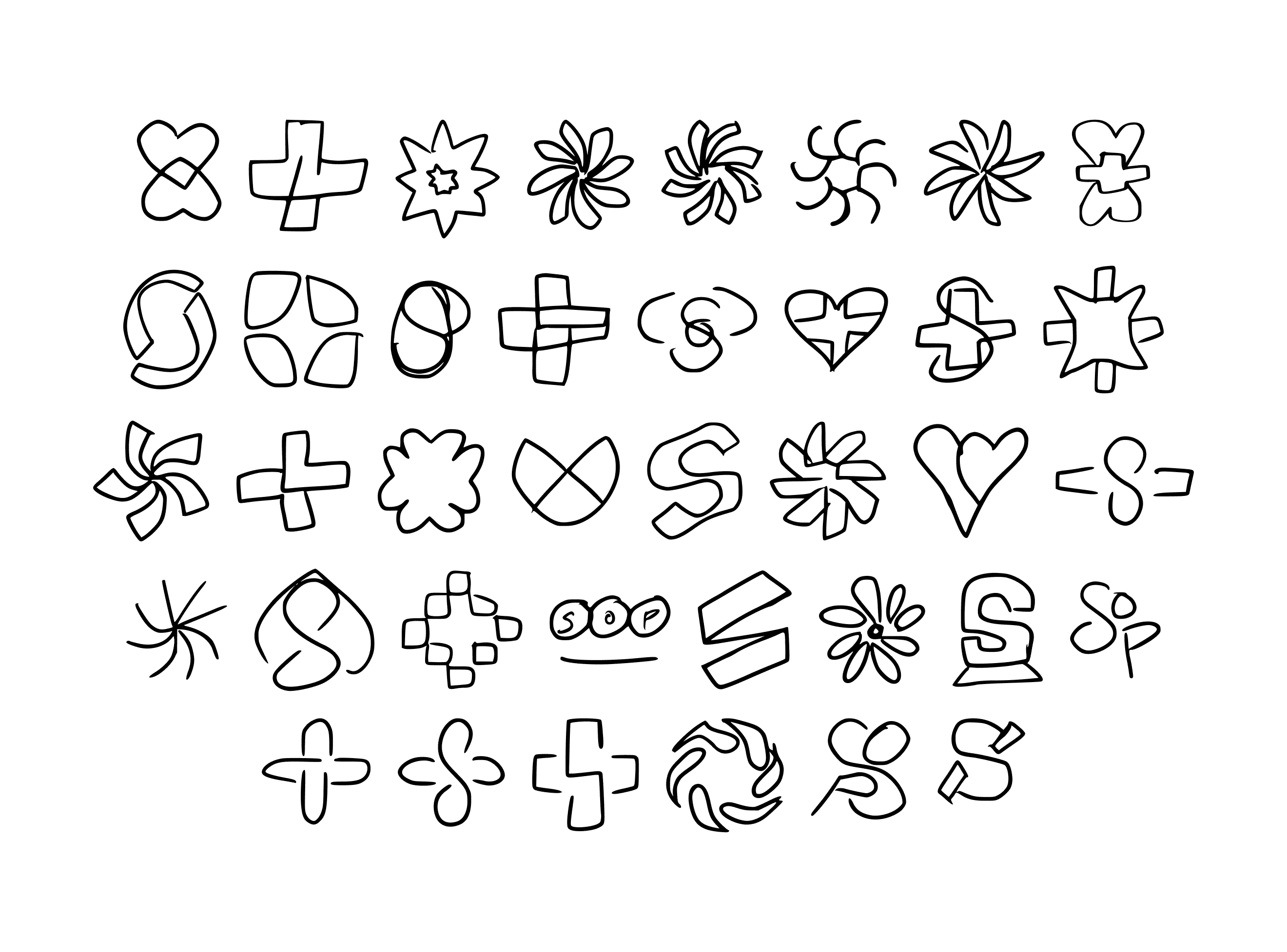
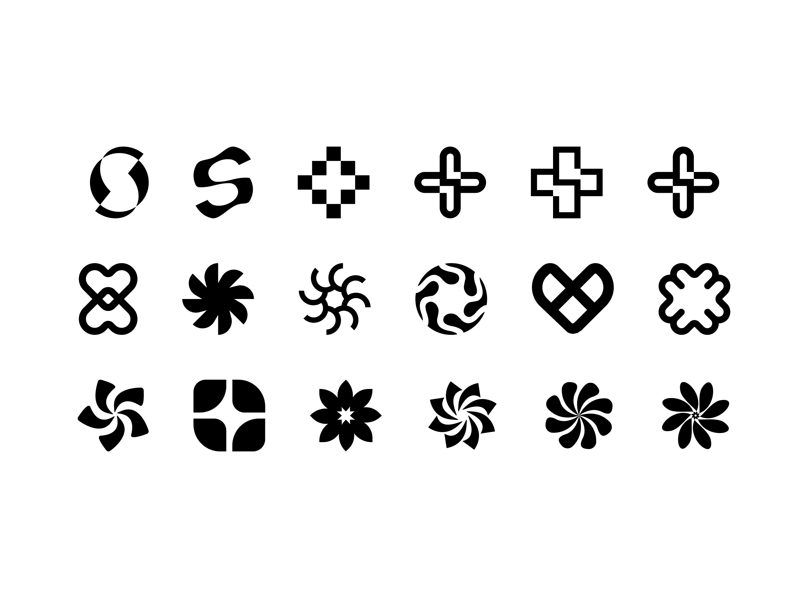
I played around with a lot of concepts before settling on a direction. I knew the wordmark was always going to be limited by the length of the name, so the priority went on the mark.
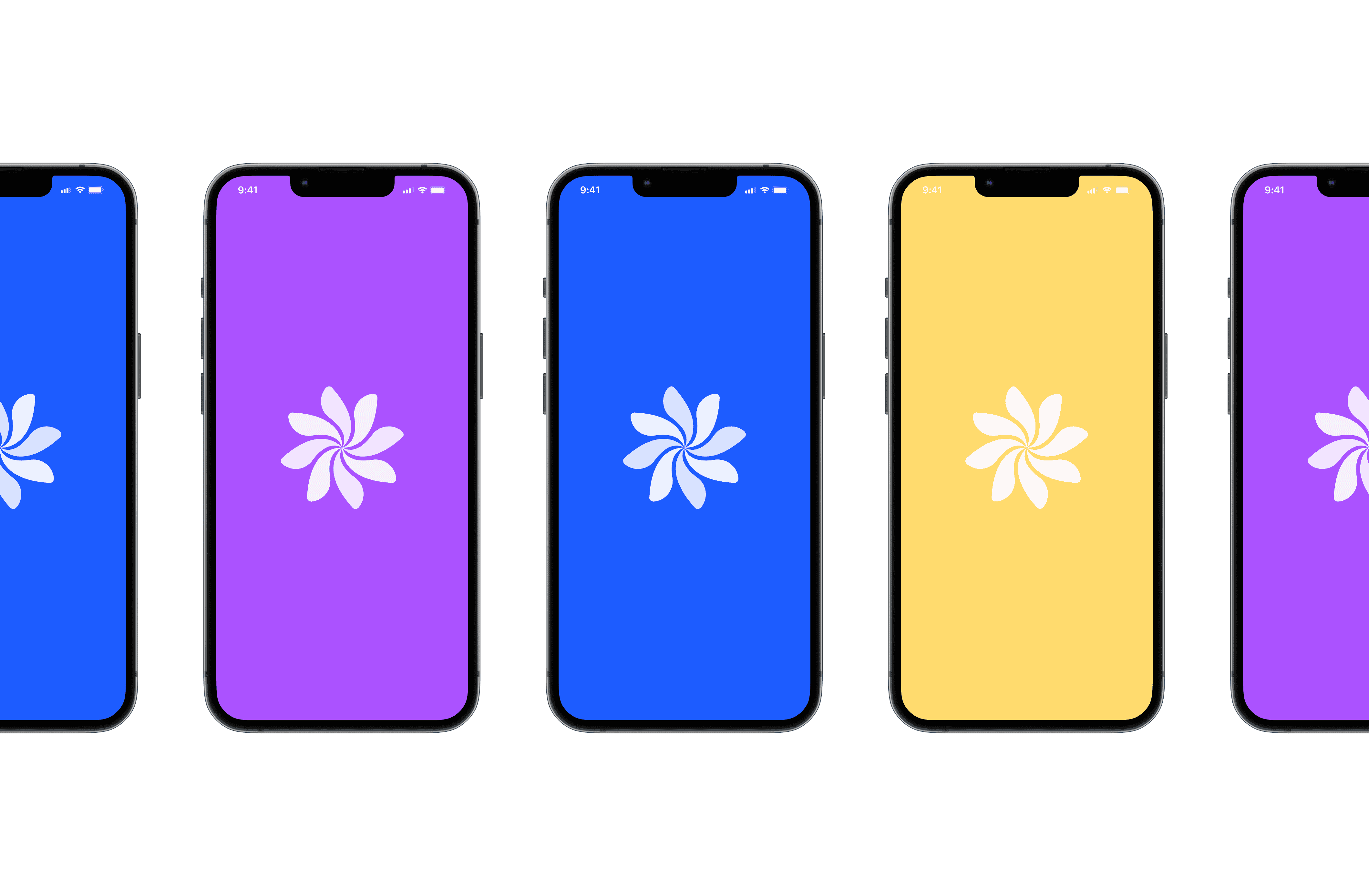
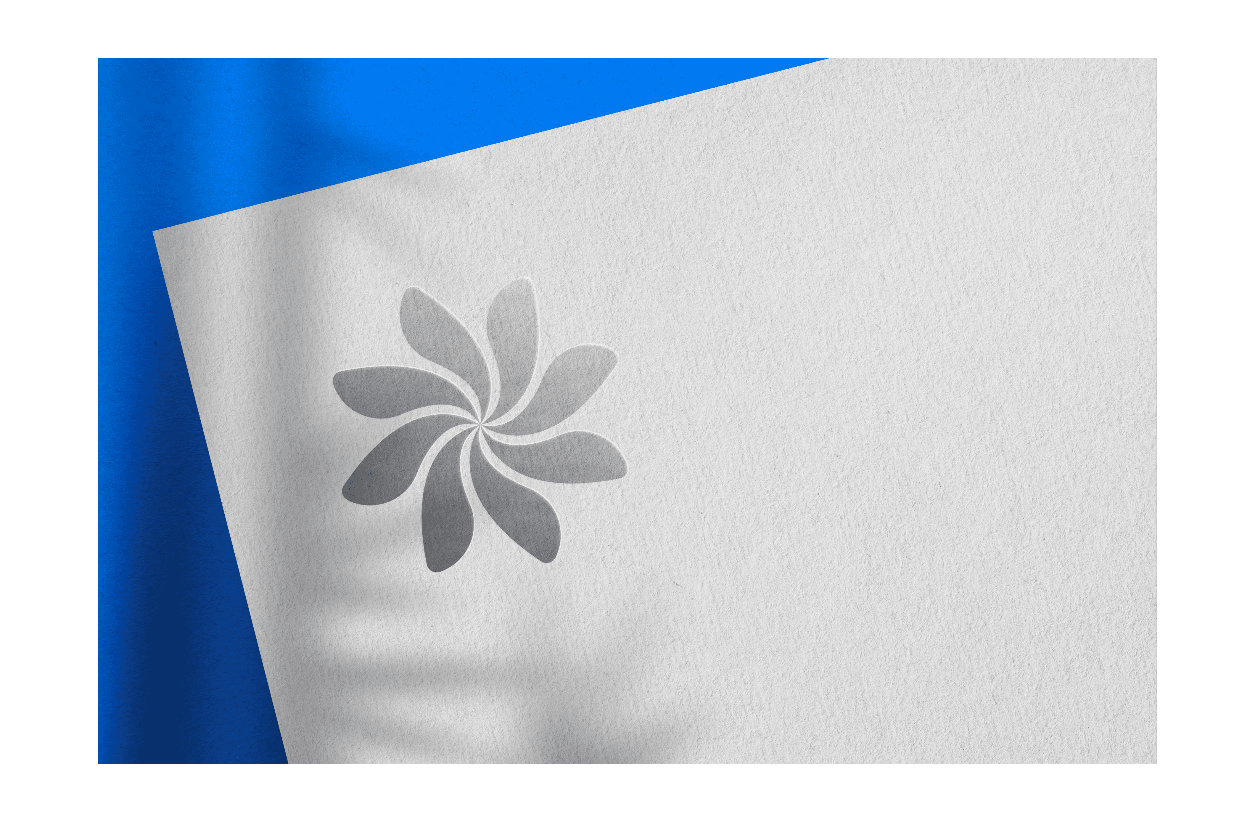
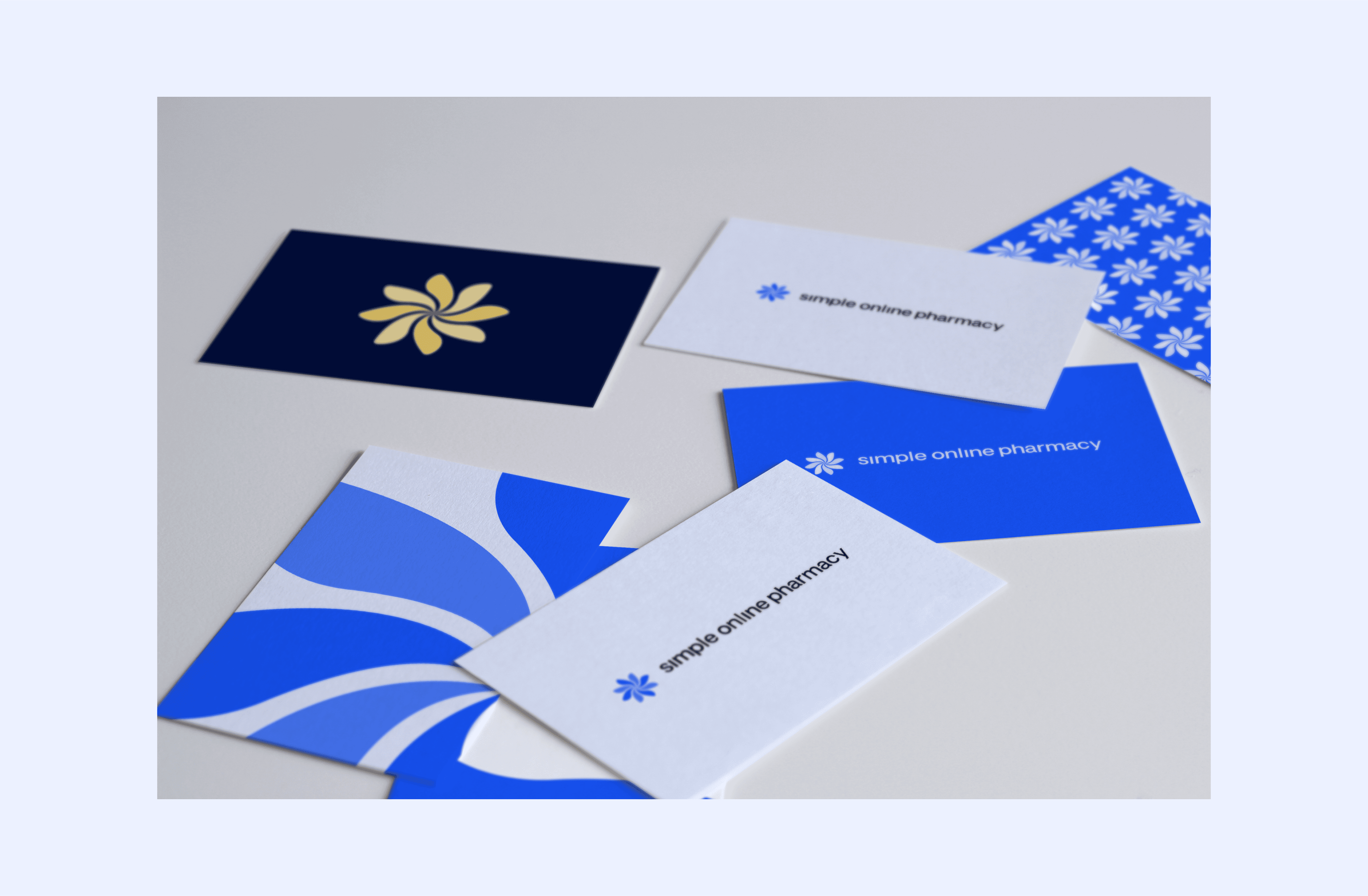
The mark is built from eight leaf-inspired shapes looped in a circle, connecting in the middle. It represents the relationship the brand wants with its patients, across every part of the business. From the tech team building the products to the pharmacy team dispensing medication, we’re always around to make sure they get the best care.
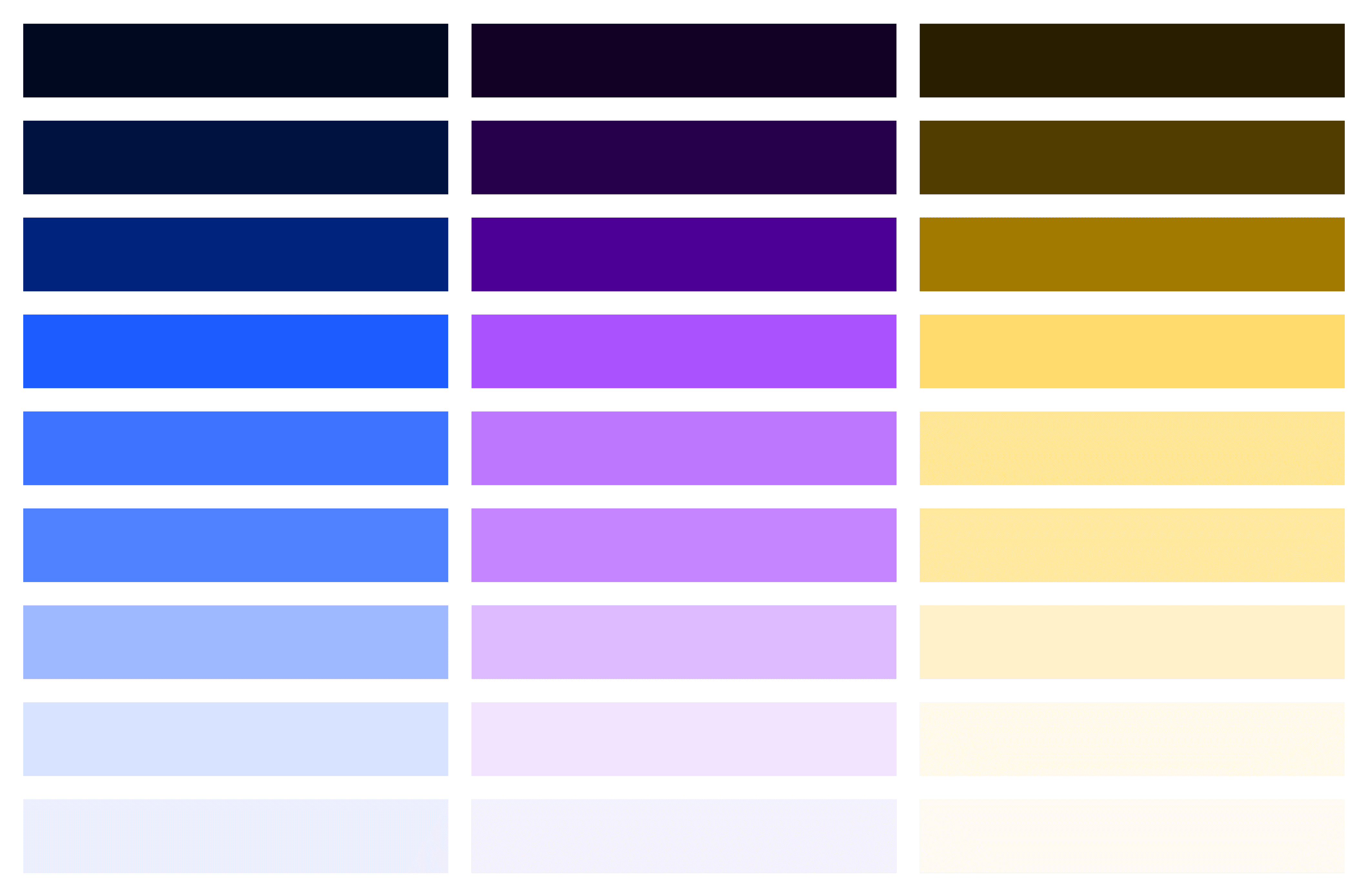
We wanted to stay close to the existing palette so the transition from old brand to new was as smooth as possible. I modernised the core blue and expanded the shades and tints to give us more to work with. This was Simple Blue.
I added a secondary purple (Simple Purple) and a tertiary yellow (Simple Yellow), giving us three brand colours in total. Expanding the palette gave us an extra layer to communicate with. We could use colour to emphasise things without them getting confused with links or primary actions.
There was also a set of three UI colours:
One of the biggest requirements from the business was that the typography had to be available in every piece of software we used. That was a problem with the previous brand — there was no defined font, so teams used whatever they wanted.
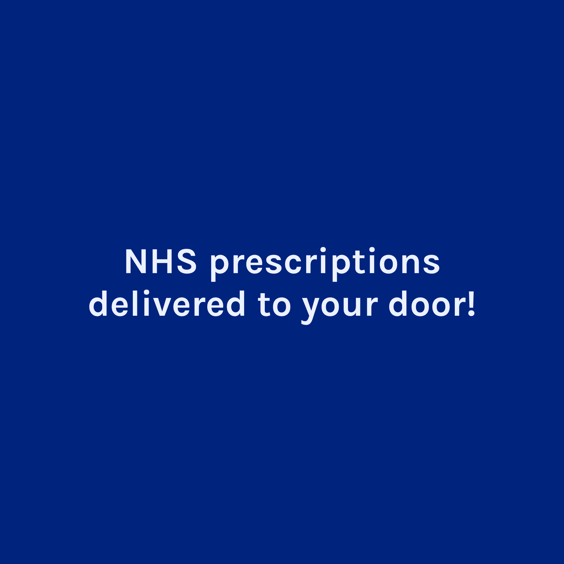
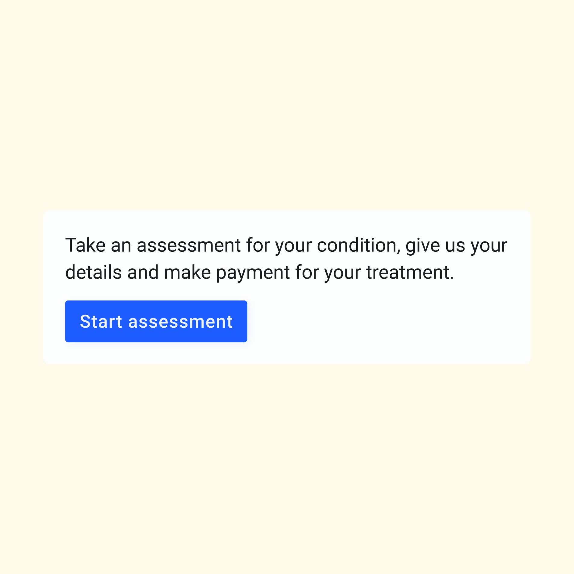
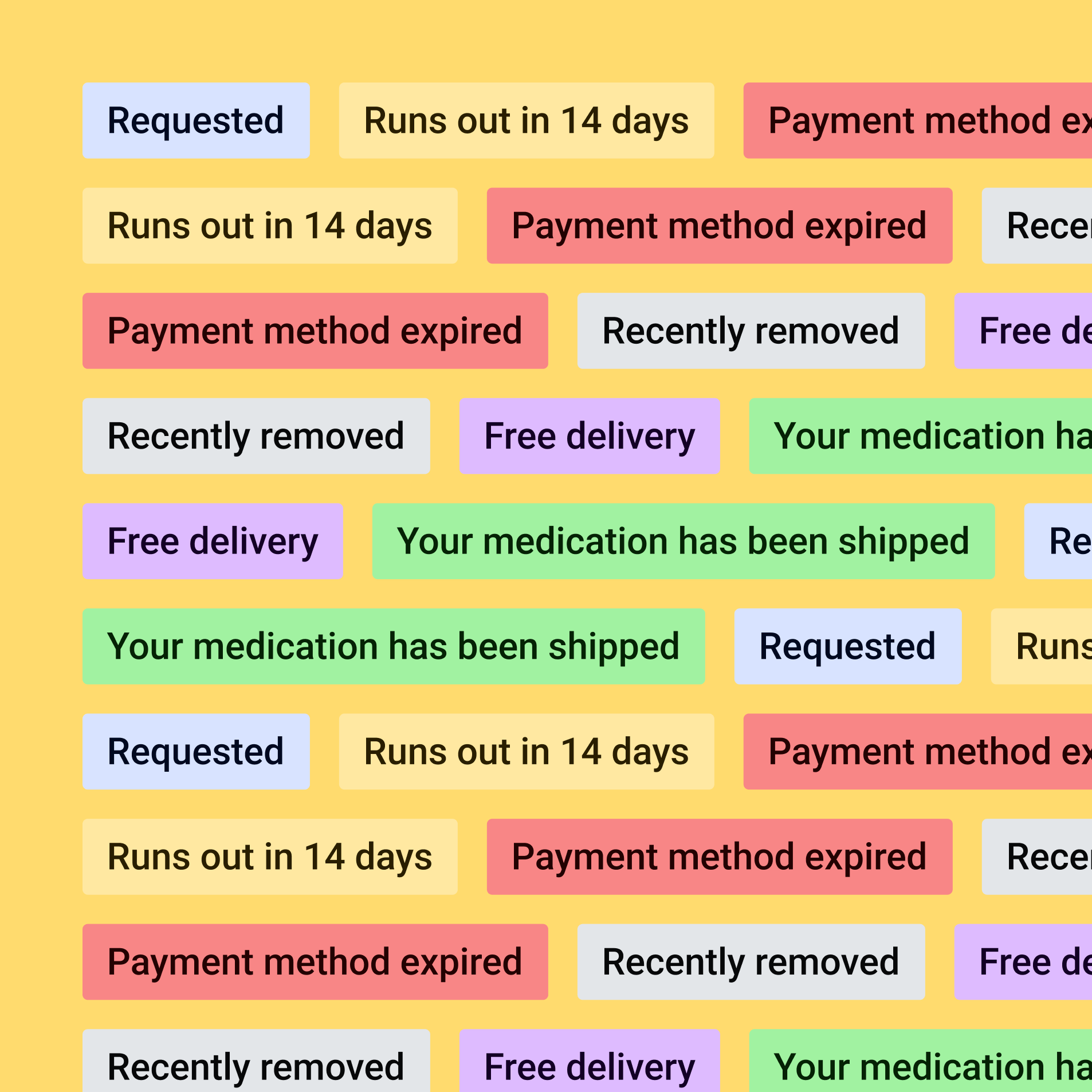
In the end we went with two simple Google Fonts: Karla for the main brand and Roboto for everything else. This meant every department could access the fonts on the tools they actually used. From the management team in Google Docs all the way to the warehouse team printing shipping labels.
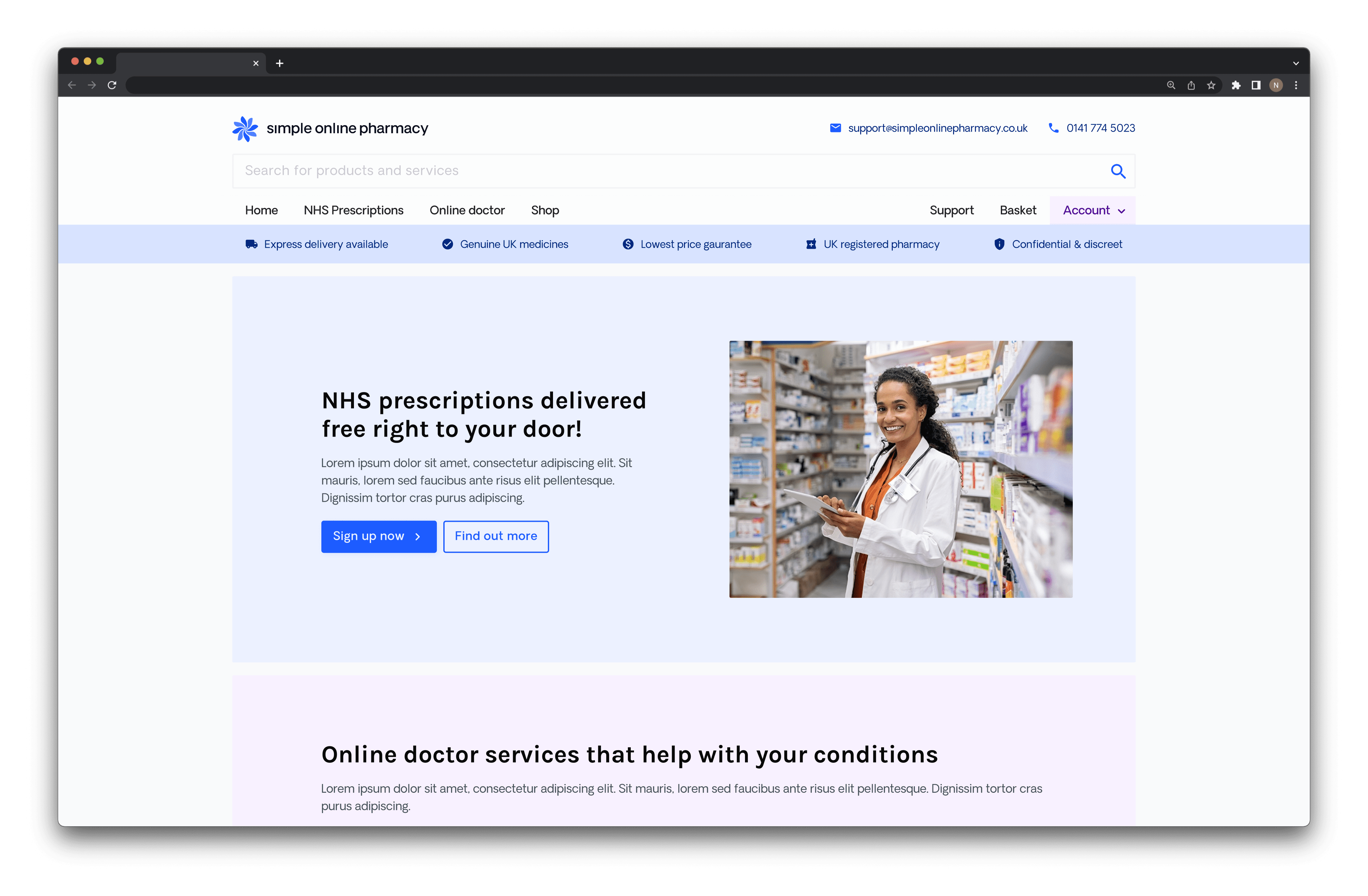
The brand has had its soft launch and is now on all digital products and most print material. Once the new NHS web app launches, it’ll get its full debut.


Ready to get in touch?