Built a task based internal system to manage patients and orders.
The old tool was not made to scale, so we rebuilt it around the tasks people perform and automations to help it grow.
The old tool was not made to scale, so we rebuilt it around the tasks people perform and automations to help it grow.
Simple Online Pharmacy started in 2015 selling over-the-counter treatments across the UK, then grew into private online GP clinics and NHS prescriptions. These days more than 1,000 patients a day rely on it to get their medication safely and on time. None of that works without the tools running behind it — and the ones they had couldn’t keep up.
The goal was a new internal tool for the pharmacy, clinical and support teams to manage patients and orders. It needed to be simple: easy to understand, easy to onboard new staff onto, while still handling complex tasks and automating the manual work wherever possible.
The existing tool couldn’t scale with the business. It wasn’t user-friendly, which made onboarding hard, and it was full of manual tasks that were either unnecessary or easy to automate. As we were the ones getting medication to people, even one error was too many.
We were in the lucky position of having access to 100% of the people who’d actually use the product. Before planning anything, I wanted to map out the full journey of an order from start to finish, so I spent a few days talking to at least two people in each department.
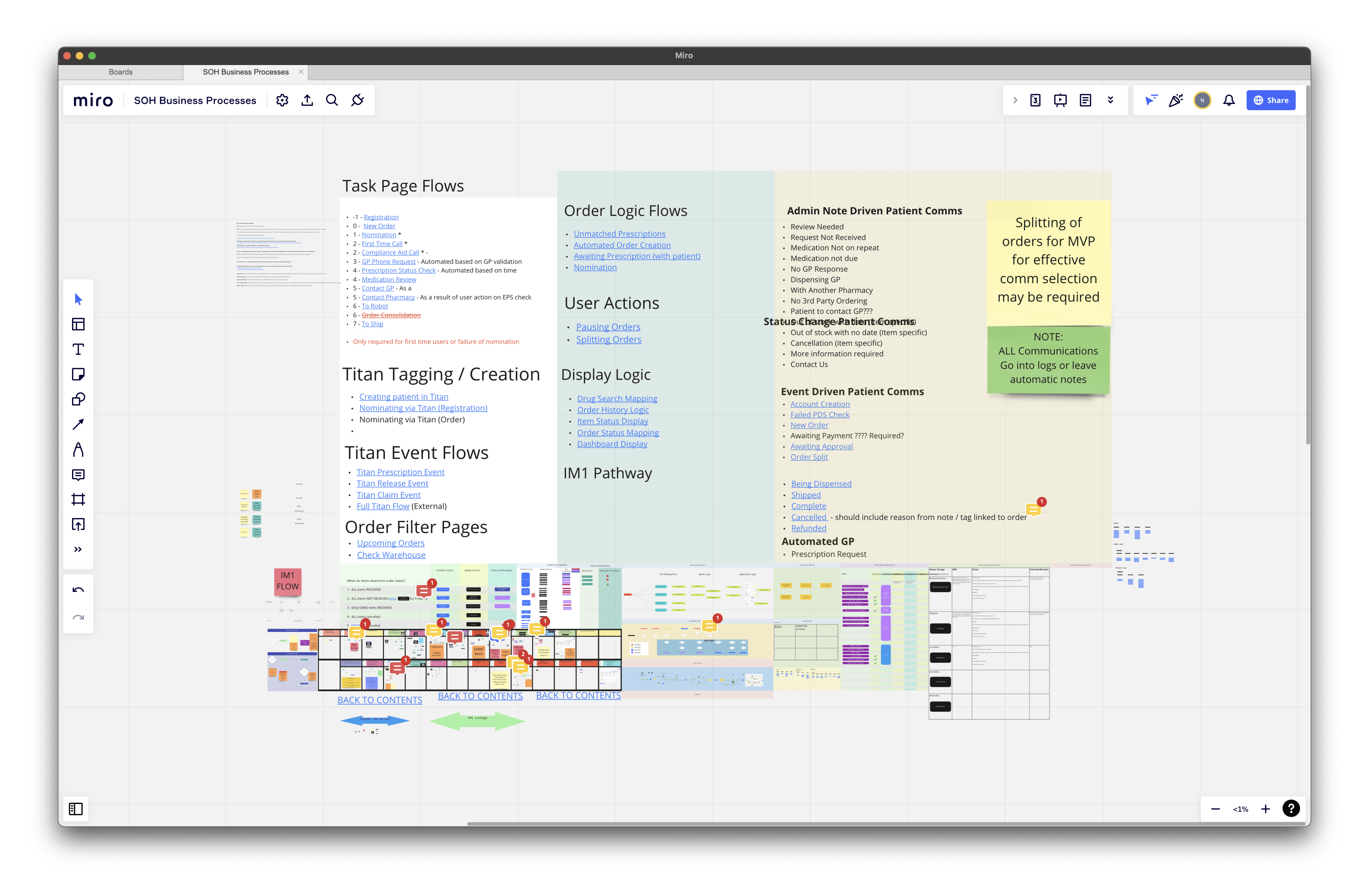
Alongside that, I sent a short survey to everyone who used the existing tool.
Then I ran a workshop with the co-founders and the team leads across the operational teams (pharmacy, clinical, support, warehouse). The point of it was to define the MVP, the key problems, and the metrics we’d use to measure whether our solutions actually worked.
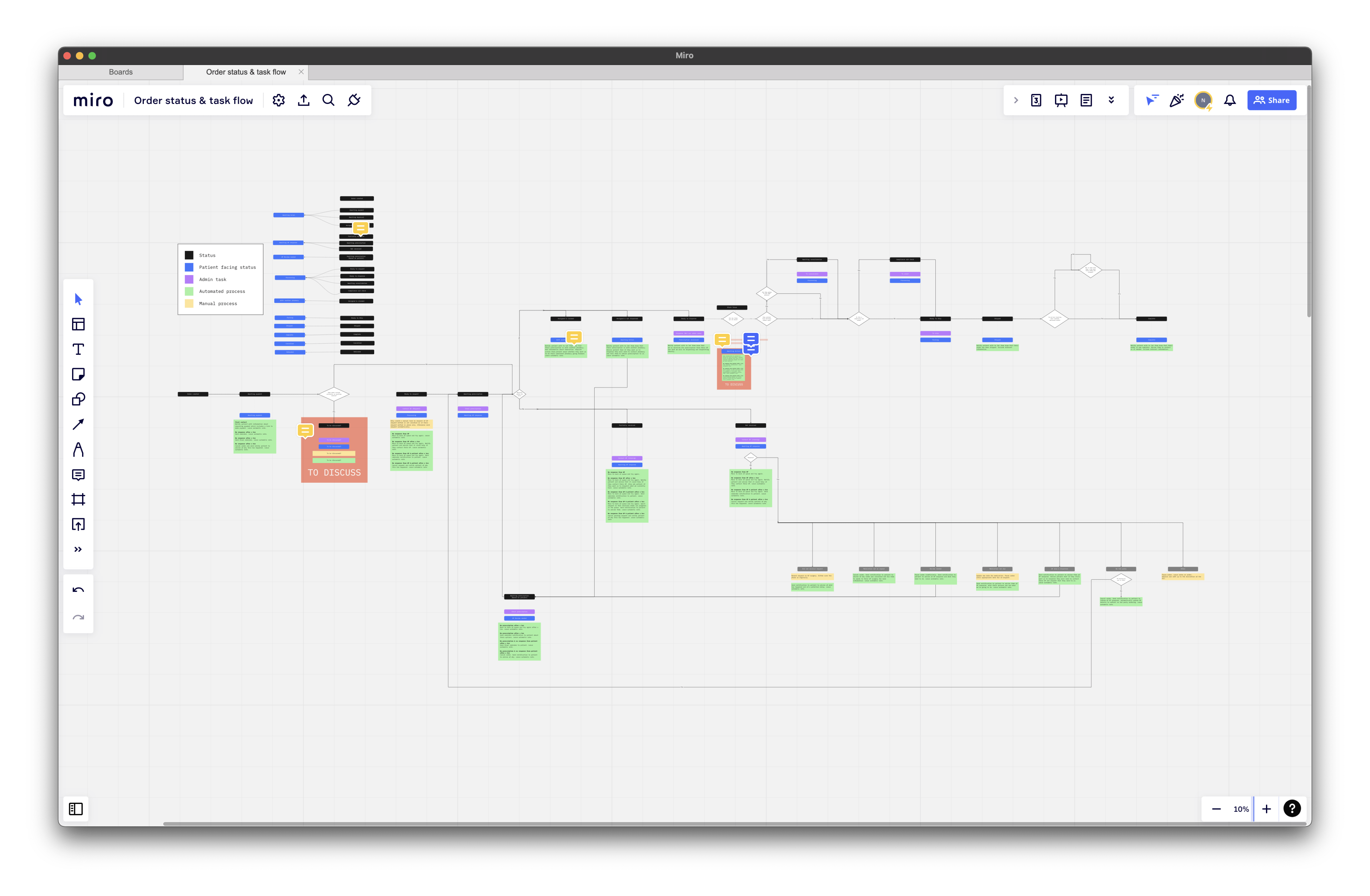
Unlike a regular ecommerce order, a patient’s NHS order can’t just go from the warehouse to the back of a truck. We were dealing with medication and regulatory pharmacy requirements, so a fully automated system was never on the table. The flow of an NHS order became the thing we used to map out the core tasks for the MVP, and to work out what could and couldn’t be automated.
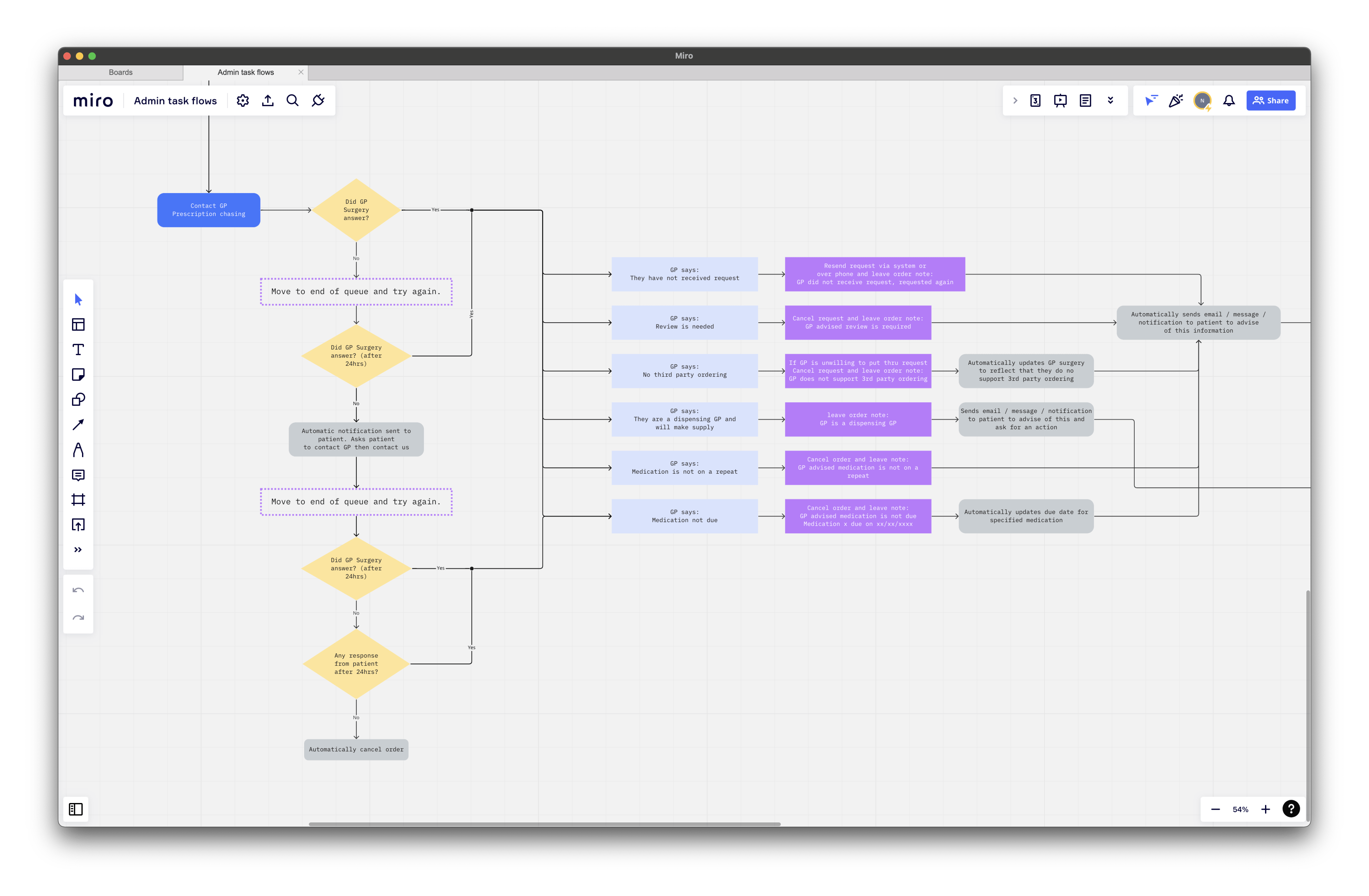
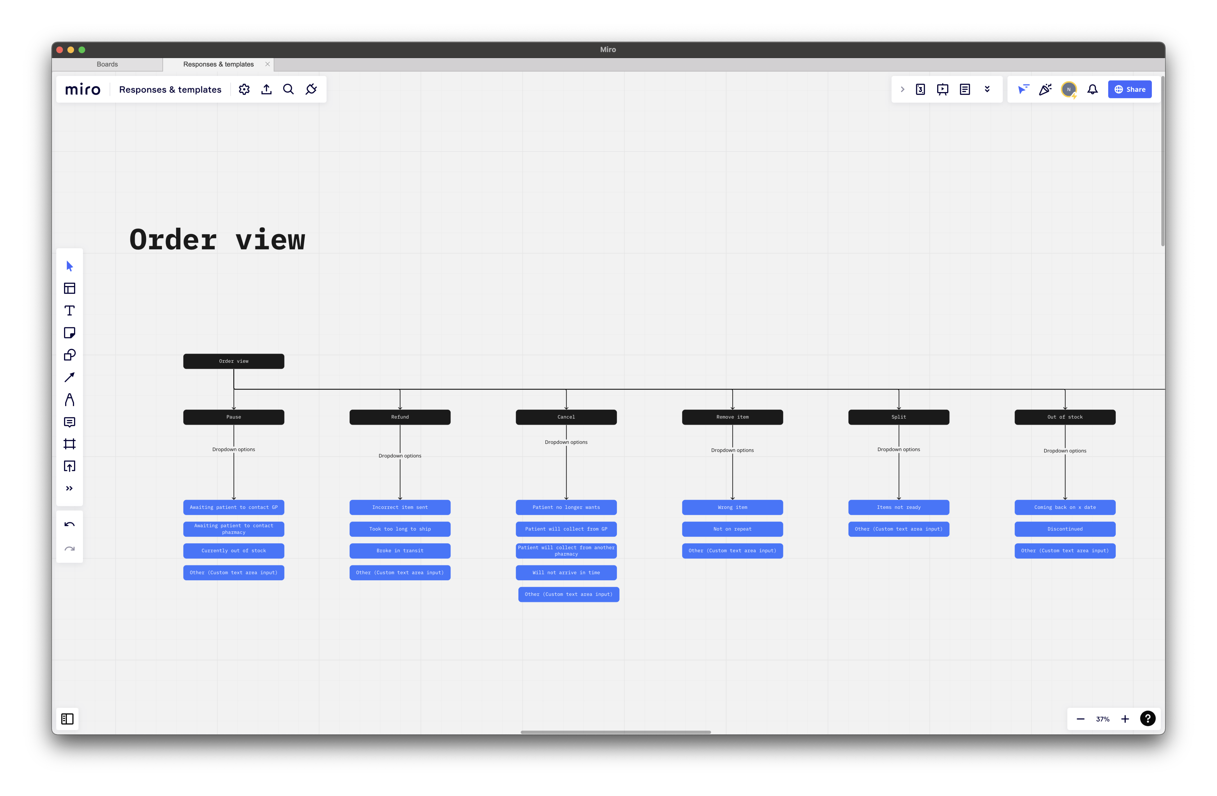
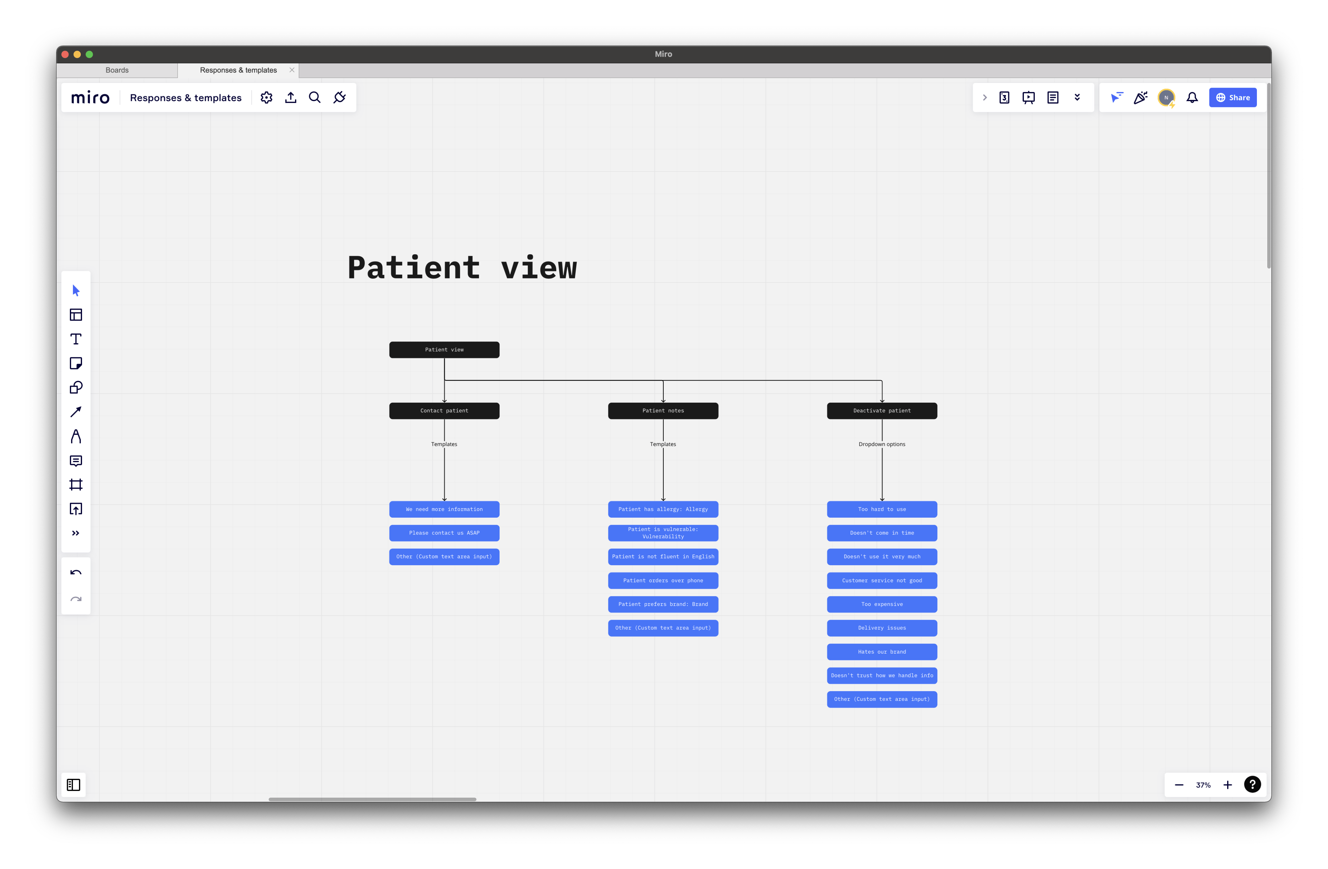
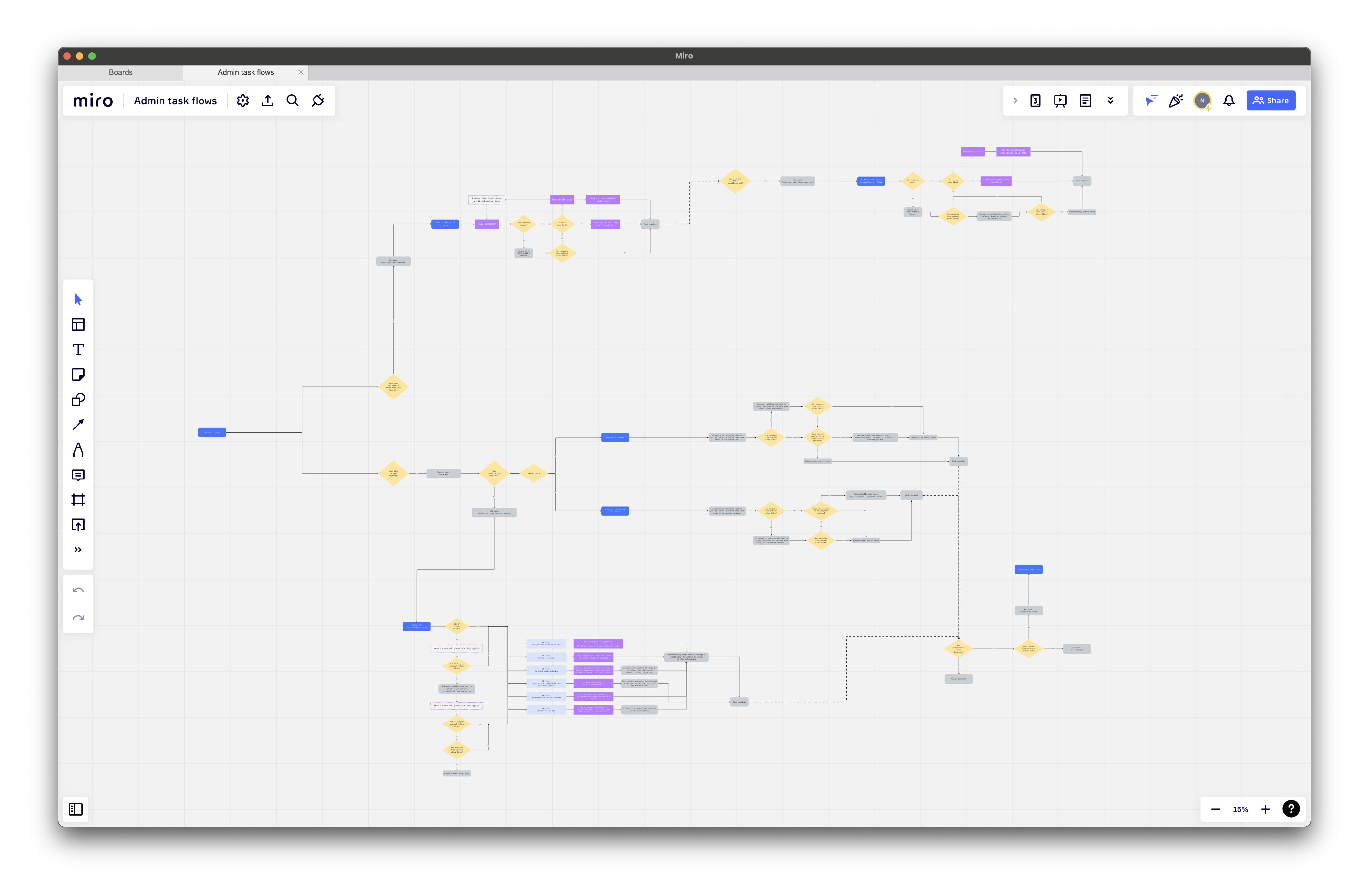
I ran multiple sessions, each with different members from different internal teams. Before each one I’d send rough wireframes and concepts to look through, then walk everyone through the ideas during the session and get their feedback on both the existing product and the new concepts.
I always knew the UI was going to be plain (in the best way possible). Nothing flash, no reinventing the wheel — it just had to work. Then we hit the first major milestone: the MVP designs were ready. We had a simple click-through prototype that had been passed around for a week, and so far, it had landed pretty well (people just got it).
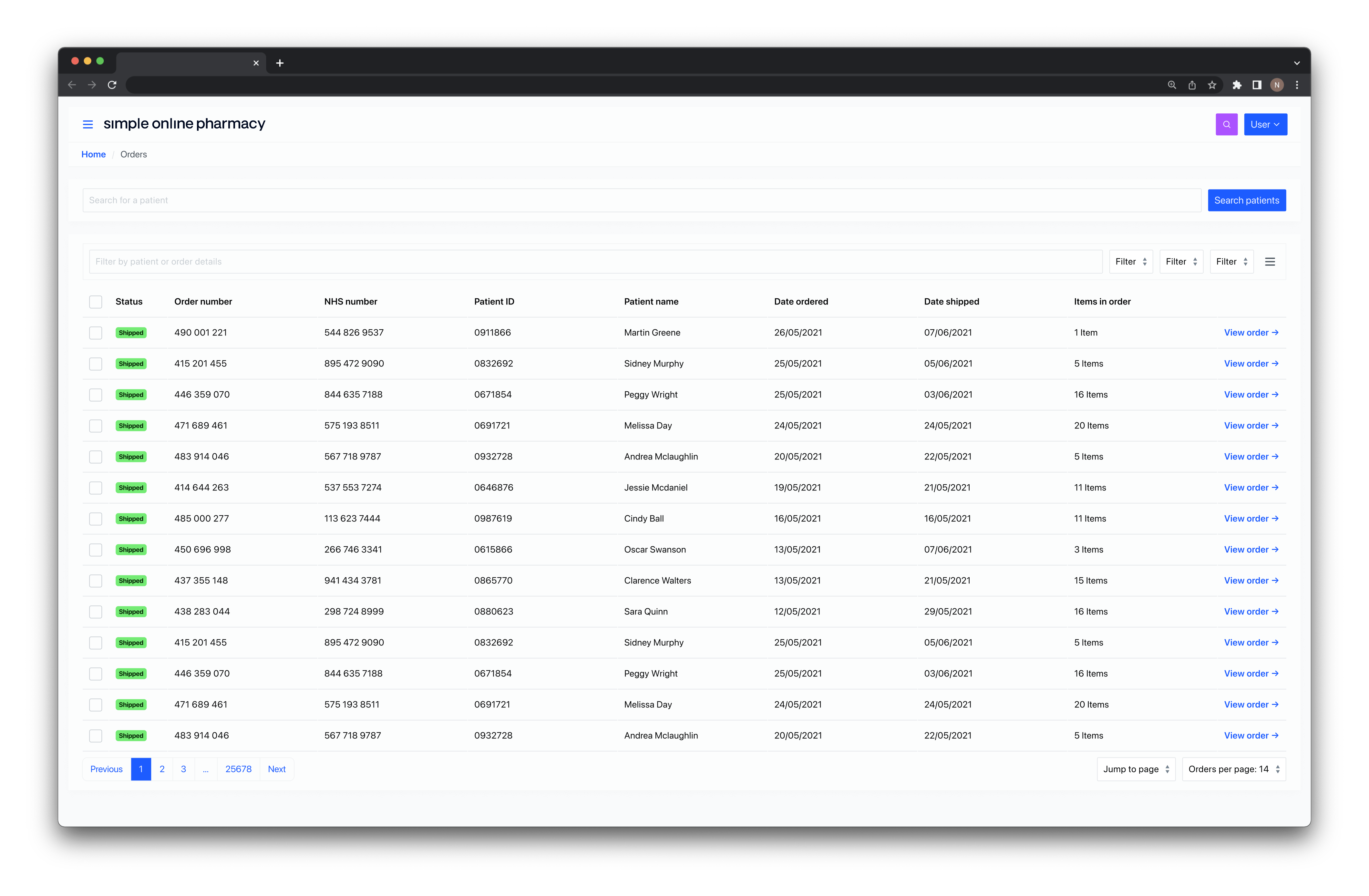
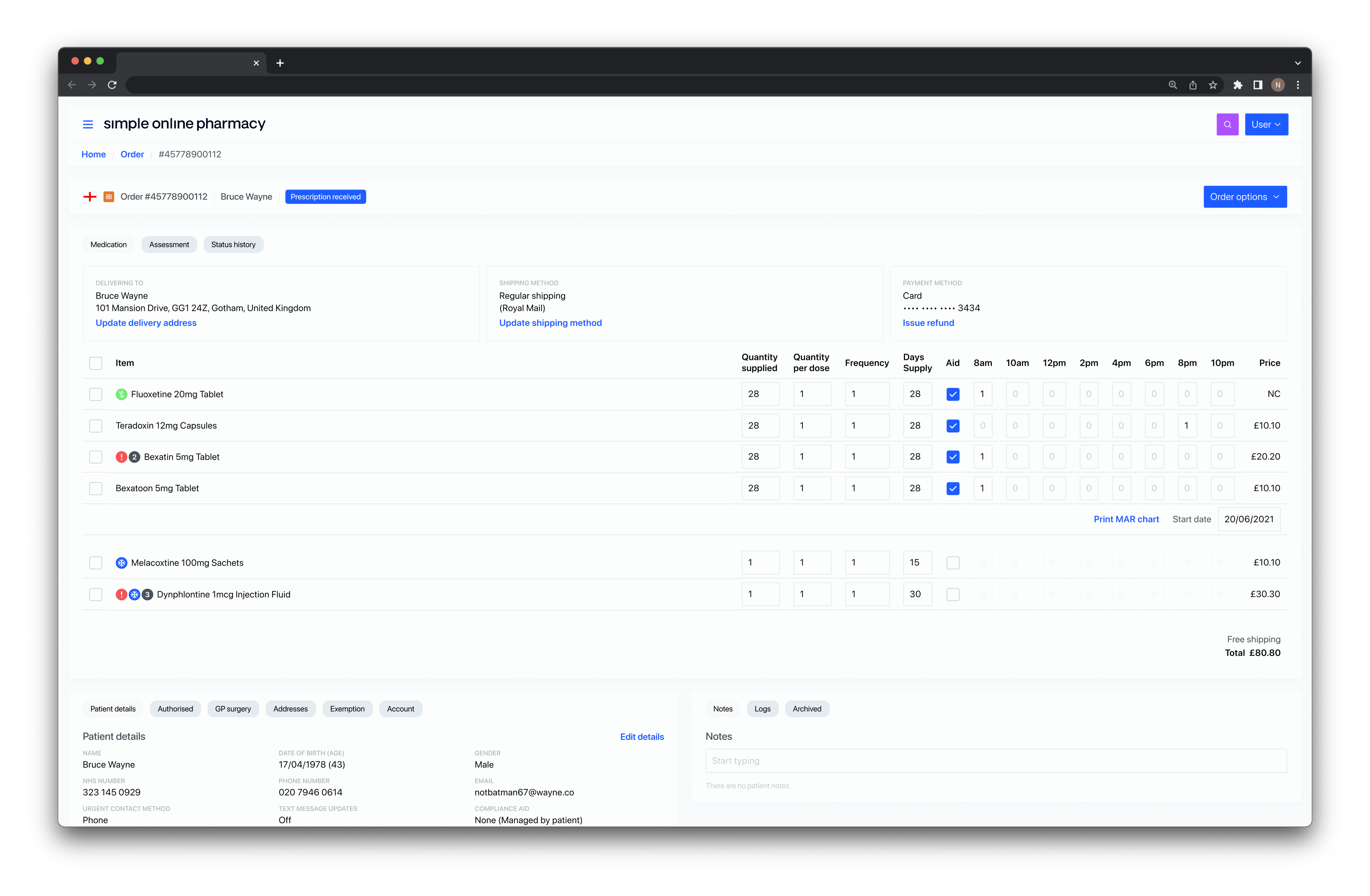
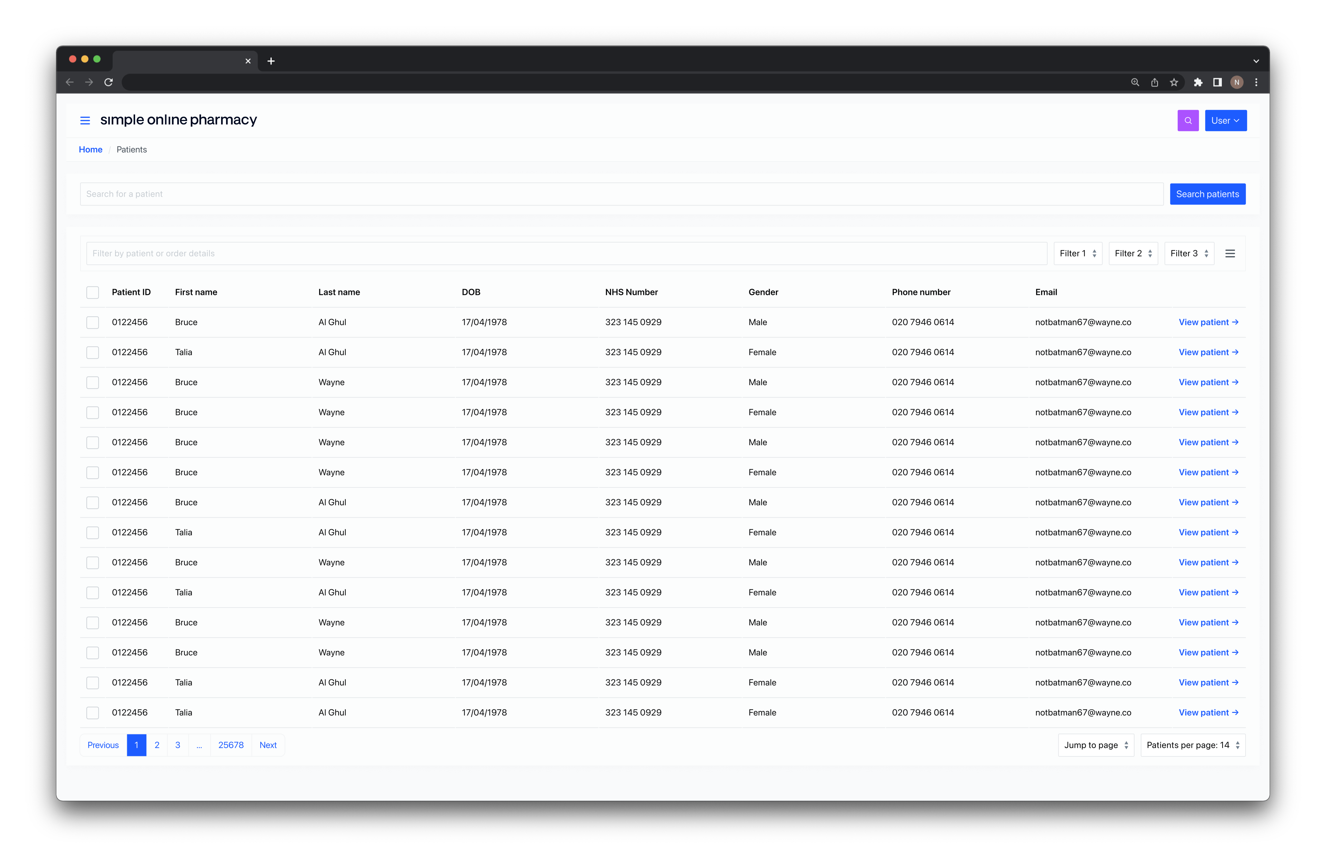
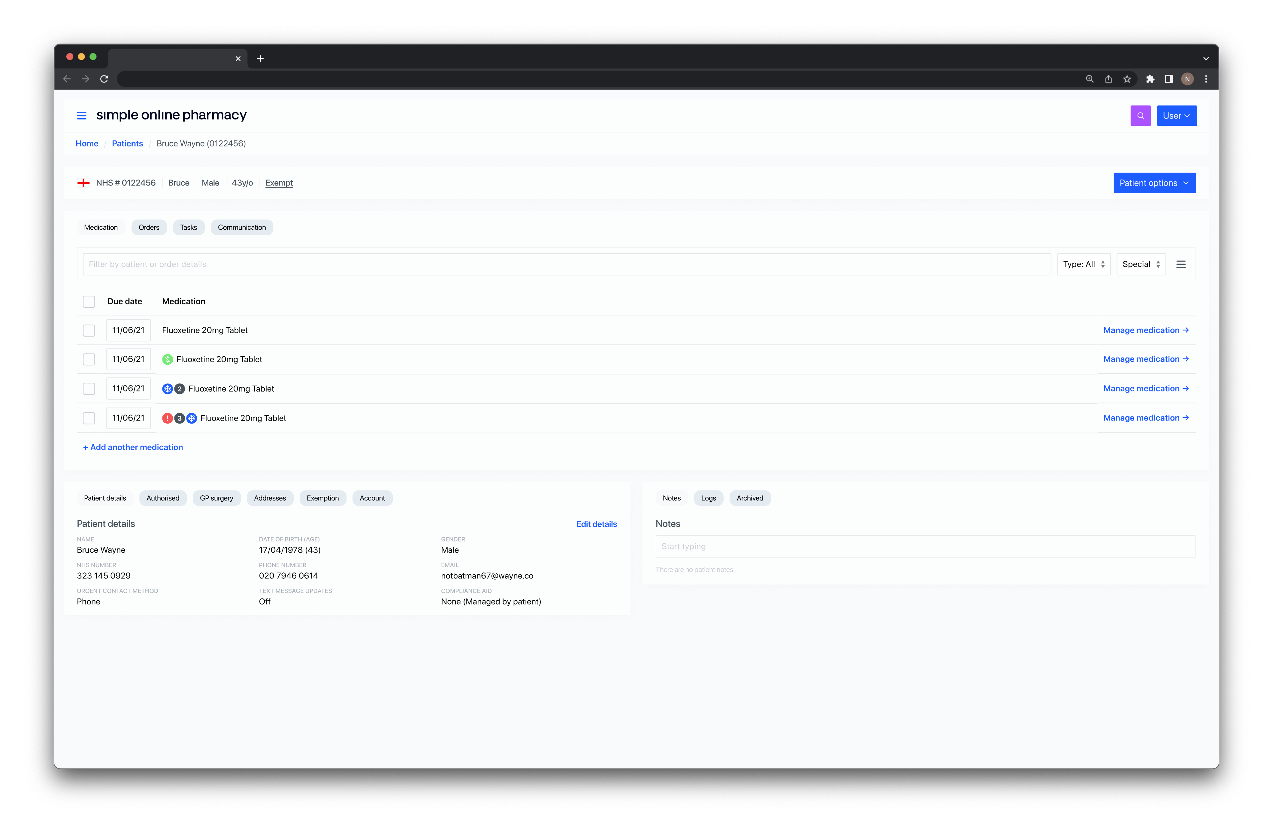
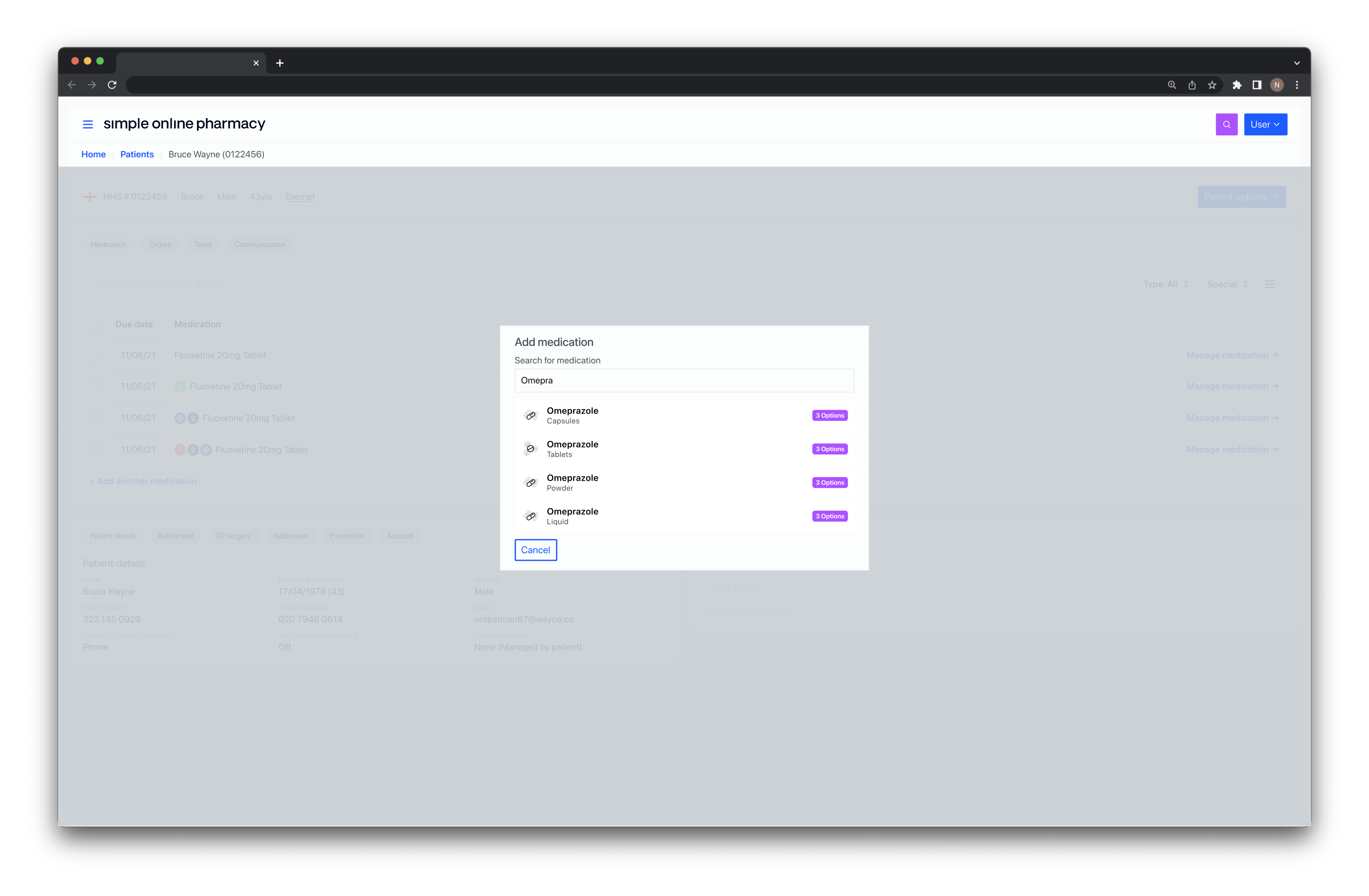
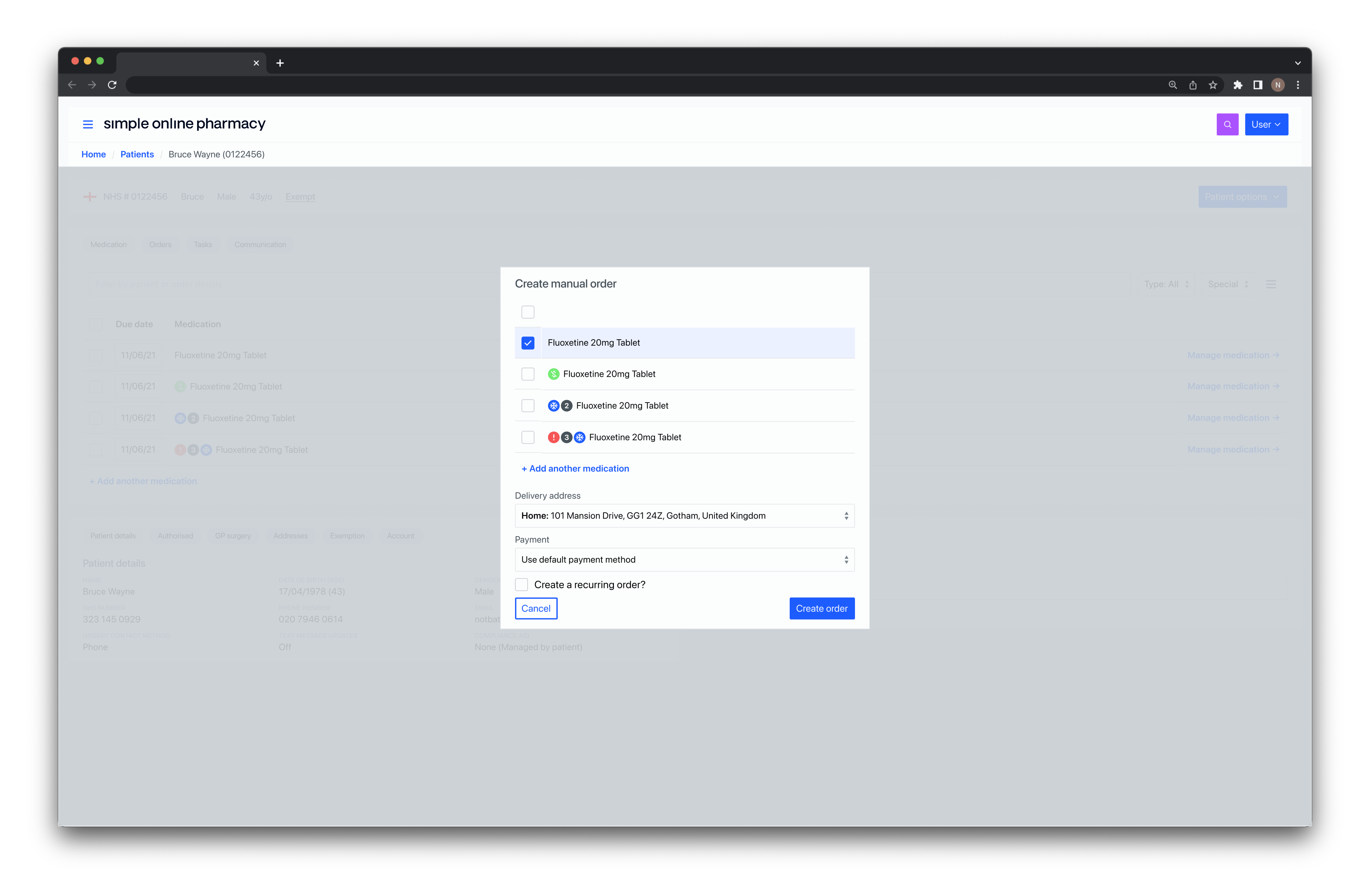
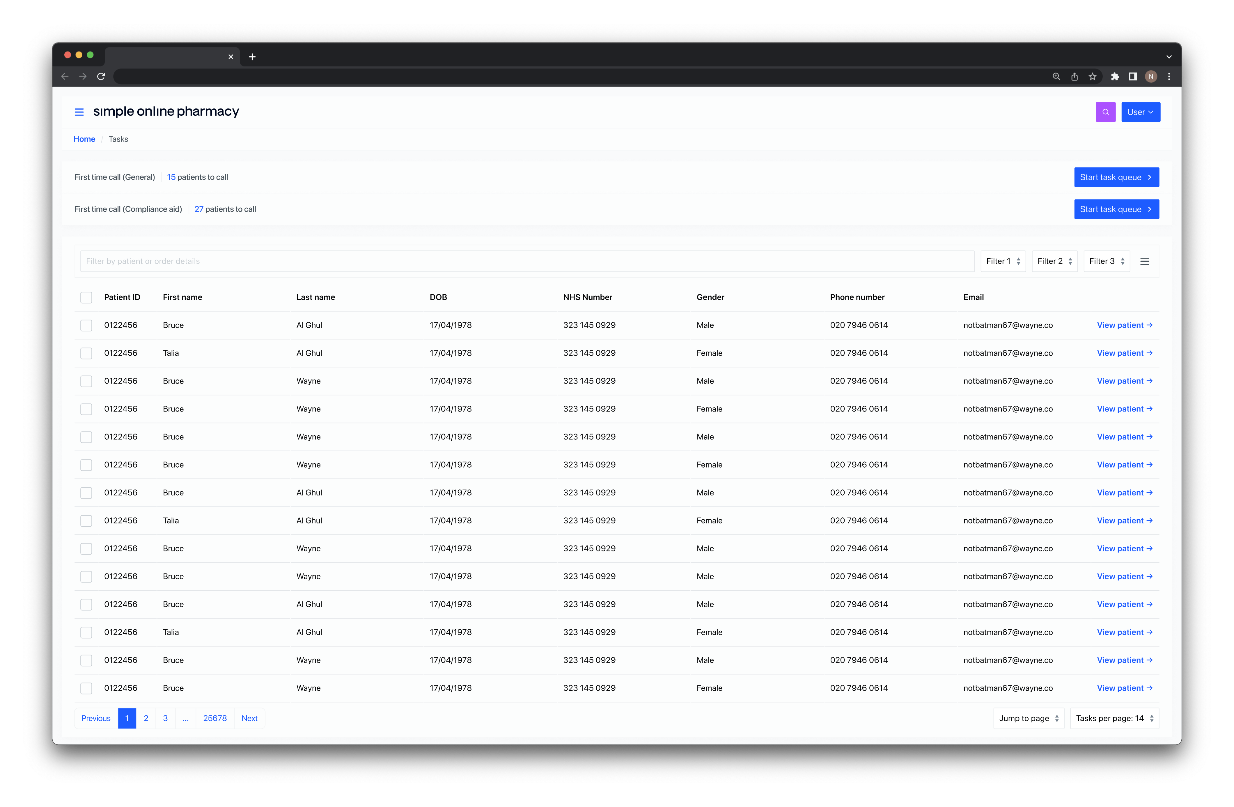
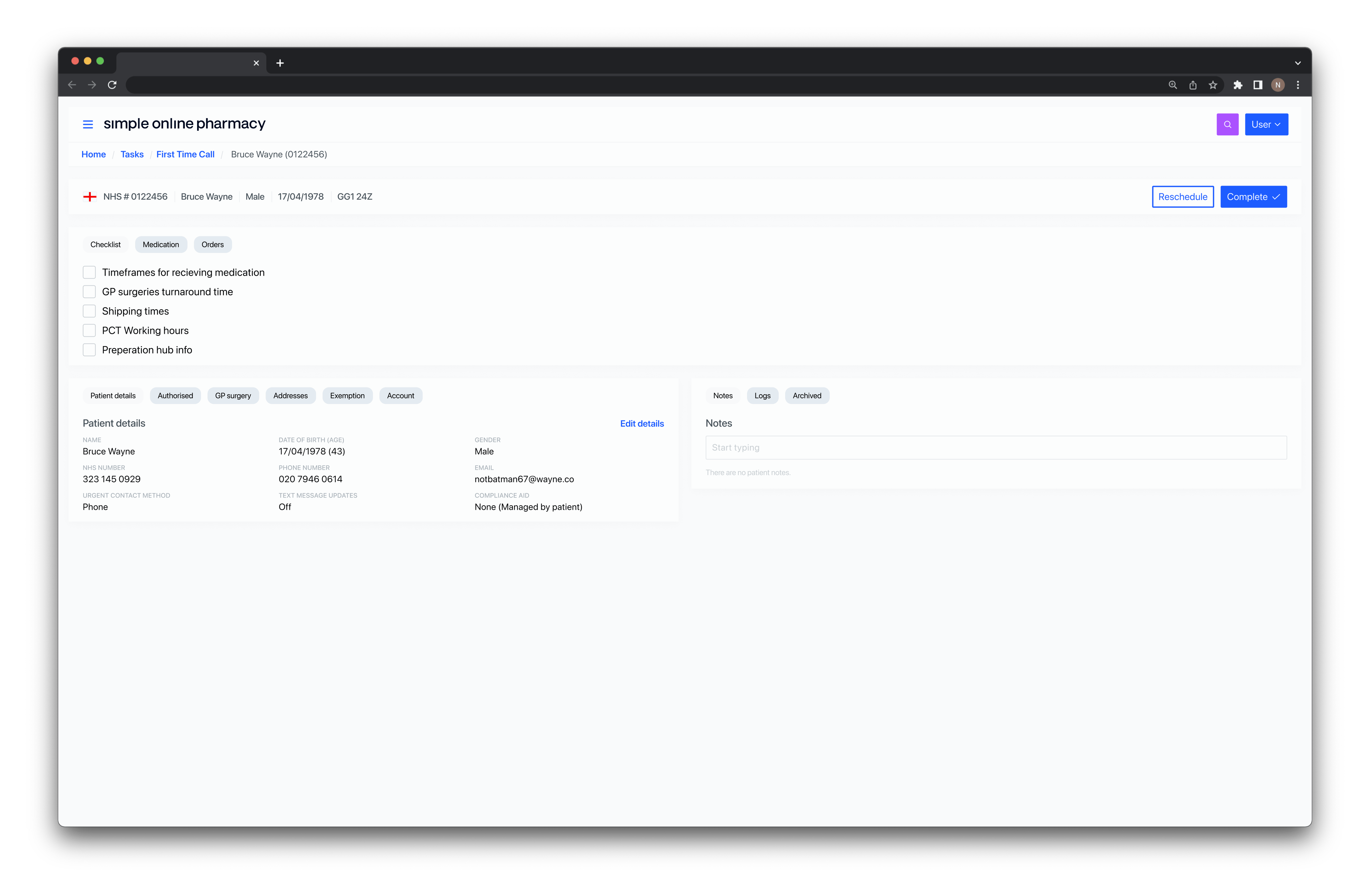
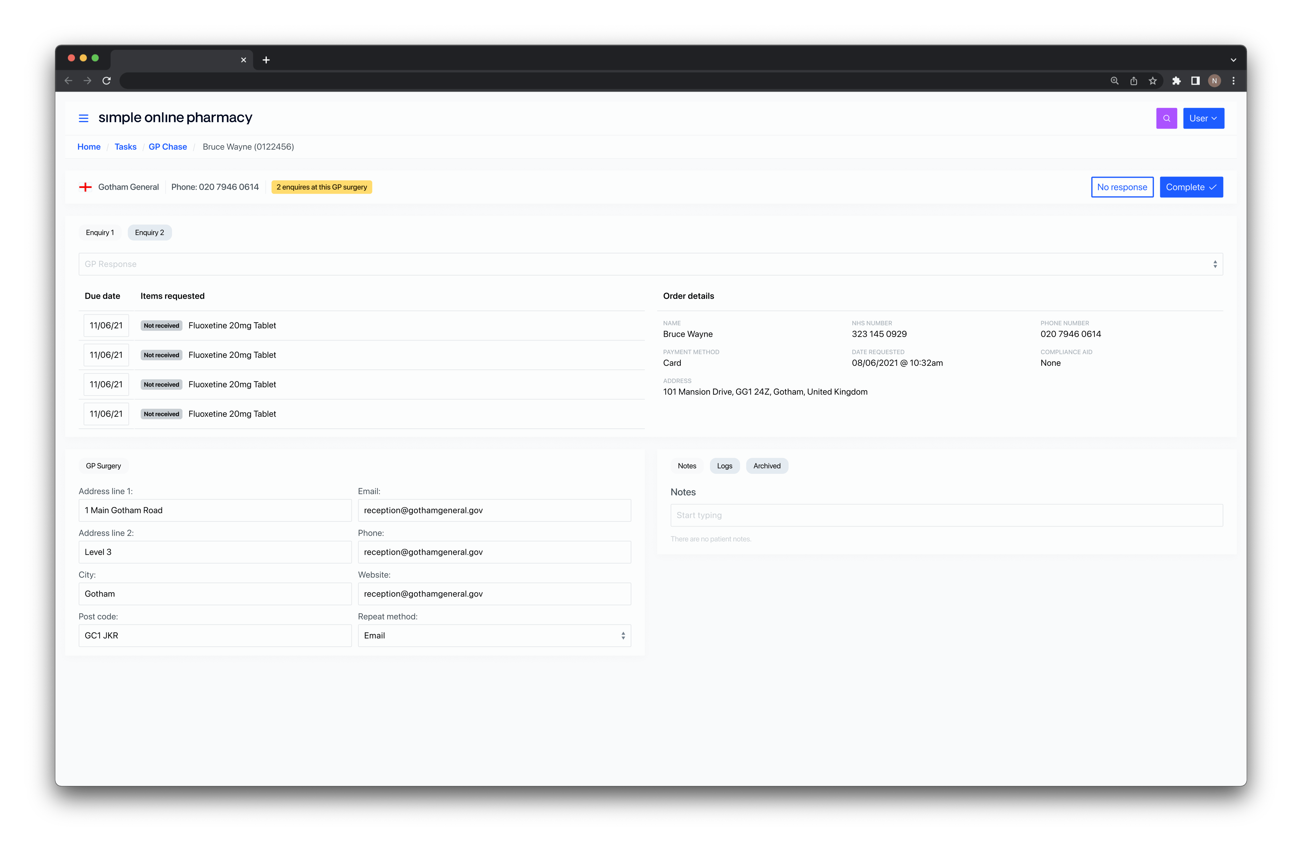
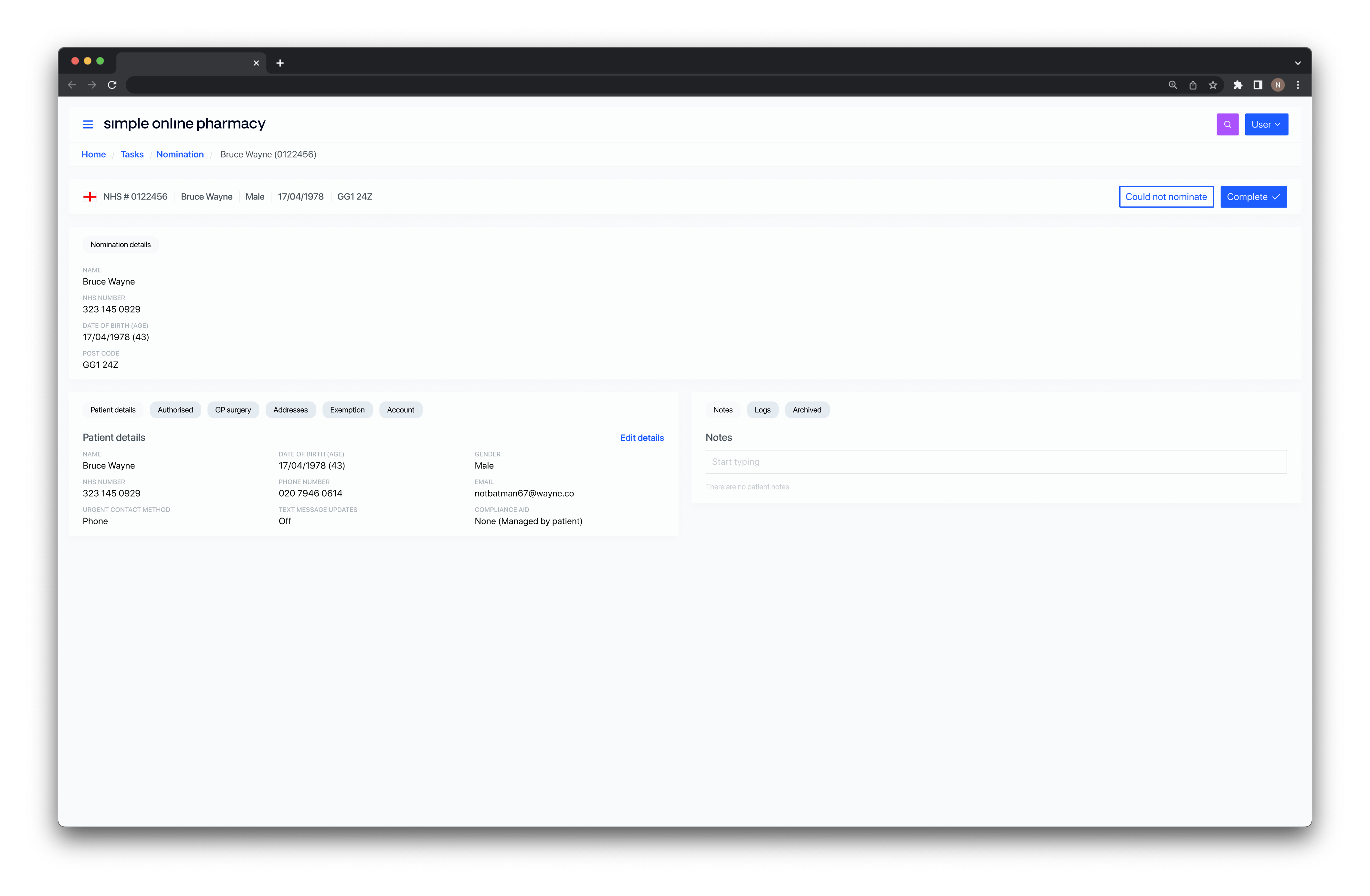
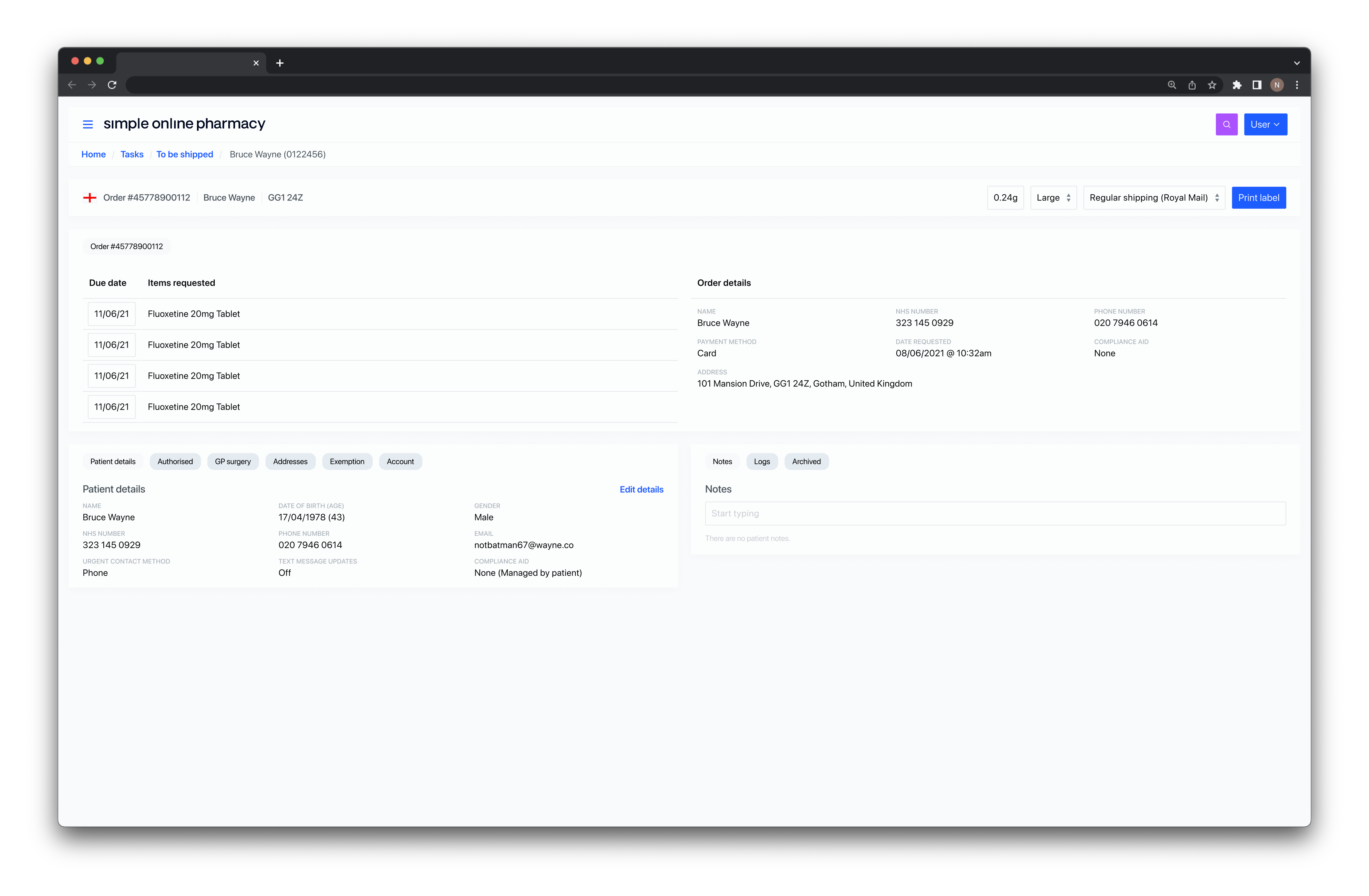
As the tool was being built, we tested it continuously. We’d get members of the internal teams to run specific tasks like searching for an order or a patient, and then tell us how it felt now that they were working with something real, not a basic click-through prototype.
We released a light version first, with two minor tasks: nominations and first-time-calls, and basic patient and order views. The point was to get real usage data and start measuring the difference between the old tool and the new one.
The nominations task saw a massive improvement. On the old system, a patient care member could get through around 27 nominations an hour. Using the new task-based system, that jumped to close to 70 — mostly down to bulk copy-and-paste actions.
First-time calls were a different story. Depending on the length of the call, a patient care member could make around 12 an hour, and the new system didn’t move that number much. What it did do was give the team a checklist of the information they needed to cover, a way to reschedule calls so there was no manual follow-up, and an automated email to the patient with dynamic content based on which items got checked off.
Over the following weeks we released more tasks into the light version until it included all we needed for version 1. When the teams compared it to the old tool, the problem that had dominated the early stages of the project (not being able to find what you were looking for) was pretty much gone.
Ready to get in touch?