On its first run, the project was a way for me to improve my illustration style and ability. This time, the focus was more on turning this personal project into an actual product. This meant that the entire project needed to be replanned and a lot of the existing design elements needed to be redesigned.
In 2014 every day for fifty days I illustrated a footballer and in 2016 I relaunched the project.
Defining the illustration style
During the project’s original run, there were no guidelines in place. Even though I was making the illustrations as part of a project, they lacked structure and consistency. It was all about self improvement rather than creating a consistent style.
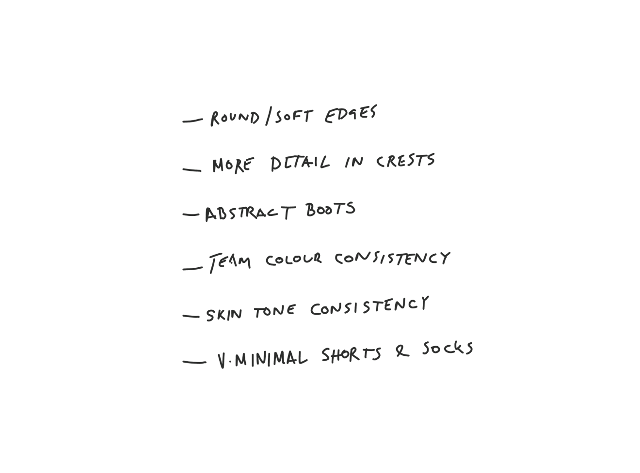
This time around, I needed to develop style guidlines for the collection and then create illustrations based on these rules. From the beginning I knew that I wanted the illustrations to have round/soft edges. One thing I didn’t like about the original illustrations was that the corners were hard and it made them look unfinished.
A foundation built on templates
Now that the guidelines have been defined, it was time to create the templates. Not having any guidelines during the original run was definitely a factor but more importantly not using templates made creating new illustrations challenging.
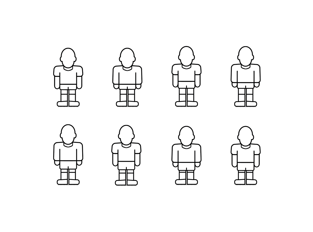
For every new illustration, I would copy and paste the last one I created, then delete bits here and there. This time I knew that wouldn’t work, so I had to come up with a set of templates to use as a starting point. Based on the original illustrations I knew that I needed eight different templates to begin with.
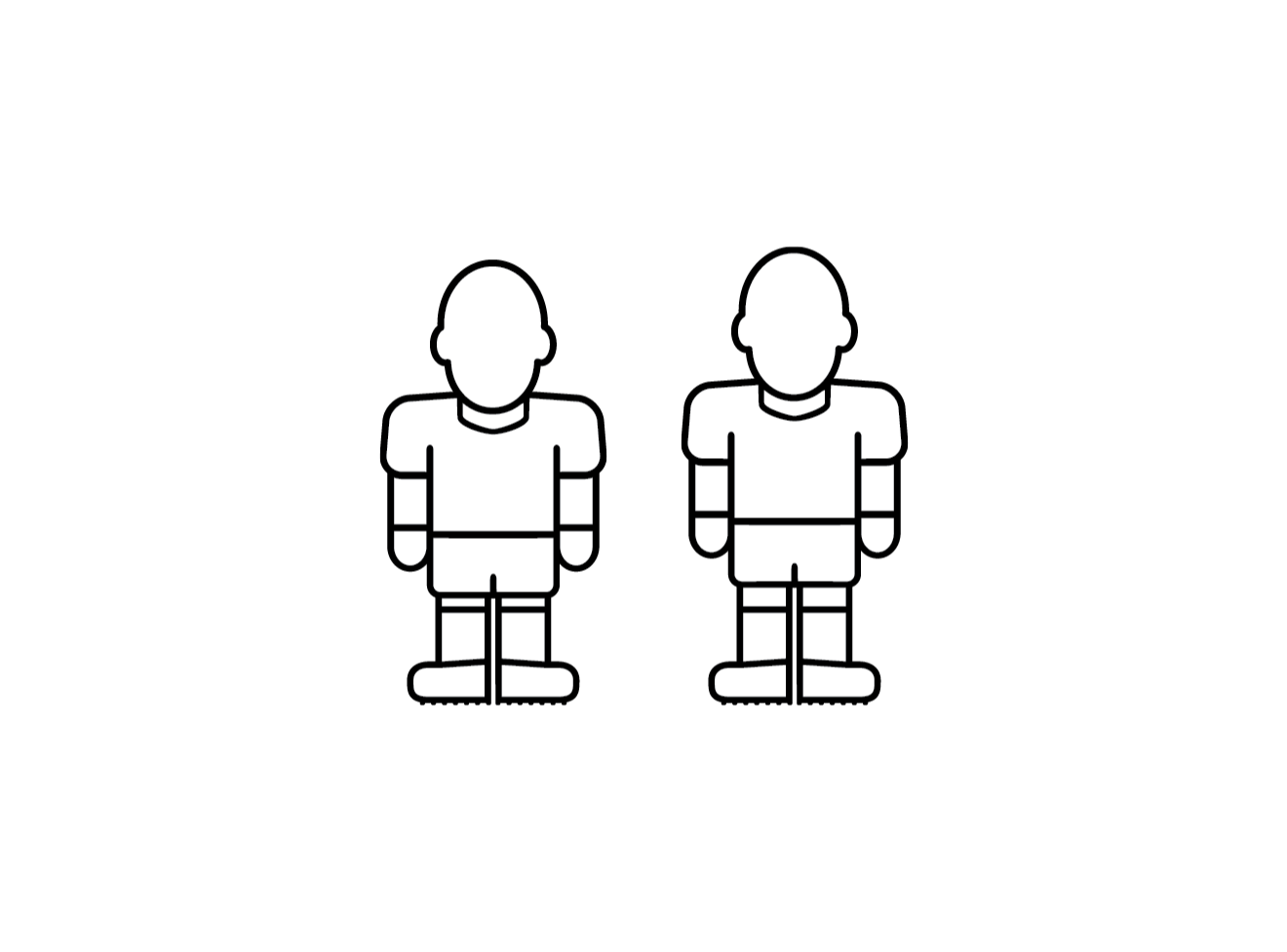
I needed four classic (mid 60s to early 90s) templates and four modern (up until 2006) templates. Each set of templates consisted of an average height player with short sleeves and long sleeves and a short height player with short and long sleeves.
In preparation for the new collection which will contain players from recent seasons, I came up with two new templates for players with under shirts rather than the traditional long sleeve shirts.
Putting it all together
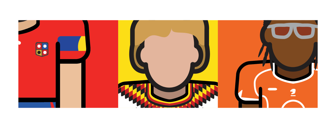
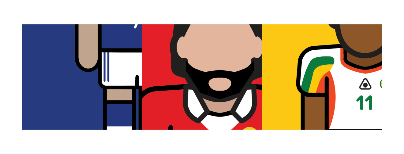
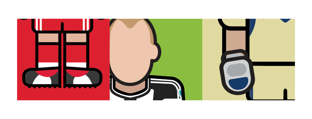
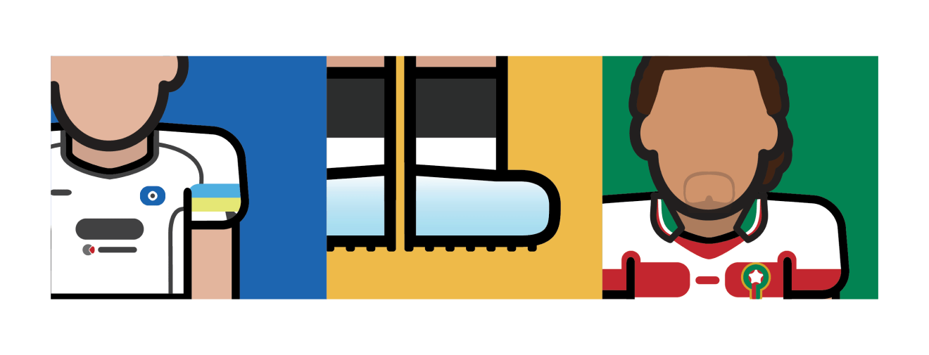
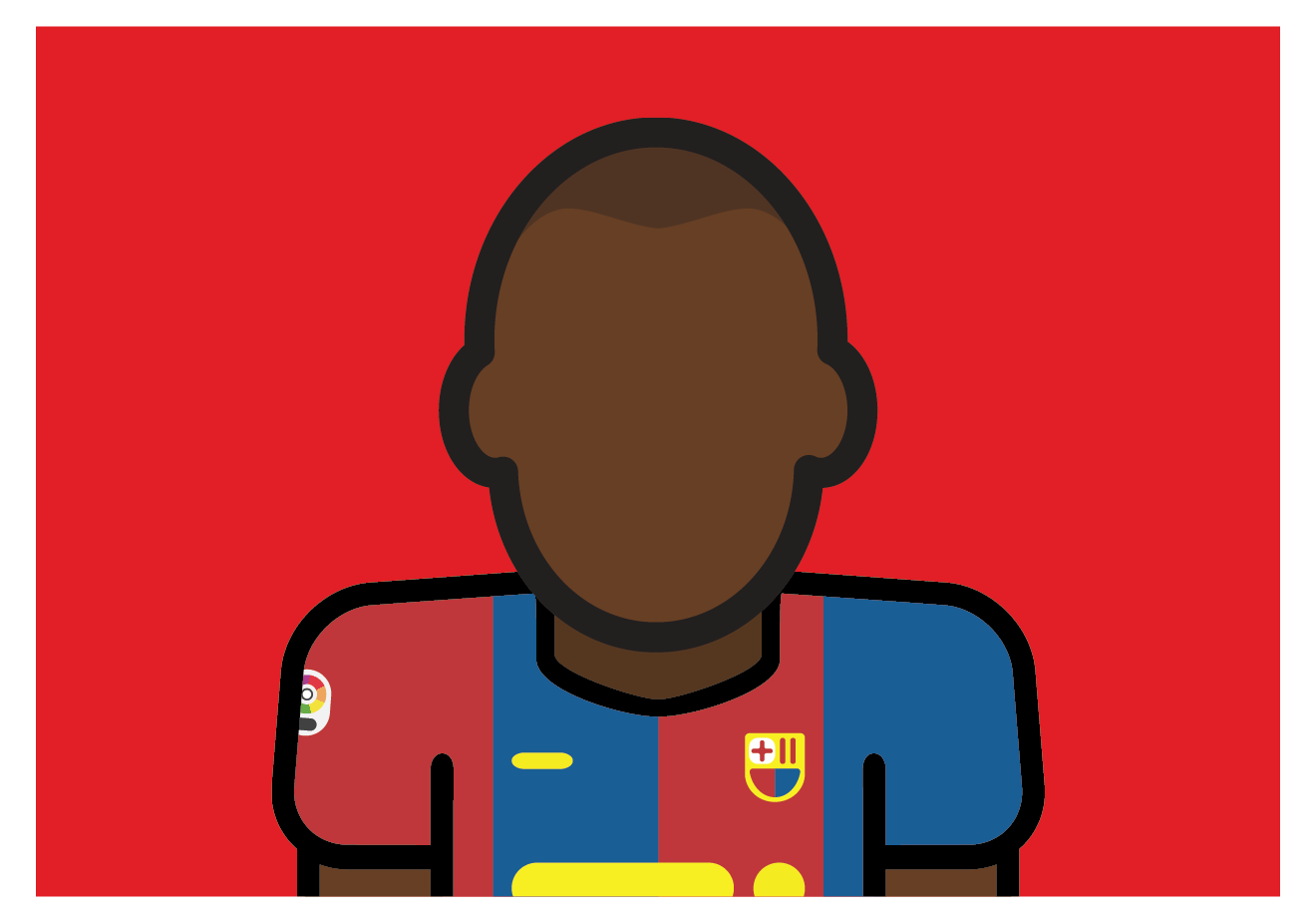
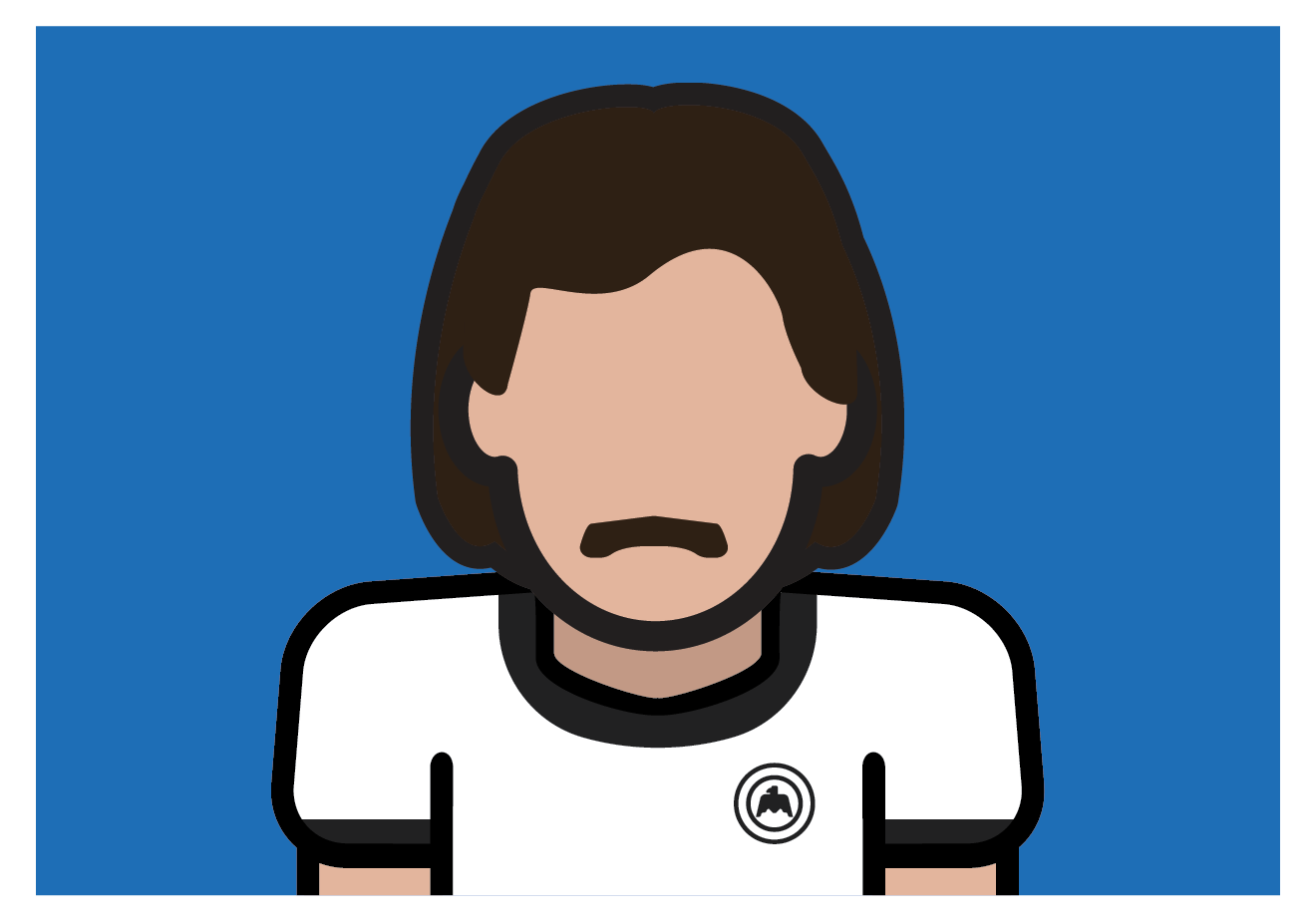
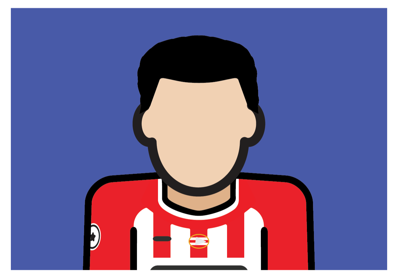
Once the templates were completed it was time to start on the illustrations. The style I defined would now shape how the new illustrations would look. A new soft/rounded edge style would be used across the entire collection, instead of the varied chaos of the original illustrations. There would also be less detail on the shorts and socks, more detail in the crests, team colour and skin tone consistency, and a minimal-abstract approach for the boots. The resources I used for reference mainly came from Getty Images and Colours of Football.
New crests

As part of the guidelines I created for the illustrations, the crests needed more detail this time around. I would still need to keep the style minimal and it needed to comply with the other guidelines. My approach to the crests wasn’t to copy them exactly but instead was to use the main elements from the actual crest and then illustrate a Minimal Football version.
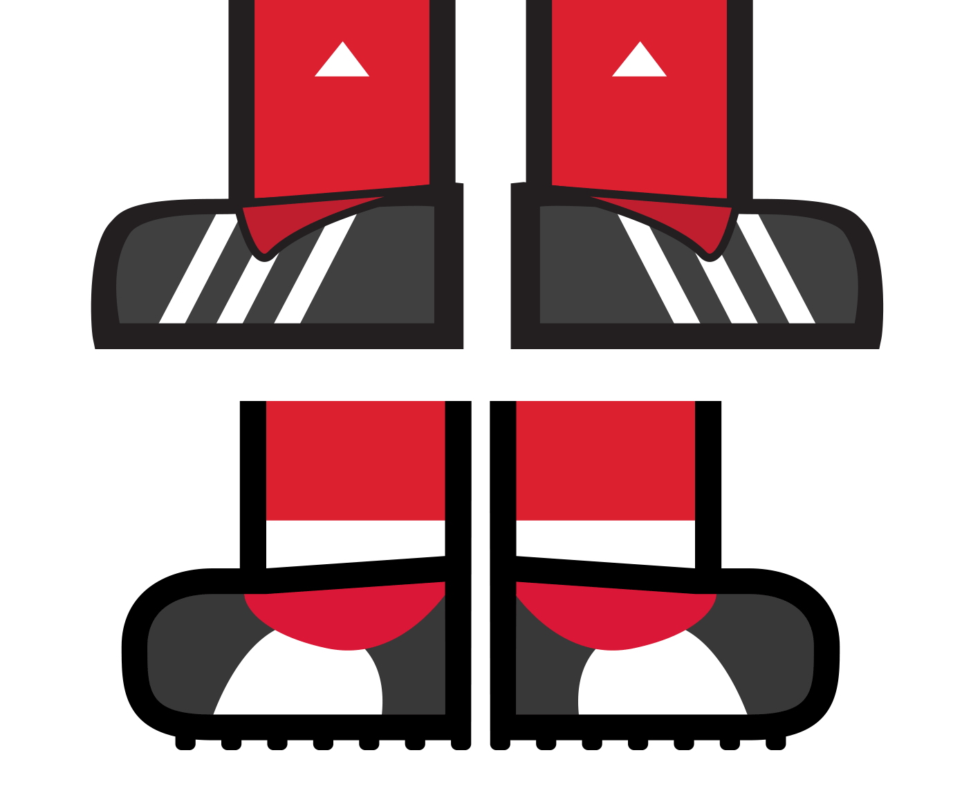
Abstract boots
In the first run, I tried too hard to make the players’ boots match exactly. This, in many cases lead to the boots looking out of place and not matching the rest of the illustration. Now I had the freedom to use the same colours as the real boots but give it a distinct, more abstract style matching the rest of the illustration.
How did it compare?
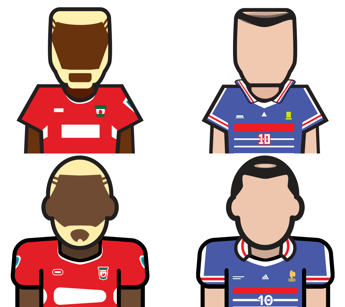
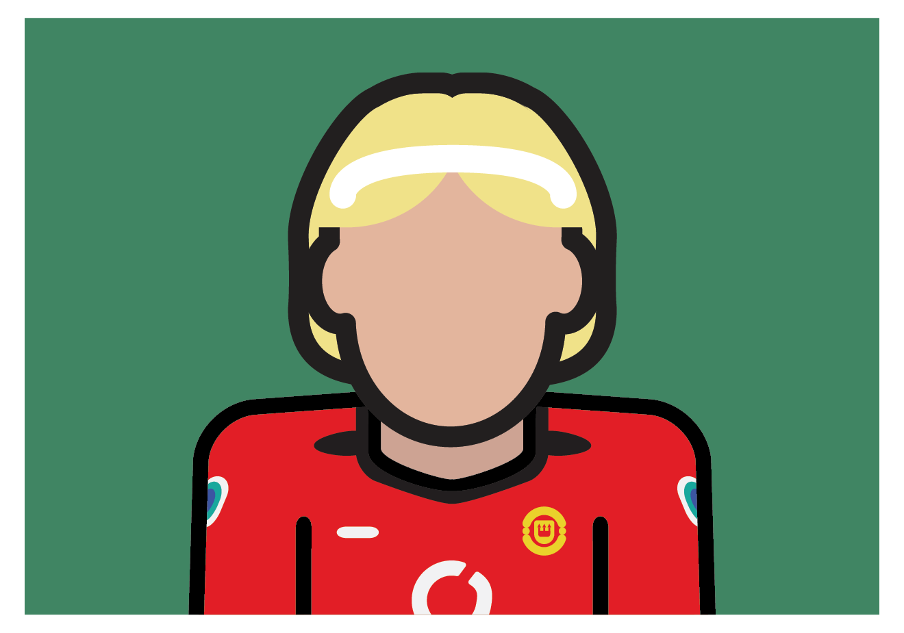
Once the first collection was complete, I compared them to the original collection and the difference was astounding. Little details made the biggest difference. The colours seemed more vibrant and the soft/round edges made it look far more polished.
Developing a creative football brand
With the first collection complete it was now time to create Minimal Football’s brand and identity. There were two main requirements. The first was that the brand had to reflect the minimal style of the illustrations and collections. The second was that it needed to look and feel like a professional sporting brand. I started sketching some ideas.
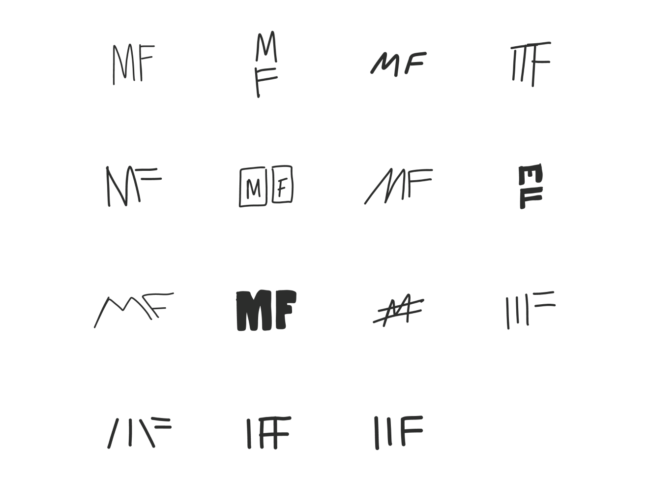
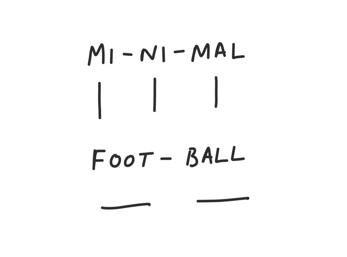
It wasn’t until the last few sketches that I started to get on the right track of what I envisioned the logo to look like. The line ideas made the most sense to me. They could represent many aspects of the brand and they suited the minimal style.
They also gave me options to give the logo a more in depth meaning. Something I wanted to do with this logo as the end result was always going to look very simple. I wanted to showcase my ability as a designer to implement a deeper idea into a simple execution.
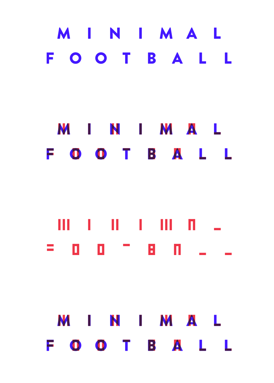
Now the final idea for the design started coming together nicely. It was time to play around with the straight line ideas to see how the Minimal Football type would look using the full title. This wasn’t exactly part of the brand and I had no plans of using it but I wanted to experiment with the idea and see what I could come up with.
Creating the final logo design.
Even though the direction that I wanted to take for the logo was established with the final few sketches, the experiment using the full brand title pushed me even further in the right direction. It showed me that even though I wanted the logo to simply say the initials MF, the combination and placement of the lines could spell every letter in the title.
However, the main (and most obvious) aspect of the logo still needed to be MF. You didn’t need to see the whole title, but you should definitely be able to make out the initials. So I began putting together the final design and based on the initial idea of what the identity had to end up looking like, the final design turned out great. It fit the criteria of suiting the minimal style of the collection plus it had the look and feel of a sports brand.
Finalising the brand, colours, and type.
Now it was time to create the colour scheme. Unlike most of the branding projects I’ve done in the past, I intentionally decided to come up with the colour scheme of the brand after I finalised the logo. This was an attempt to see if the process of designing the logo would shape the colour scheme rather than the other way around.
And it worked. Once the logo was created only two colours kept popping up in my head. Black and Red. I always wanted a colour scheme that would stand out on it’s own but when used along side the illustrations or collections it wouldn’t take anything away from them.
Black was always going to be part of the colour scheme, but the red was something that came out of me trying to make the F part of the logo stand out. Red is also a prominent colour in a lot of the illustrations, so its impact alongside the illustrations would not take anything away from them.

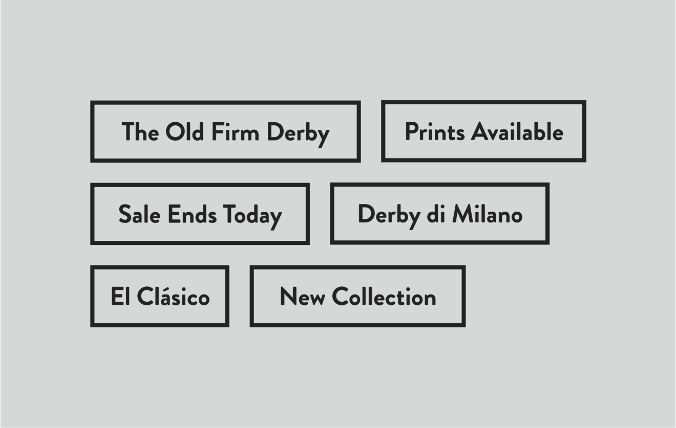
Just like the colours, the type I wanted for the brand had the same criteria; stand out alone, and act as a secondary focus with the illustrations. I also wanted a round/soft edged typeface to match the soft edges of the illustration.

Designing the website.
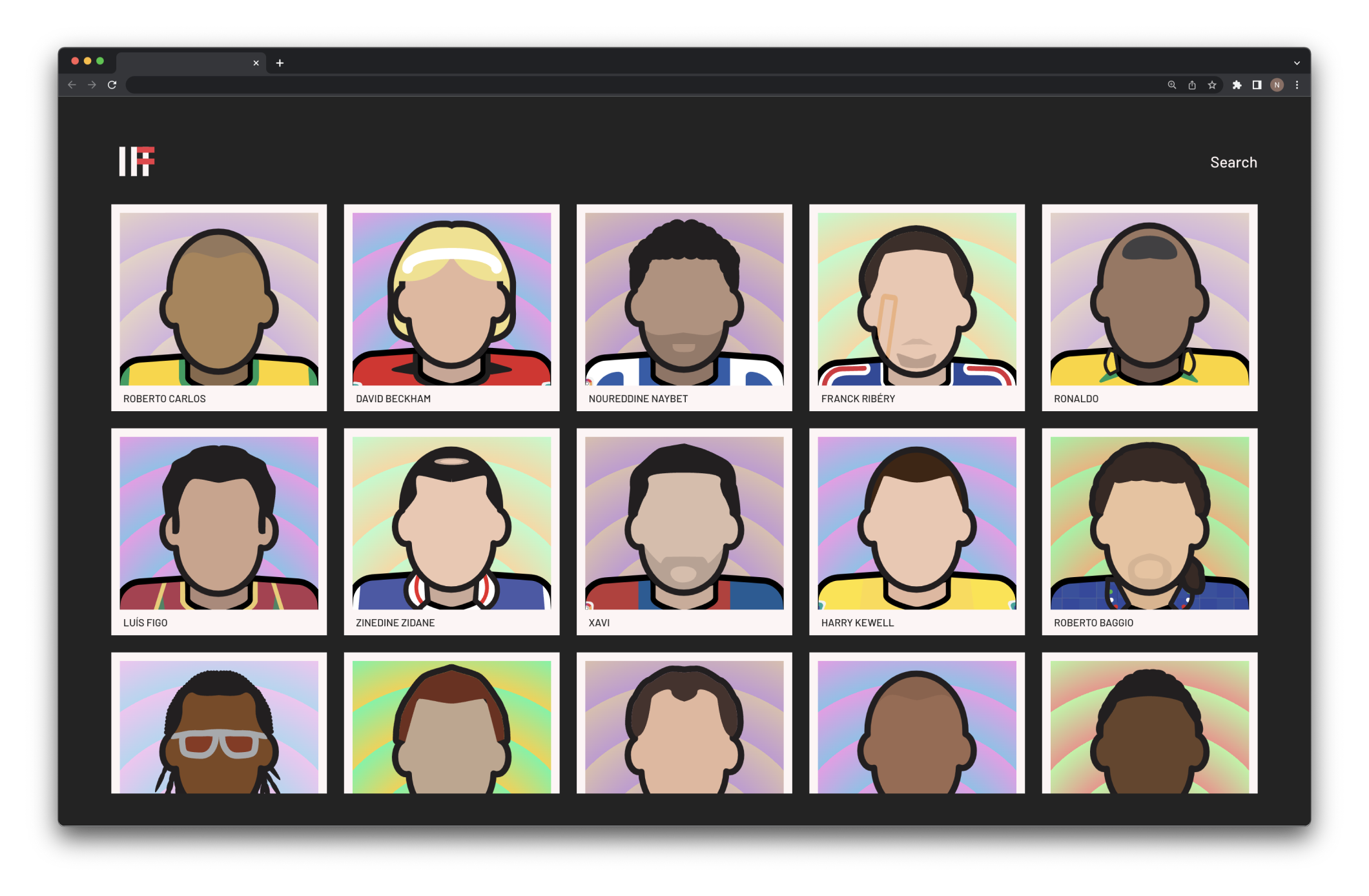
The plan was to relaunch the project with the original fifty illustrations redesigned, then add more players and collections. With the first collection of illustrations completed as well as the brand and identity, it was time to start working on the website. The idea for it was to create a simple showcase website that shows the illustrations with some basic information about each player. Once the next collection was complete, I would then start working on an online shop component for the website.
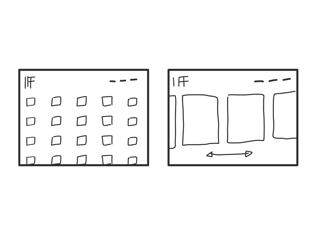
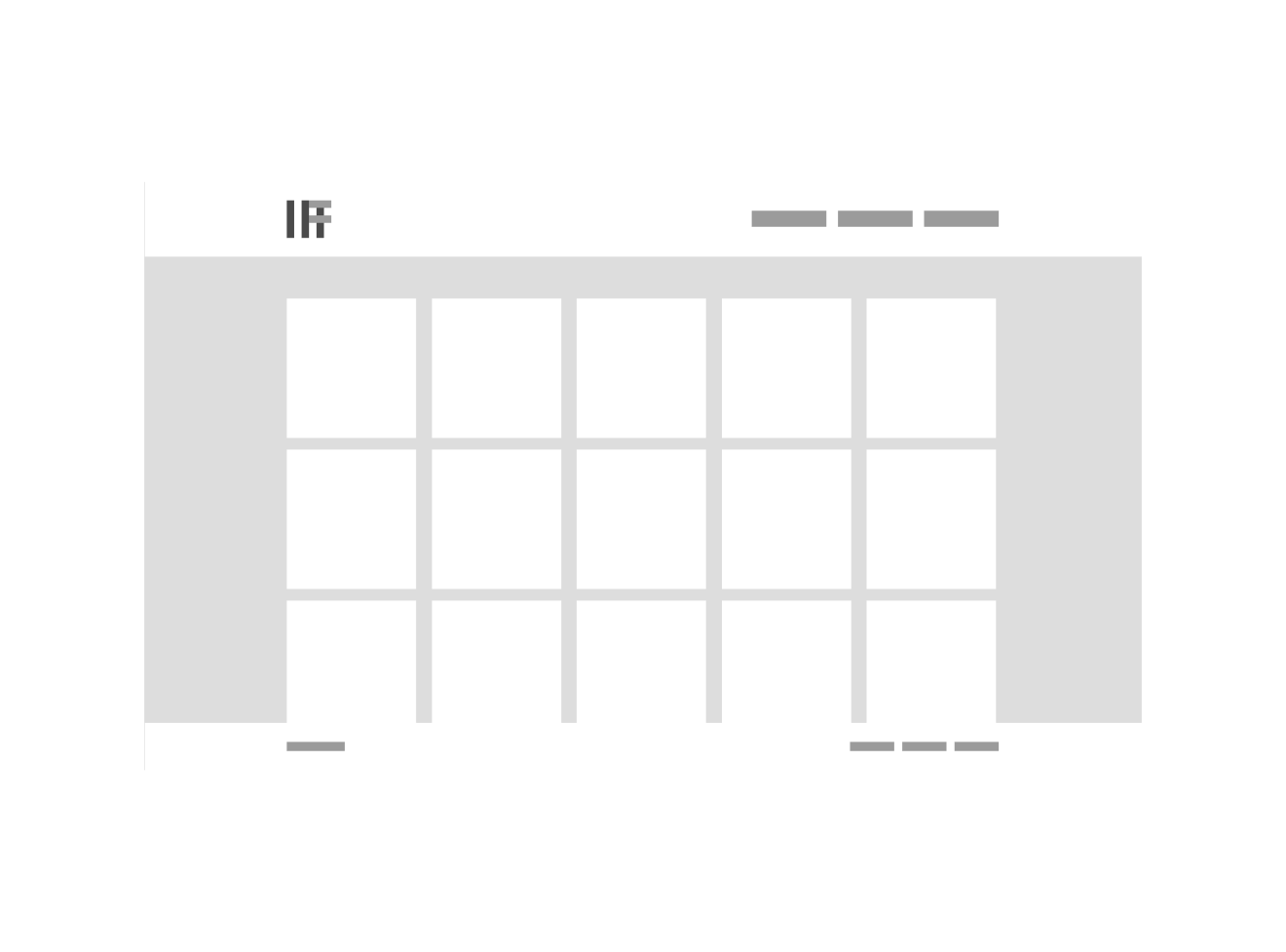
After a few sketches it became clear that there were only two options that would work best for the type of minimal approach I wanted. The first layout displayed the players in small thumbnails in a grid layout scrolling up and down while the second layout showed larger images with the user scrolling horizontally to see more players. Both these layouts were tested with a small group of users.
The main points that came out of that were that the first layout was easier to navigate as they were all used to the natural scrolling, the second layout took too long to get through each player (especially since I would be launching with fifty illustrations) and the last point was that the second layout showed the players in bigger and better detail. I decided to move forward with the first layout.
Building the website.
Once the final design was completed, I started development straight away. Since the purpose of the website that I would be launching along with the first collection was to only show the illustrations along with a small paragraph for each player, I didn’t over complicate it. I stuck with what I knew and developed it in very simple but scalable HTML, CSS (Sass) and vanilla Javascript.
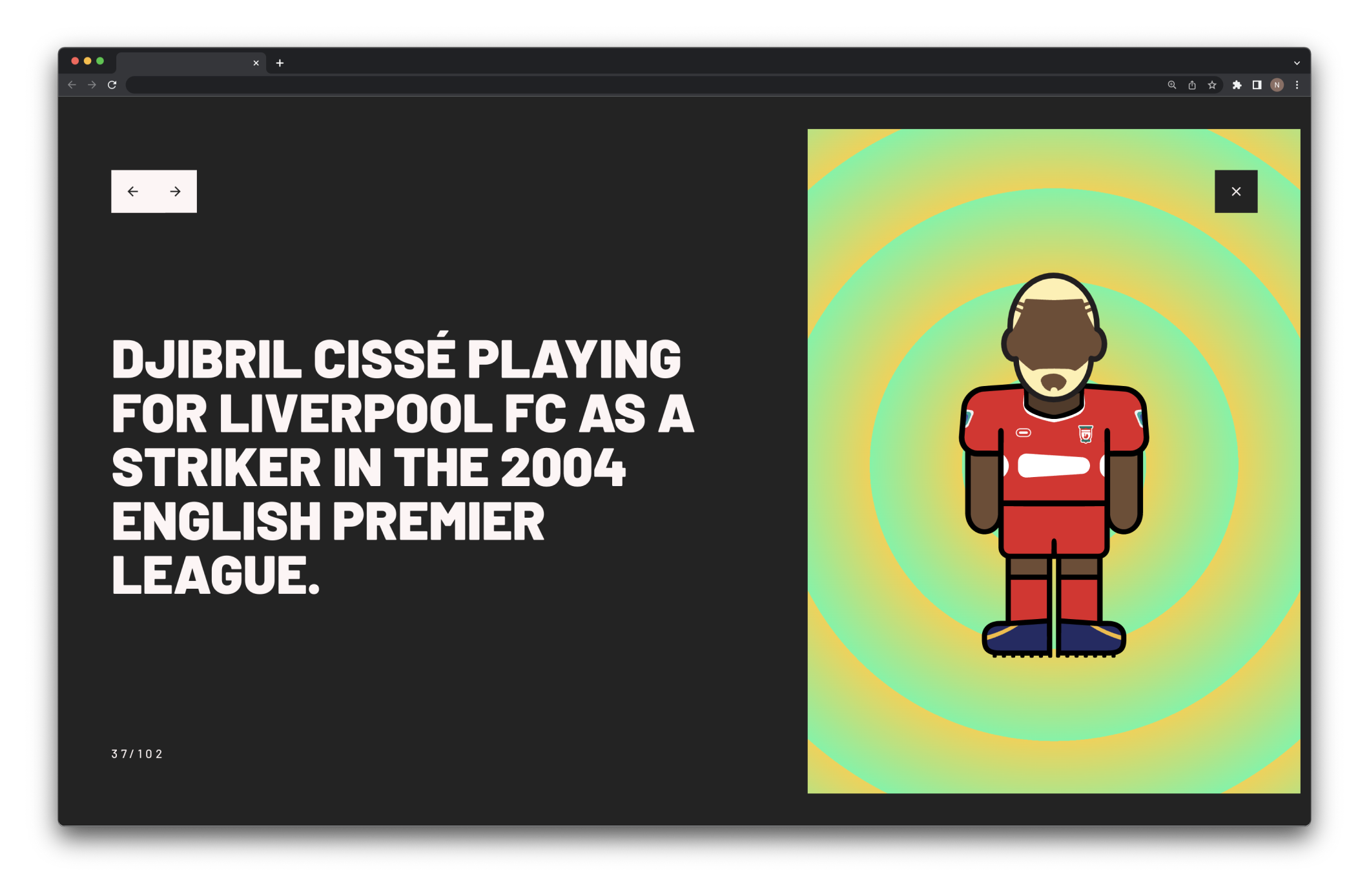
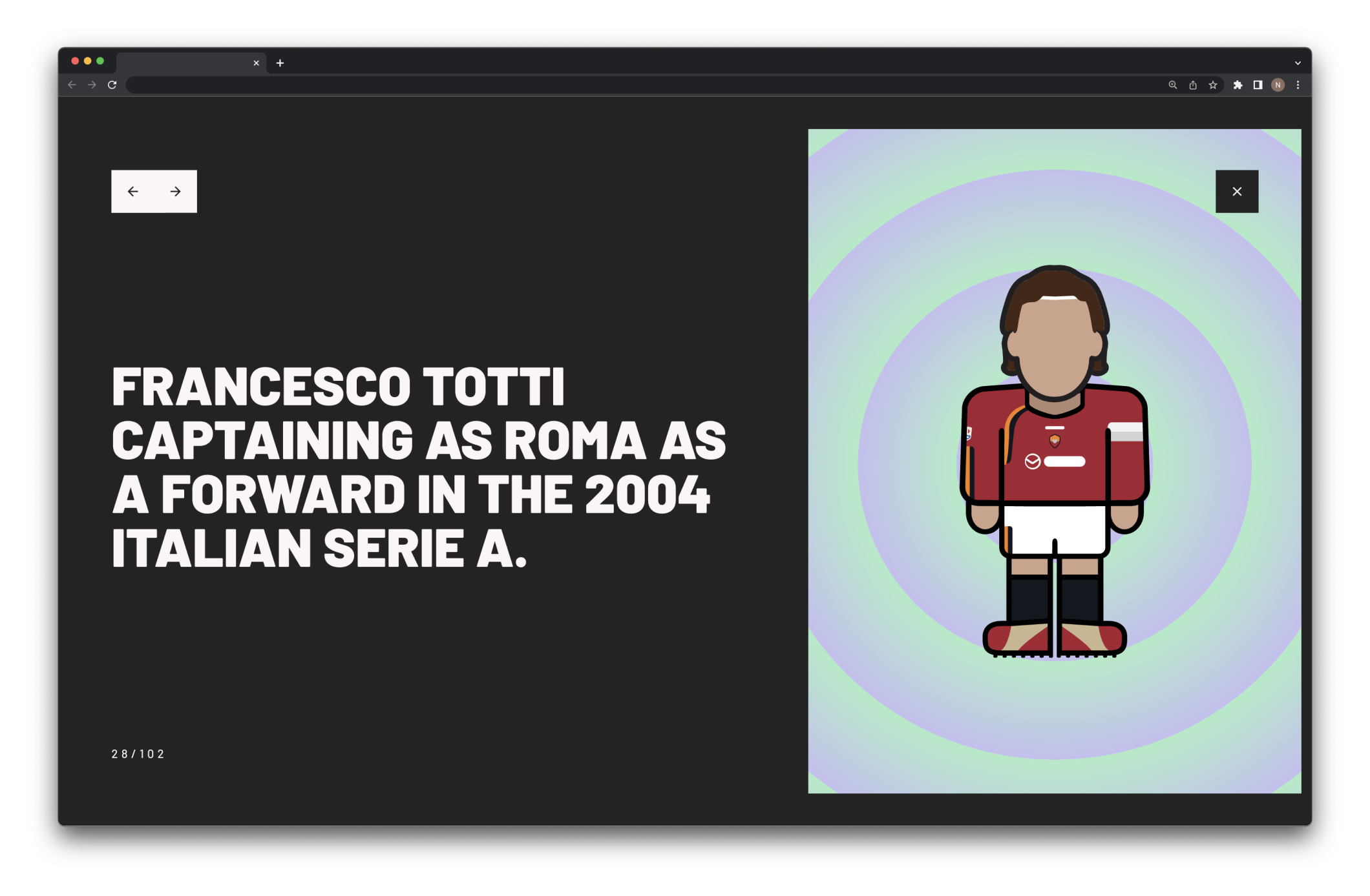
All the player information along with image filenames were stored in a basic json file. To display all the players, I used Javascript to loop through every entry in the file, get the information and then place it in an anchor tag. The player information was placed into specific data attributes so that it can be used to populate the player pop up when a user clicks on a player.
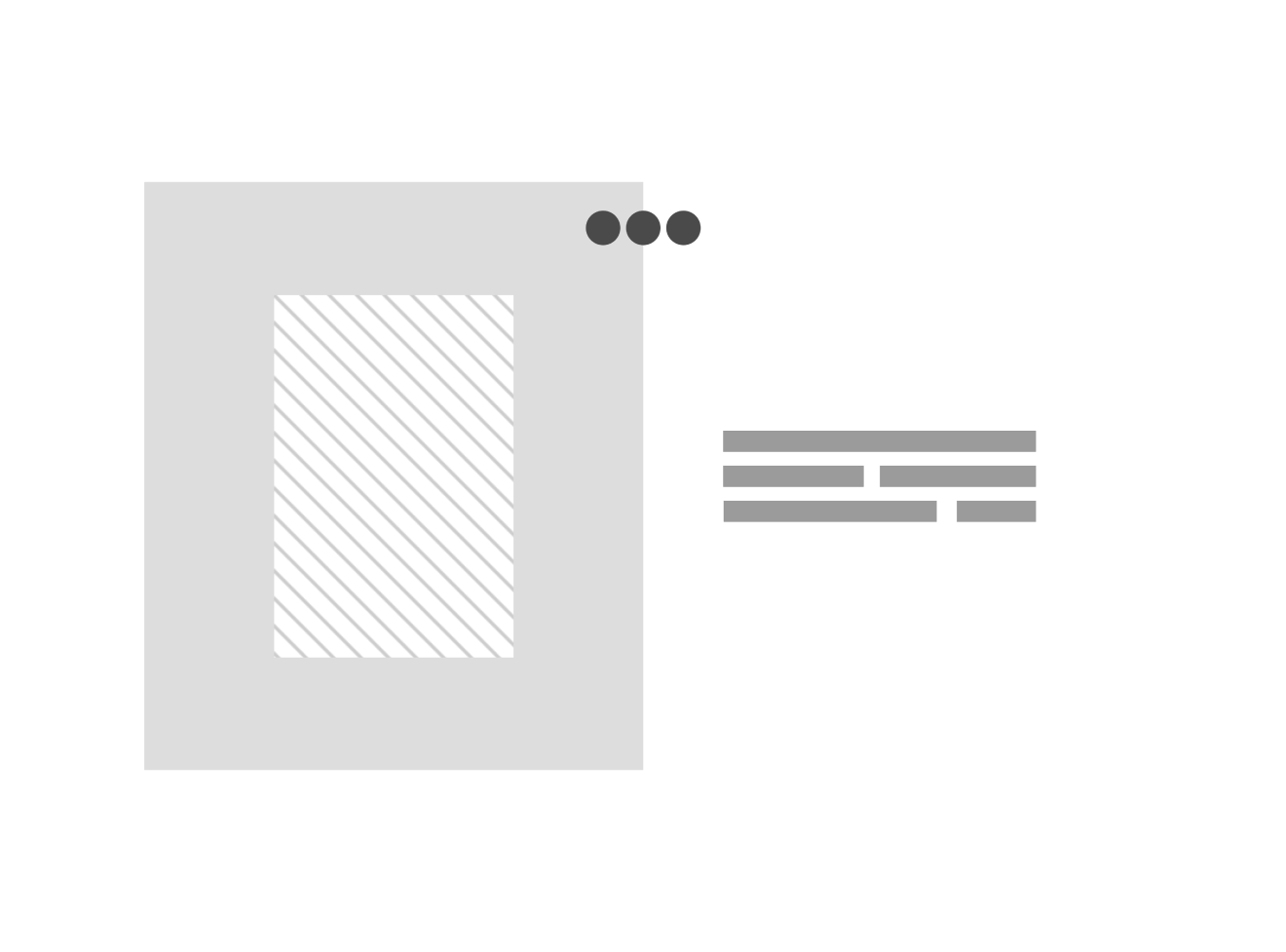
For the player pop-up, when a user clicks on any player a click event grabs the relevant information from the data tags and places it in the corresponding field in the player info section of the pop up. It also takes the link of the players image and places it in the image section of the pop up. It then adds a class to the pop up and it animates onto the screen.
Searching the website
The search functionality incredibly simple. Once the user has opened the search bar, an event is then triggered by the user typing. Since all the search tags are retrieved from the json file and placed in the data attributes all I had to do was filter the results using real expression in javascript. The code simply filters the players based on the search query and it is all displayed in real time.
Where to from here?
With the first collection complete, the website live and the Instagram page active it’s now onto the next phase. Using the same guidelines I created for the illustration I will start working on a new collection of players. Once that’s completed it will be time to begin working on the shop component of the website. Long term my plan and focus will be on growing the Minimal Football brand, releasing new collections and launching the store.
Wanna see how it turned out? Visit the website at minimal.football.